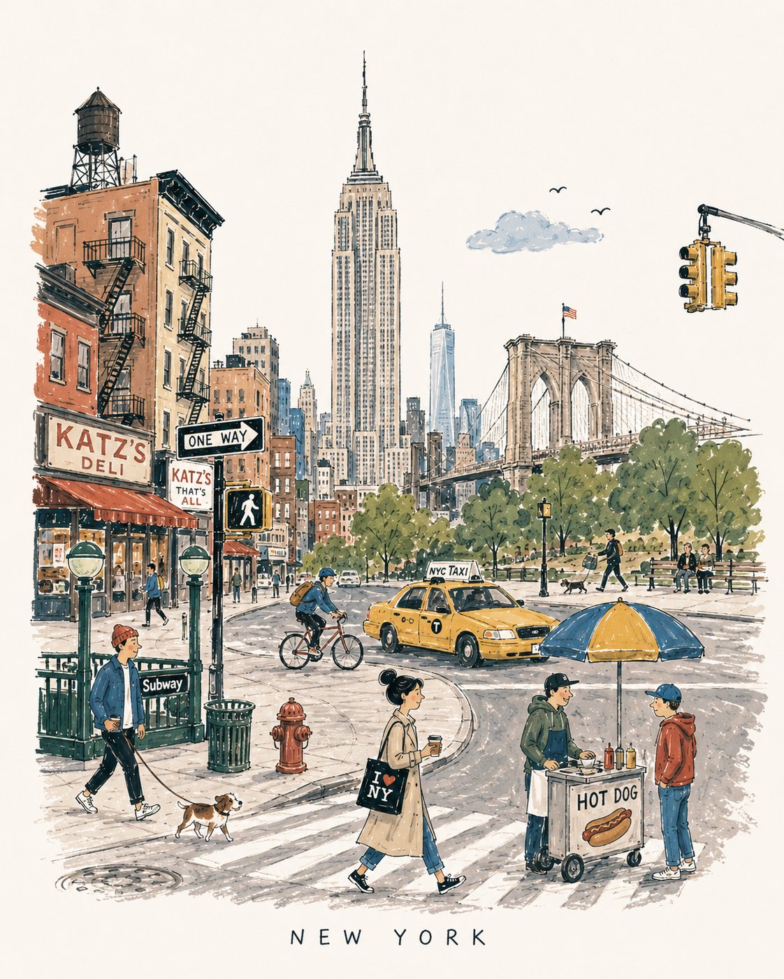
想创作具有影棚级质感且情绪松弛的艺术大片,却苦于无法完美呈现 20世纪中叶欧式旅行图画书插画 中复杂的细节与光影质感?
Nanobanana Pro 完美还原了画面的细腻纹理与高级氛围,助您精准定格具备顶尖商业杂志感的视觉瞬间。
复制这套免费提示词,一键复制进顶级模型,秒出大片。
Struggling to create Mid Century European Travel Book Illustration Prompt with a high-end editorial style? Nanobanana Pro captures the textures and lighting details perfectly for a hyper-realistic masterpiece. Get FREE Prompt, enjoy one-click copy, and create instantly!
Prompt (English):
ADVERTISEMENT
[DESTINATION] = [CITY NAME]

Create a charming vertical 4:5 mid-century travel picture-book illustration of [DESTINATION], inspired by playful 1950s–60s European city books.

Depict the city as an affectionate, imperfect travel memory—not a map, postcard, architectural rendering, landmark collage, or cinematic panorama.

Include:
• 1 distinctive primary landmark
• 1 smaller secondary landmark
• 1 distant/partially hidden local feature
• 1 recognizable local vehicle
• 3–5 subtle everyday city details
• 5–6 ordinary people doing simple local activities

Compress these naturally into one imaginary street, plaza, park, or waterfront. Keep the primary landmark slightly off-center, with open foreground, shallow theatrical depth, gentle curves, and generous museum-white negative space. The city should be recognizable without feeling geographically accurate.

STYLE:
Hand-drawn picture-book illustration with loose charcoal/navy ink, trembling contours, crooked architecture, uneven proportions, sparse windows, simplified silhouettes, occasional double strokes, and minimal detail. Use the fewest lines necessary. Slightly awkward, intelligent, warm, humorous, and handmade.

PEOPLE:
Simple expressive figures with oversized heads, thin legs, narrow bodies, tiny faces, tilted accessories, and awkward but readable gestures. Show ordinary local life, not celebrities, models, stereotypes, or tourist clichés.

COLOR:
Use a restrained 6–7 color destination-specific palette with flat matte gouache shapes, uneven brush edges, white gaps, slight misregistration, and occasional color spilling beyond ink. Mostly unpainted sky/paper. No gradients or realistic shading.

MEMORY DISTORTION:
Gently compress geography and distort scale: distant landmarks may appear nearby, roads may curve strangely, buildings may overlap, and people/vehicles may be slightly oversized or undersized. Keep it balanced, affectionate, and culturally respectful.

OPTIONAL TEXT:
“[DESTINATION]” in small uneven hand-drawn capitals near the bottom. No slogans, dates, labels, logos, or promotional text.

AVOID:
Photorealism, map-like accuracy, landmark checklists, aerial views, cinematic lighting, technical perspective, dense crowds, detailed ornament, polished vector art, CGI, 3D rendering, gradients, sepia/beige paper, artificial aging, distressed textures, and hyper-detailed watercolor.

Overall feeling: [DESTINATION] remembered lovingly-recognizable, spacious, human, humorous, slightly improbable, and beautifully imperfect.
中文参考:
ADVERTISEMENT
[DESTINATION] = [城市名称]

创作一张迷人的垂直 4:5 20世纪中叶旅行图画书插画,描绘 [DESTINATION],灵感源自 1950 年代至 60 年代俏皮的欧洲城市书籍。

将城市描绘成一段充满深情、不完美的旅行记忆——而不是地图、明信片、建筑渲染图、地标拼贴画或电影全景图。

包含:
• 1 个独特的首要地标
• 1 个较小的次要地标
• 1 个远处或部分隐藏的当地特色
• 1 辆辨识度高的当地交通工具
• 3–5 个微妙的日常城市细节
• 5–6 个进行简单当地活动的普通人

将这些元素自然地压缩到一个想象中的街道、广场、公园或海滨。将主要地标略微偏离中心,前景开阔,具有浅层次的剧场深度,柔和的曲线,以及大量的博物馆白色负空间。城市应该是可辨认的,但不追求地理上的准确性。

风格:
手绘图画书插画,使用松散的炭笔/海军蓝墨水,颤动的轮廓,歪斜的建筑,不均匀的比例,稀疏的窗户,简化的剪影,偶尔的双线条,以及极简的细节。使用尽可能少的线条。略显笨拙、睿智、温暖、幽默且富有手工感。

人物:
简单且富有表现力的人物,头部比例偏大,腿部细长,身体窄小,面部微小,配饰倾斜,姿态笨拙但易于理解。展示平凡的当地生活,而不是名人、模特、刻板印象或游客陈词滥调。

颜色:
使用受限的 6–7 种特定于目的地的色调,采用平涂哑光水粉形状,笔触边缘不均匀,有白色间隙,轻微的套色不准,以及偶尔超出墨水线条的颜色溢出。大部分为未着色的天空/纸张。无渐变或写实阴影。

记忆扭曲:
轻轻压缩地理位置并扭曲比例:远处的地标可能出现在附近,道路可能奇怪地弯曲,建筑物可能重叠,人物/车辆可能略大或略小。保持平衡、充满深情且尊重文化。

可选文本:
底部附近有小而参差不齐的手绘大写字母 “[DESTINATION]”。没有标语、日期、标签、徽标或宣传文本。

避免:
写实主义、地图般的准确性、地标清单、航拍视图、电影照明、技术透视、密集的人群、详细的装饰、精致的矢量艺术、CGI、3D 渲染、渐变、棕褐色/米色纸张、人工老化、磨损纹理和超精细的水彩画。

总体感受:充满爱意的记忆中的 [DESTINATION]——可辨识、宽敞、人性化、幽默、略显不可思议且美妙地不完美。