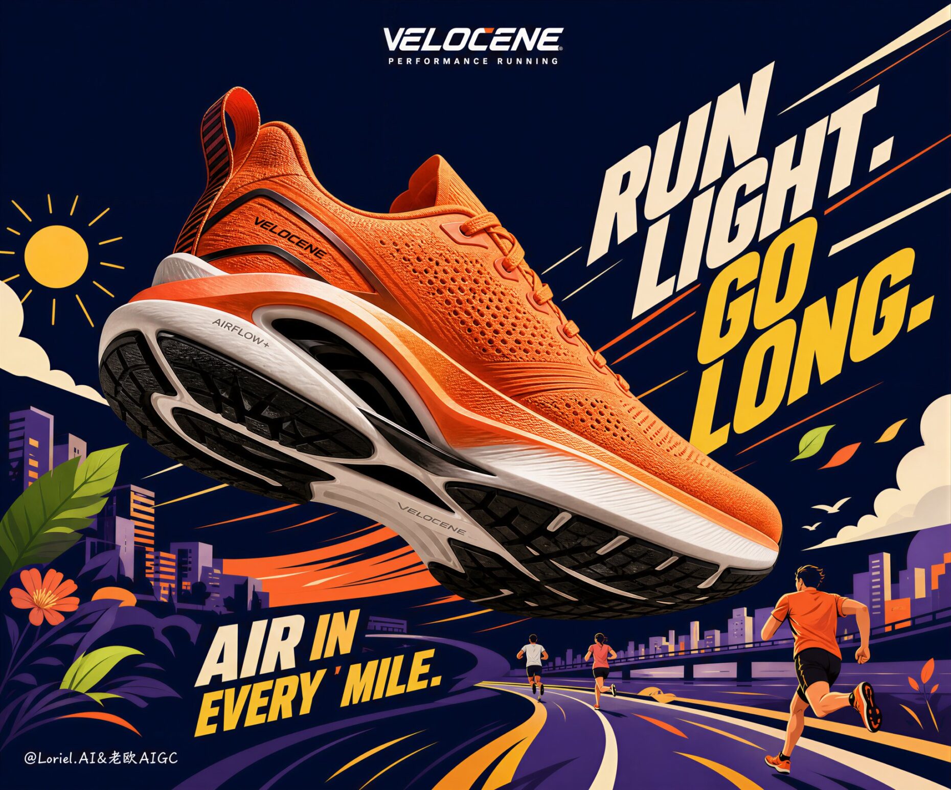
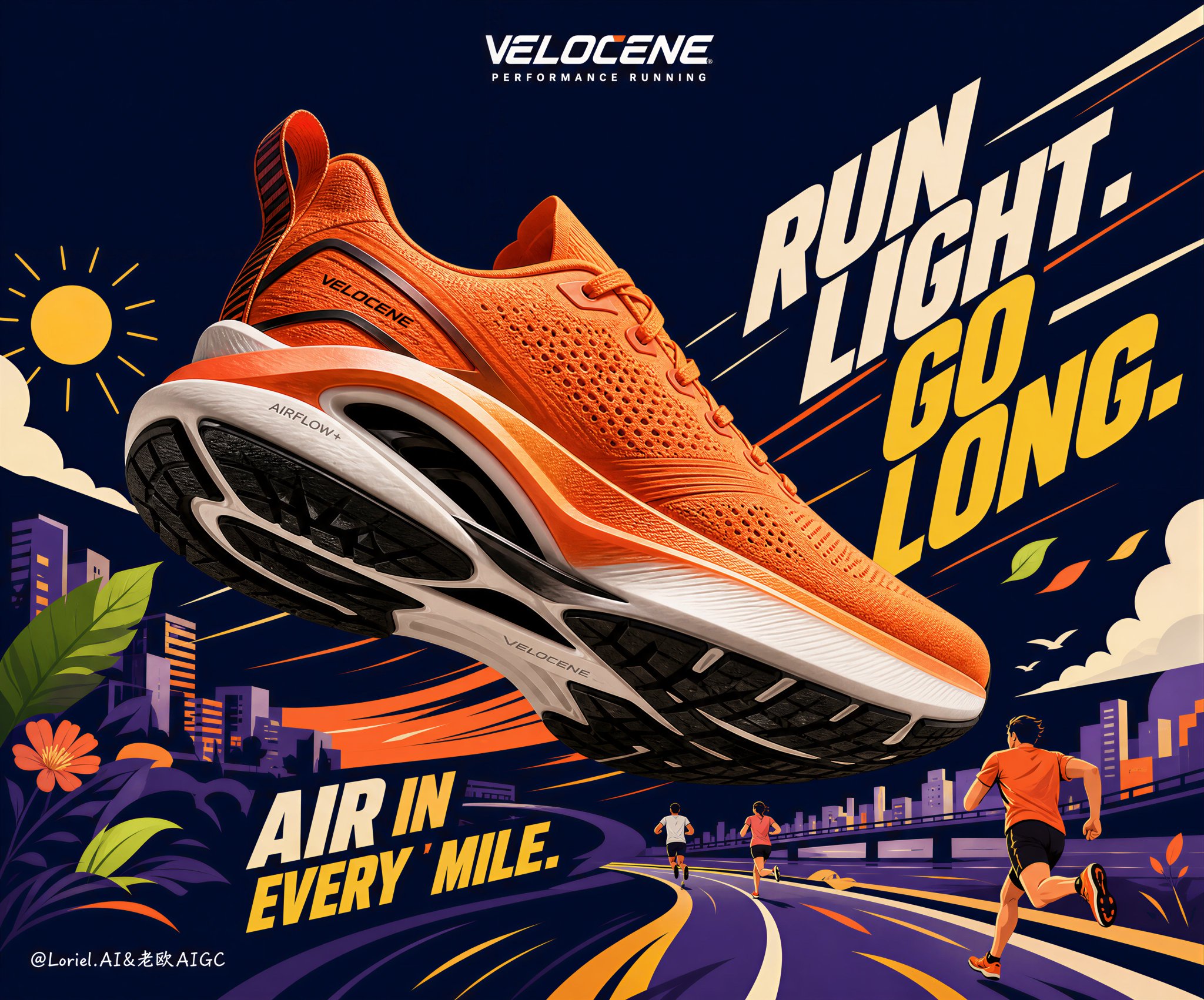
想创作具有影棚级质感且情绪松弛的艺术大片,却苦于无法完美呈现 戛纳级别VELOCENE高端运动鞋广告海报 中复杂的细节与光影质感?
Nanobanana Pro 完美还原了画面的细腻纹理与高级氛围,助您精准定格具备顶尖商业杂志感的视觉瞬间。
复制这套免费提示词,一键复制进顶级模型,秒出大片。
Struggling to create Velocene Premium Running Shoe Campaign with a high-end editorial style? Nanobanana Pro captures the textures and lighting details perfectly for a hyper-realistic masterpiece. Get FREE Prompt, enjoy one-click copy, and create instantly!
Prompt (English):
ADVERTISEMENT
Create a Cannes-level premium running shoe campaign poster for a fictional brand called VELOCENE, designed as a world-class fusion of hyper-real product photography and bold designer-led vector illustration. Square format, deep midnight-navy base, one oversized hero performance running shoe floating diagonally across the center as the absolute visual focus, surrounded by a cleaner, more internationally refined illustrated motion world. The image must merge Orbit energy with Transit sophistication: stronger directional thrust, sharper motion architecture, cleaner graphic reduction, and a more premium athletic-brand finish.

Main product:
One ultra-real performance running shoe in vivid orange with black and white engineered sole structure, shown in a dramatic three-quarter underside angle, enlarged and suspended in midair. Increase the Orbit feeling by tilting the shoe slightly more aggressively upward-forward so the toe projects into space and the whole silhouette feels like it is accelerating out of the frame. The shoe must feel lightweight, breathable, and technically advanced: dense knit mesh upper, perforation zones, sculpted heel pull tab, layered support cage, precise lace system, responsive foam midsole, black traction outsole, realistic stitching, subtle matte-sheen overlays, and highly believable sports-footwear construction. Lighting on the shoe must be premium, dimensional, and crisp, clearly separating it from the illustrated background.

Background concept:
Build a stylized running-life universe around the shoe using a reduced but highly intentional vector language. Keep the playful spirit, but make it more curated and globally premium: simplified sunshine icon, a few energetic runners, abstract urban blocks, flowers, clouds, curved roads, leaves, and one or two lifestyle accents only. Remove decorative excess and keep the background cleaner than a typical cartoon poster. Every illustrated element must support the shoe’s forward motion and comfort story. The environment should feel like a branded motion landscape, not a busy cartoon scene.

Typography and layout:
Integrate oversized dynamic slogan blocks into the illustrated composition, using original English only, such as “RUN LIGHT. GO LONG.” and “AIR IN EVERY MILE.” The typography should be bold, angled, condensed, and architectural, helping create forward thrust around the shoe. Strengthen the Orbit direction by making the large type panels slant and push in the same movement axis as the shoe. Strengthen the Transit direction by keeping type spacing cleaner, hierarchy sharper, and the number of text elements more restrained. Add one small original brand wordmark near the top with a minimal running descriptor.

Style:
Hyper-real product hero plus designer vector world, premium global sports campaign, youthful but not childish, playful but not noisy, graphic but commercially luxurious. The final image must feel like a top-tier international running brand seasonal key visual with award-level clarity and momentum.

Lighting and atmosphere:
The shoe receives premium studio lighting with controlled highlights, elegant shadow falloff, and subtle warm bounce from surrounding orange-yellow graphic elements. The vector background remains mostly flat but can include minimal tonal layering for depth. Keep contrast strong, composition clean, and motion unmistakable. Use angled type, directional clouds, and selective flying leaves to amplify movement without clutter.

Color system:
Deep midnight navy background, vivid orange hero shoe, yellow and cream typography highlights, restrained violet or purple support blocks, touches of lime green and coral, crisp black-and-white outsole contrast. Keep the palette energetic but controlled, with a more international flagship polish.

Negative prompt:
no copied brand names, no copied slogans, no messy background, no low-detail shoe, no deformed footwear, no broken sole structure, no muddy colors, no black blotches, no cheap cartoon look, no childish illustration, no weak hierarchy, no photoreal background, no cluttered typography, no watermark, no existing logo.
中文参考:
ADVERTISEMENT
为虚构品牌 VELOCENE 创建一张戛纳级别的高级跑鞋运动广告海报,设计为超写实产品摄影与大胆的设计师主导矢量插图的世界级融合。正方形格式,深午夜蓝底色,一只巨大的主角性能跑鞋呈对角线漂浮在中心,作为绝对的视觉焦点,周围是一个更简洁、更具国际精细感的插图动态世界。图像必须融合 Orbit(轨道)能量与 Transit(转换)的精致感:更强的定向推力,更锐利的运动架构,更简洁的图形简化,以及更高级的运动品牌质感。

主产品:
一只亮橙色的超写实性能跑鞋,配有黑白工程鞋底结构,以戏剧性的四分之三底部视角展示,放大并悬浮在半空中。通过将鞋子稍微更激进地向上向前倾斜来增加 Orbit 感觉,使鞋尖投射到空间中,整个轮廓感觉像是正在加速冲出画框。鞋子必须感觉轻便、透气且技术先进:致密的针织网眼鞋面、穿孔区、雕刻鞋跟拉环、分层支撑架、精密系带系统、响应式泡沫中底、黑色抓地外底、逼真的缝线、微妙的哑光光泽覆盖层以及高度可信的运动鞋结构。鞋子上的照明必须是高级、立体且清晰的,将其与插图背景明确区分开。

背景概念:
使用简化但极具意图的矢量语言围绕鞋子构建一个风格化的跑步生活宇宙。保留趣味精神,但使其更具策展感和全球高级感:简化的阳光图标、几个充满活力的跑者、抽象的城市街区、花朵、云朵、弯曲的道路、叶子以及仅一两个生活方式点缀。移除装饰性多余部分,保持背景比典型的卡通海报更简洁。每个插图元素都必须支持鞋子的前向运动和舒适故事。环境应该感觉像是一个品牌动态景观,而不是拥挤的卡通场景。

排版和布局:
将超大的动态标语块融入插图组合中,仅使用原始英文,例如 “RUN LIGHT. GO LONG.” 和 “AIR IN EVERY MILE.”。字体应大胆、有角度、紧凑且具建筑感,有助于在鞋子周围创造前向推力。通过使大字体面板倾斜并推向与鞋子相同的运动轴来加强 Orbit 方向。通过保持字体间距更整洁、层级更清晰以及文字元素数量更克制来加强 Transit 方向。在顶部附近添加一个带有极简跑步描述符的小型原始品牌字标。

风格:
超写实产品主角加设计师矢量世界,高级全球运动广告,年轻但不幼稚,有趣但不嘈杂,图形化但具备商业奢华感。最终图像必须感觉像是顶级国际跑鞋品牌具有奖项级清晰度和动能的季节性主视觉。

照明和氛围:
鞋子接受带有受控高光、优雅阴影衰减以及来自周围橙黄色图形元素的微妙温暖反弹的高级摄影棚照明。矢量背景保持大部分平整,但可以包含极小的色调分层以增加深度。保持对比度强,构图整洁,运动感明确。使用有角度的字体、定向云朵和选择性的飞叶来放大运动感而又不显杂乱。

色彩系统:
深午夜蓝背景,亮橙色主角鞋,黄色和奶油色排版高光,克制的紫罗兰色或紫色支撑块,点缀石灰绿和珊瑚色,清脆的黑白外底对比。保持色调充满活力但受控,具有更具国际旗舰感的抛光度。

负面提示:
无抄袭品牌名称,无抄袭标语,无凌乱背景,无低细节鞋子,无变形鞋类,无断裂鞋底结构,无浑浊色彩,无黑色污渍,无廉价卡通外观,无幼稚插图,无虚弱层级,无照片写实背景,无杂乱排版,无水印,无现有徽标。