想创作具有影棚级质感且情绪松弛的艺术大片,却苦于无法完美呈现 高级杂志感手写观察图谱海报 中复杂的细节与光影质感?
Nanobanana Pro 完美还原了画面的细腻纹理与高级氛围,助您精准定格具备顶尖商业杂志感的视觉瞬间。
复制这套免费提示词,一键复制进顶级模型,秒出大片。
Struggling to create High End Magazine Style Handwritten Observation Poster with a high-end editorial style? Nanobanana Pro captures the textures and lighting details perfectly for a hyper-realistic masterpiece. Get FREE Prompt, enjoy one-click copy, and create instantly!
Prompt (English):
ADVERTISEMENT
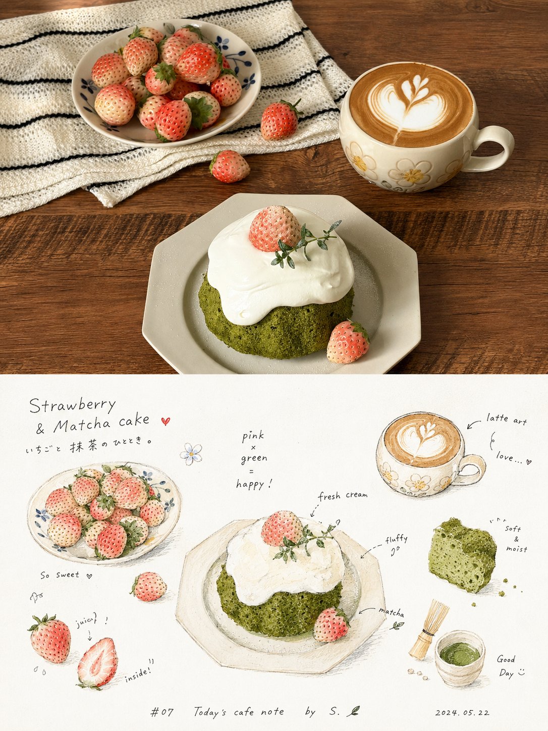
Please turn every photo I upload into an individual high-end design poster, no multi-image stitching, output each photo separately. The overall composition uses a 3:4 vertical layout, with the top and bottom two areas strictly at a 1:1 height, each occupying 50% of the frame.

The upper part preserves the original photo, maintaining the main structure, real texture, natural light and shadow, and original color atmosphere, only performing slight high-end photographic color grading to give it the texture of magazine photography and art publications. To adapt to the frame, the sky, ground, or environmental background can be naturally extended, but the subject must not be stretched, distorted, or changed.

The lower part extracts the most recognizable subject, outline, posture, and narrative relationship from the photo, reconstructing it into a relaxed, intimate, and refreshing handwritten observation map. With a large area of clean white paper as the main space, the theme is broken down into several small block-like physical graphics, partial close-ups, cross-section small images, repeated small items, or detail fragments, loosely distributed in the upper-middle and middle sections of the frame, without a rigid table, but using staggered white space, a rhythm akin to horizontal reading, and handwritten phrases to naturally connect them, forming a casual observation record like taste, touch, sound, action, or memory. Small graphics should retain the material feel, color, and identification characteristics of the subject itself, presenting small scales, rounded outlines, slight perspective, and hand-painted coloring marks, with local parts carrying particles, charred edges, debris, textures, or cross-section details; do not unify them into standard icons, but rather a physical note feeling between picture book illustrations and journal stickers.

Text is the important skeleton of the lower part. Use thin black, slightly childlike or handwritten short words, short sentences, onomatopoeia, and annotations, interspersed around the graphics, some close to the edges of the graphics, some floating in the blank space, with relaxed character spacing and slightly jumping baselines, forming an intimate reading rhythm of 'reading while looking'; a smaller signature-style explanation, number, date, title, or thematic short sentence can be added at the bottom, making the text naturally integrate into the picture rather than a post-pasted layout label.

The overall color scheme is extracted from the upper photo, with white paper white space occupying the largest area, thin black characters carrying information, and the main color being warm, clean, and slightly high in brightness; a small amount of high-saturation warm colors, dark colors, or thematic auxiliary colors are only used for focus, shadows, textures, and rhythmic embellishments. Retain the slight softening, natural compression, uneven edges, and pigment absorption effects of scanned paper, without adding heavy shadows, decorative borders, or a strong sense of modern layout. The overall style references handwritten observation pages, picture book information pages, art publications, and relaxed editorial design, presenting a refreshing, gentle, naive, agile, readable, and life-like visual temperament, avoiding a template feel, cartoonization, cheapness, and over-design.
中文参考:
ADVERTISEMENT
请将我上传的每一张照片分别制作成一张独立的高级设计海报,不多图拼接,每张照片单独输出。整体采用3:4竖版构图,上下两个区域高度严格1:1,各占画面50%。

上半部分保留原始照片,保持主体结构、真实质感、自然光影和原有色彩氛围,仅进行轻微高级摄影调色,使其具有杂志摄影与艺术出版物质感。为适配画幅,可自然扩展天空、地面或环境背景,但不得拉伸、扭曲或改变主体。

下半部分提取照片中最具识别性的主体、轮廓、姿态与叙事关系,重构为轻松、亲切、清爽的手写观察图谱。以大面积洁白纸面作为主要空间,将主题拆解为若干小块实物状图形、局部特写、剖面小图、重复小件或细节片段,松散分布于画面中上部与中段,不做严整表格,而以错位留白、近似横向阅读的节奏和手写短语自然串联,形成像对味觉、触感、声音、动作或记忆的随手观察记录。小图形应保留主题自身的材料感、颜色与识别特征,呈现小尺幅、圆钝轮廓、轻微透视和手绘上色痕迹,局部带有颗粒、焦边、碎屑、纹理或剖面细节,不要统一成标准图标,而要像绘本插图与手账贴纸之间的实物笔记感。

文字是下半部分的重要骨架。使用细黑色、略带童稚感或手写感的短词、短句、拟声词和注释,围绕图形左右穿插,部分贴近图形边缘,部分漂浮在空白中,字距松弛,基线轻微跳动,形成“边看边读”的亲密阅读节奏;底部可加入一行较小的署名式说明、编号、日期、标题或主题短句,使文字自然融入画面,而不是后期贴上的排版标签。

整体配色从上方照片中提取,白纸留白占最大面积,黑色细字承担信息,主体色温暖、清洁、略高明度;少量高饱和暖色、深色或主题辅色仅用于焦点、阴影、纹理和节奏点缀。保留扫描纸张的轻微柔化、自然压缩感、边缘不齐和颜料吸收效果,不加厚重阴影、装饰边框或强烈现代排版感。整体参考手写观察页、绘本信息页、艺术出版物与轻松编辑设计,呈现清爽、温柔、稚拙、灵动、可读、富有生活感的视觉气质,避免模板感、卡通化、廉价感和过度设计感。