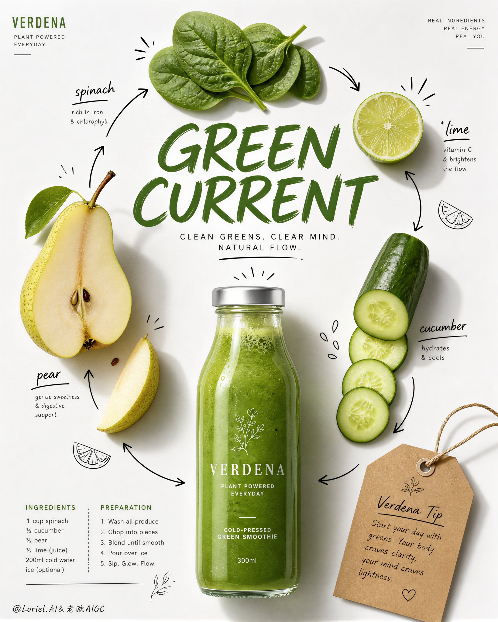
想创作具有影棚级质感且情绪松弛的艺术大片,却苦于无法完美呈现 极简奢华果汁品牌社论海报设计 中复杂的细节与光影质感?
Nanobanana Pro 完美还原了画面的细腻纹理与高级氛围,助您精准定格具备顶尖商业杂志感的视觉瞬间。
复制这套免费提示词,一键复制进顶级模型,秒出大片。
Struggling to create Aurora Press Luxury Wellness Juice Campaign Poster with a high-end editorial style? Nanobanana Pro captures the textures and lighting details perfectly for a hyper-realistic masterpiece. Get FREE Prompt, enjoy one-click copy, and create instantly!
Prompt (English):
ADVERTISEMENT
Create a premium editorial juice-campaign poster for a fictional wellness beverage brand called AURORA PRESS, refined in a more international, cleaner, and more luxurious Transit direction. Vertical format, bright white paper-like background, one realistic orange juice bottle centered near the lower-middle as the main product hero, a carefully curated arrangement of fresh ingredients around it, one large expressive editorial headline across the middle, a compact recipe block below, restrained black doodle-style ingredient annotations, and one elegant kraft-paper tip tag near the upper-left. The whole image must feel like a flagship health-drink editorial page from a top-tier global lifestyle magazine.

Main composition:
Place one clear glass bottle filled with vivid fresh orange juice in the lower-center as the visual anchor. Around it, arrange a highly disciplined ingredient constellation: a halved apple near the upper-right center, one large orange slice near the upper-left center, a piece of fresh ginger near the upper-middle, a few carrot coin slices placed with editorial precision, one lemon wedge near the upper-right, and one small ginger slice below. Keep the ingredient spacing more refined and intentional, with increased breathing room and less visual noise. The bottle must remain the unquestioned hero.

Product realism:
The bottle must be rendered with premium realism: transparent glass, vivid orange liquid, subtle pulp density, soft reflective highlights, natural meniscus, light refraction, and a clean white cap. Ingredients must look fresh and elevated: juicy orange pulp, moist apple flesh with visible seed cavity, realistic ginger fiber texture, crisp carrot cross-sections, glossy lemon flesh, and subtle organic imperfections. All materials should feel more polished and editorial than a casual recipe page.

Graphic design layer:
Use a restrained hand-drawn black doodle system with cleaner hierarchy and fewer marks: a few sketched fruit outlines, minimal arrows, and elegant accent lines only where they help the composition. Add original ingredient labels in a mix of hand-drawn and editorial type, all fully original. Place one large expressive orange headline across the middle such as “Fresh Lift” or “Bright Fuel,” fully original, but keep it cleaner and more internationally art-directed than a playful craft page. Below or left of the bottle, include a compact ingredients list and short preparation guide in refined editorial microcopy. Near the upper-left, place one kraft-paper tip tag with string and original tiny note text, but keep it smaller, neater, and more premium.

Style:
Luxury wellness editorial, premium juice recipe campaign, global health-magazine commercial page, clean real-fruit photography fused with restrained hand-drawn annotation, sophisticated and highly shoppable. The whole page must feel like a polished brand-sponsored editorial feature.

Lighting and mood:
Soft natural daylight from upper-left or upper-front, with delicate object shadows, clean bottle highlights, and gentle separation from the white background. Keep the image bright, airy, and health-oriented, but more refined and internationally premium. Avoid overly playful contrast; use subtle tonal discipline.

Color system:
Bright white background, vivid juice orange, carrot orange, citrus yellow, soft apple cream and red, ginger beige, restrained black doodle lines, muted kraft-paper beige, and subtle dark gray editorial text. Keep the palette clean, optimistic, and globally premium.

Negative prompt:
no copied text, no existing magazine layout, no cluttered ingredient arrangement, no dirty background, no warped fruit shapes, no low-detail bottle, no muddy orange liquid, no black blotches, no messy doodles, no watermark, no existing logos, no chaotic typography.
中文参考:
ADVERTISEMENT
为一个名为 AURORA PRESS 的虚构健康饮料品牌创作一张高端社论风格的果汁竞选海报,以更国际化、更简洁、更奢华的 Transit 方向进行改进。垂直格式,明亮的白色类纸背景,一个真实的橙汁瓶位于中下方中心作为主要产品核心,周围精心布置新鲜配料,中间有一行富有表现力的大型社论标题,下方是一个紧凑的配方板块,克制的黑色涂鸦风格配料注释,左上方有一个优雅的牛皮纸标签。整个图像必须感觉像是顶级全球生活方式杂志中的旗舰健康饮料社论页面。

主要构图:
将一个装满鲜艳新鲜橙汁的透明玻璃瓶放在中下方作为视觉锚点。在它周围,布置一个高度严谨的配料星座:中右上方有一个切开的苹果,中左上方有一个大的橙子片,中上方有一块新鲜生姜,几片具有社论精确度的胡萝卜圆片,右上角有一个柠檬块,下方有一小片生姜。保持配料间距更精致且有目的性,增加呼吸空间并减少视觉噪音。瓶子必须保持毫无疑问的核心地位。

产品现实主义:
瓶子的渲染必须具有高端现实感:透明玻璃、鲜艳的橙色液体、微妙的果肉密度、柔和的反射高光、自然的液面、光线折射和干净的白色瓶盖。配料必须看起来新鲜且高雅:多汁的橙子果肉、带有可见种子腔的湿润苹果肉、真实的生姜纤维纹理、脆嫩的胡萝卜横截面、光泽的柠檬果肉和微妙的有机缺陷。所有材料应感觉比普通的食谱页面更考究且具社论感。

平面设计层:
使用克制的手绘黑色涂鸦系统,具有更清晰的层级和更少的标记:一些素描水果轮廓、极简的箭头,以及仅在有助于构图的地方使用优雅的强调线。添加原创的配料标签,采用手绘和社论字体的混合,全原创。在中间放置一个大型的、富有表现力的橙色标题,如“Fresh Lift”或“Bright Fuel”,全原创,但保持比俏皮的手工艺页面更简洁且具国际化艺术指导感。在瓶子的下方或左侧,包含一份精致的社论微型文字形式的紧凑配料表和简短准备指南。在左上方放置一个带有绳子和原创微小注释文本的牛皮纸标签,但保持它更小、更整洁、更高端。

风格:
奢华健康社论、高端果汁配方竞选、全球健康杂志商业页面、洁净的真实水果摄影与克制的手绘注释融合、精致且高度具购买欲。整个页面必须感觉像是一个精美品牌赞助的社论专题。

光影与氛围:
来自左上方或正前方的柔和自然日光,带有精致的物体阴影、干净的瓶身高光,以及与白色背景的温和分离。保持图像明亮、通透且以健康为导向,但更精致且具有国际高端感。避免过度俏皮的对比;使用微妙的色调纪律。

色彩系统:
明亮的白色背景、鲜艳的果汁橙、胡萝卜橙、柑橘黄、柔和的苹果奶油色和红色、生姜米色、克制的黑色涂鸦线条、柔和的牛皮纸米色以及微妙的深灰色社论文本。保持色调干净、乐观且具有全球高端感。

负面提示词:
无抄袭文本、无现有杂志布局、无杂乱的配料排列、无肮脏背景、无变形的水果形状、无低细节瓶子、无浑浊的橙色液体、无黑色斑块、无凌乱涂鸦、无水印、无现有标志、无混乱的排版。