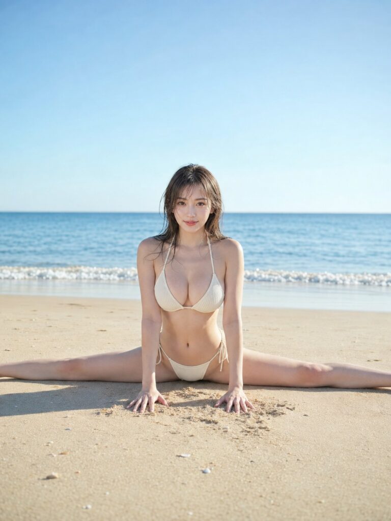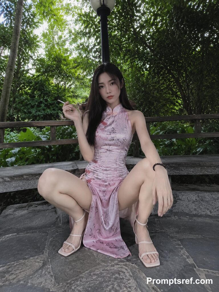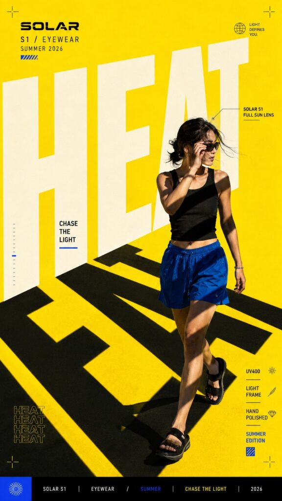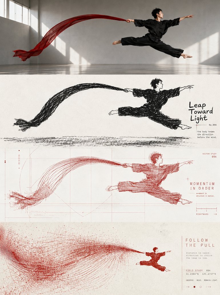
想创作具有影棚级质感且情绪松弛的艺术大片,却苦于无法完美呈现 四等分风格演进高级海报设计 中复杂的细节与光影质感?
Nanobanana Pro 完美还原了画面的细腻纹理与高级氛围,助您精准定格具备顶尖商业杂志感的视觉瞬间。
复制这套免费提示词,一键复制进顶级模型,秒出大片。
Struggling to create Four Layer Style Evolution Poster Design with a high-end editorial style? Nanobanana Pro captures the textures and lighting details perfectly for a hyper-realistic masterpiece. Get FREE Prompt, enjoy one-click copy, and create instantly!
Prompt (English):
ADVERTISEMENT
Please turn each photo I upload into an independent high-end design poster, no multi-photo stitching, each photo output separately. Overall adopts a 3:4 vertical composition. The screen is strictly divided from top to bottom into four horizontal areas, the height of each area must precisely account for 25% of the overall screen, the ratio of the four layers is strictly 1:1:1:1, no ratio deviation allowed. Seamless transition between areas, no dividers, no white space gaps. The 'no white space gaps' here only means that the seams between layers cannot have gaps; the interior of each layer can still retain negative space, paper, or solid color backgrounds according to the corresponding style. All four layers are based solely on the same uploaded photo, presenting the same subject, the same moment, and the same spatial relationship. Strictly maintain consistency in subject identity, quantity, key structure, proportions, posture, movement direction, line of sight, observation perspective, perspective, occlusion, left-right position, front-back relationship, and core narrative. The four layers are not four unrelated new compositions, but a continuous style translation of the same image. Since each layer is an extremely flat banner of about 3:1, the subject should be organized horizontally, and appropriate breathing space should be reserved on the left and right; natural horizontal extension or slight cropping of the background is allowed, but the subject must not be stretched vertically, key parts must not be cropped, character relationships must not be changed, or scenes unrelated to the original image must not be created. The visual center of gravity, subject proportion, and contour landing points of the four layers should be aligned vertically as much as possible, forming a coherent evolution from real photography to the target style. Each layer must completely fill its own 25% area. Do not add layer numbers, dividers, borders, collage gaps, watermarks, or logos. Unless a layer style description explicitly requires small amounts of editorial text, bill marks, or handwritten notes, do not generate extra text; even if text is needed, it must be small, restrained, not block the subject, and avoid gibberish as much as possible. Layer 1 | Original Photography: Directly retain the real photography state of the uploaded photo as the visual benchmark for the style translation of the subsequent three layers. Maintain the original person or subject identity, quantity, facial features, hairstyle, clothing, structure, proportions, posture, movements, line of sight, interactive relationships, observation perspective, perspective, occlusion, environmental direction, natural light and shadow, and core colors, without performing illustration, texture transformation, geometrization, or 3D reconstruction. To adapt to the extremely flat banner of about 3:1, only natural extension of the left and right sides of the background that conforms to the original scene logic is allowed, or slight cropping that does not damage the subject; the subject's proportions must not be changed, people or buildings must not be stretched, and the head, hands, feet, key objects, or important narrative relationships must not be cropped. The screen remains natural, real, and clear, avoiding excessive skin smoothing, exaggerated color grading, fictional scenery, and decorations unrelated to the original image. Layer 2 | Black and White Thick Crayon Silhouette: In the roughly 3:1 flat horizontal banner area of this layer, translate the real subject of the first layer into a 'black and white thick crayon silhouette' style. Maintain consistency with the first layer's subject identity, quantity, key structure, posture, left-right position, perspective, spatial relationship, and core narrative, and then fully implement the following visual requirements: Extract the most recognizable subject, outline, posture, and narrative relationship from the photo, and reconstruct it as a minimalist thick black dry medium silhouette illustration. Do not mechanically trace photo details, but compress the subject into a rounded, thick, slightly naive generalized form; the head, main outline, or most memorable parts can be appropriately enlarged so that it can still be identified at a glance with minimal information. If the photo contains multiple subjects, retain the most important interactive relationship and treat them as a single visual unit rather than spreading focus evenly. This layer only uses nearly pure white paper base + thick black crayon, charcoal, or dry erase marks, no colors, no grayscale gradients. The black form is not a smooth solid vector block, but is formed by repeated smearing of short, forceful crayons, retaining paper grain, broken strokes, indentations, rough edges, uneven thickness, and local white exposure. The outline is slightly shaky, incomplete, and imprecise, giving the screen a real handmade feel. The most critical identification features of the subject can be strengthened through 'white feature areas suddenly cut out from the black silhouette,' such as the face, around the eyes, window holes, vessel openings, animal faces, key structures of objects, or the most identifiable parts; then use minimal black dots, short lines, or symbols to complete expressions and details. Do not pursue realistic facial features and precise structures, but let a direct, interesting, and strong identification relationship form between black and white. Composition maintains large areas of pure negative space + one main visual relationship. The subject can be centered and suspended, or slightly offset, partially cropped, or close to the bottom of the screen, using only a rough ground friction line, a few short lines, or minimal environmental symbols to suggest space. Grass, rain, smoke, table, shadow, road, wind, or other environmental information should be compressed into minimal crayon marks, keeping the background quiet and empty. Overall does not pursue complex scenes, but lets a posture, action, distance, or relationship bear the main narrative. Text retains a system of small characters where a sense of high-end editorial and children's book coexist. Do not just write the name of the place or object, but extract a short English title from the emotions, actions, relationships, time, or tiny stories in the photo, and then pair it with a number, a matching gold sentence, a chapter number, or a very short, implicit piece of copy. The text can be restrained small printed characters, or a very small amount of clumsy handwriting, crayon characters, or incomplete regular font shapes can be added, making it look as if it originally belonged to this illustration. Text needs to have a clever relationship with the graphics: it can be arranged along the ground line, extended along the direction of the subject's movement, hidden in large areas of negative space, slightly blocked by the outline, stuck in the negative space between two subjects, or use a thin line to connect the number to the subject. Maintain 'one short title + 1–2 groups of tiny auxiliary text' to let the text become part of the composition's rhythm, rather than a common poster title. Overall presents visual characteristics of thick black, clean white, simple shape, and rough texture, maintaining a subtle balance between childishness, gentleness, quietness, humor, and loneliness, like an old black-and-white children's book re-edited by a high-end design studio. Avoid smooth digital strokes, precise line drawings, realistic light and shadow, impasto, 3D effects, color, large-area gray rendering, cartoon sticker feel, and templated commercial illustration. Layer 3 | Geometric Order Linear Experiment: In the roughly 3:1 flat horizontal banner area of this layer, translate the real subject of the first layer into a 'geometric order linear experiment' style. Maintain consistency with the first layer's subject identity, quantity, key structure, posture, left-right position, perspective, spatial relationship, and core narrative, and then fully implement the following visual requirements: Extract the most recognizable subject, outline, posture, and narrative relationship from the photo, and reconstruct it as a linear experimental poster with geometric order. The subject is manifested by high-density repeating lines, misplaced outlines, short loops, and slight jitter trajectories, retaining clear identification edges while maintaining instability and flow internally; the periphery uses lines of the same origin but thinner, sparser, and lighter to spread outward, and establishes a rational structure with horizontal, vertical, diagonal, arc, tangent, or implicit grids, forming visual tension with high density in the center and low density on the periphery, where geometric order and free linearity coexist. Color extraction: from the uploaded original photo, extract the color that is most vital, most recognizable, and best represents the spirit of the subject as the main line color; do not take the average color by area, and do not deliberately age or gray it; it can be appropriately purified, brightened, and corrected to make the color cleaner, more vivid, and more modern. Overall adopts a clean light-colored background, a single main line color, and black-gray micro-typography, forming layers through line density, thickness, and overlapping, avoiding dirty colors, grayness, fixed blue tones, multi-color mixing, and digital gradients. Text intervenes cleverly as part of the composition, extracting a very short English title from the emotion, action, time, state, or metaphor of the photo, and pairing it with a small amount of numbers, matching philosophical gold sentences, state words, scales, or micro-annotations. Text can be arranged along geometric axes, subject outlines, or line field boundaries, arranged horizontally, vertically, rotated, interspersed, or misplaced, forming a sense of high-end editing through tiny font size, thin font weight, wide letter spacing, and precise alignment, so that rational typesetting suppresses the restlessness of free lines. Overall maintains large areas of negative space, a single visual focus, and clear geometric order, presenting a clean, restrained, sharp, experimental, artistic, and vital visual temperament. Avoid random graffiti, directionless yarn balls, dirty old vintage, cyber-tech feel, commercial promotion feel, cartoon feel, and template feel. Layer 4 | Dynamic Magnetic Field Grain Print: In the roughly 3:1 flat horizontal banner area of this layer, translate the real subject of the first layer into a 'dynamic magnetic field grain print' style. Maintain consistency with the first layer's subject identity, quantity, key structure, posture, left-right position, perspective, spatial relationship, and core narrative, and then fully implement the following visual requirements: Extract the most recognizable subject, outline, posture, and narrative relationship from the photo, and reconstruct it as a surreal minimalist print visual. Compress the subject into a clear and restrained visual anchor, usually placed in a large area of negative space on a small scale, retaining only the most critical outline and posture; do not replicate complex details, but let the actions, directions, light and shadow, or spatial relationships in the original image transform into a dynamic field expanding around the subject. The dynamic field naturally chooses a main movement logic according to the subject's own characteristics: prioritized to flow horizontally or diagonally, spread from the core to both sides, or form irregular ripples and echoes; only when the original action itself is clear, retain short-distance falling or rising. Use a large number of thin lines, broken trajectories, coarse dots, and changes in grain density to express movement, denser and stronger near the core, gradually thinning, breaking, and disappearing into negative space towards the edges. Avoid stacking multiple special effects at the same time, let one subject, one movement, and one huge spatial relationship become the core of the screen. Color extraction: from the uploaded original photo, extract the most recognizable and spirited primary color, and form a strict 2–3 color system with warm white, ivory white, or natural paper color and a small amount of black. The primary color can be appropriately purified and strengthened, making it vivid and powerful but not overly digital; form depth through dot density, ink layering, and paper negative space, rather than common gradients. Retain silk screen printing, Risograph, coarse grain, paper fiber, uneven ink coverage, and slight overprint deviation, avoiding computer rendering, 3D, real light effects, and smooth digital illustration feel. Text establishes a restrained experimental art book micro-typography system. Extract a very short English title from the action, distance, state, emotion, or metaphor of the photo, and pair it with 2–4 groups of micro-text, which can be freely combined from short phrases, state words, place or object information, serial numbers, coordinate-style numbers, direction words, archive labels, or observation notes. Text can be arranged along the horizon, dynamic trajectory, subject axis, or negative space edge, or it can be arranged vertically, rotated, with widened letter spacing, embedded in the grain field, or slightly passed through by lines, so that the typesetting itself participates in space and movement, rather than being independently pasted on the screen. Overall pursues tiny subjects, huge negative space, strong scale contrast, a single dynamic field, and coarse printing texture, presenting a quiet, lonely, mysterious, poetic, and slightly surreal experimental editorial visual. Whether the subject is a person, animal, plant, building, utensil, vehicle, or natural landscape, it should maintain a clear identity echo between the original image and the abstract field, avoiding complex scenes, multiple focuses, decorative stacking, common gradients, commercial poster feel, and template feel.中文参考:
ADVERTISEMENT
请将我上传的每一张照片分别制作成一张独立的高级设计海报,不多图拼接,每张照片单独输出。

整体采用 3:4竖版构图。画面从上到下严格四等分为四个横向区域,每个区域高度必须精确占整体画面的25%,四层比例严格为1:1:1:1,不允许出现比例偏差。区域之间无缝衔接,无分隔线、无留白间隙。这里的“无留白间隙”仅指层与层的接缝不能出现空隙;每层内部仍可按照对应风格保留负空间、纸面或纯色背景。

四层全部以同一张上传照片为唯一依据,呈现同一主体、同一瞬间和同一空间关系。严格保持主体身份、数量、关键结构、比例、姿态、动作方向、视线、观察视角、透视、遮挡、左右位置、前后关系与核心叙事一致。四层不是四张互不相关的新构图,而是同一画面的连续风格转译。由于每层均为约3:1的极扁横幅,主体应横向组织,并保留适量左右呼吸空间;允许对背景进行自然横向延展或轻微裁切,但不得纵向拉伸主体、裁掉关键部位、改变人物关系,或另造与原图无关的场景。

四层的视觉重心、主体占比和轮廓落点尽量上下对齐,形成从真实摄影逐步过渡到目标风格的连贯演化。每层都必须完整填满自身25%的区域。不要添加层号、分隔线、边框、拼贴缝隙、水印或Logo。除非某层风格说明明确要求少量编辑文字、票据标记或手写注释,否则不要额外生成文字;即使需要文字,也必须少量、克制、不遮挡主体,并尽量避免乱码。

第一层|原始摄影

直接保留上传照片的真实摄影状态,作为后三层风格转译的视觉基准。保持原始人物或主体的身份、数量、面部特征、发型、服装、结构、比例、姿态、动作、视线、互动关系、观察视角、透视、遮挡、环境方向、自然光影与核心色彩,不进行插画化、材质化、几何化或三维重建。

为了适配约3:1的极扁横幅,只允许对背景左右两侧进行符合原场景逻辑的自然延展,或进行不损伤主体的轻微裁切;不得改变主体比例,不得拉伸人物或建筑,不得裁掉头部、手脚、关键物件或重要叙事关系。画面保持自然、真实、清晰,避免过度磨皮、夸张调色、虚构景物和与原图无关的装饰。

第二层|黑白粗蜡笔剪影

在本层约3:1的扁横幅区域中,将第一层的真实主体转译为“黑白粗蜡笔剪影”风格。保持与第一层一致的主体身份、数量、关键结构、姿态、左右位置、视角、空间关系与核心叙事,再完整执行以下视觉要求:

从照片中提取最具识别性的主体、轮廓、姿态与叙事关系,重构为极简粗黑干媒介剪影插画。不要机械描摹照片细节,而是将主体压缩成圆润、敦厚、略带稚拙感的概括形体,可适度放大头部、主要轮廓或最有记忆点的局部,使其在极少信息下仍能一眼识别原物。若照片包含多个主体,则保留最重要的互动关系,将它们视为一个整体视觉单元,而不是平均分散焦点。

本层画面只使用近乎纯白的纸面底 + 浓黑蜡笔、炭笔或干擦痕迹,不使用彩色,不使用灰阶渐变。黑色形体不是光滑实心矢量块,而是由短促、有力度的蜡笔反复涂抹形成,保留纸张颗粒、断笔、压痕、边缘毛糙、浓淡不均和局部露白。轮廓略微摇晃、不完整、不精确,让画面保持真实手作感。

主体最关键的识别特征可通过“黑色剪影中突然切出的白色特征区”强化,例如脸部、眼睛周围、窗洞、器皿开口、动物面部、物件核心结构或最具有辨识度的局部;再以极少黑点、短线或符号完成表情与细节。不要追求写实五官和精密结构,而是让黑、白之间形成直接、有趣而强烈的辨识关系。

构图保持大面积纯净留白 + 一个主要视觉关系。主体可居中悬浮,也可轻微偏置、局部裁切或靠近画面下方,仅用一条粗糙地面摩擦线、几根短线或极少环境符号提示空间。草叶、雨丝、烟气、桌面、影子、道路、风或其他环境信息都应被压缩成极少的蜡笔记号,让背景保持安静空旷。整体不追求复杂场景,而让一个姿态、动作、距离或关系承担主要叙事。

文字保留少量高级编辑感与童书感并存的小字系统。不要只写地点或物体名称,而从照片中的情绪、动作、关系、时间或微小故事提炼一个简短英文标题,再搭配编号、适配的金句、章节号或一句极短的含蓄小文案。文字可以是克制的印刷小字,也可以加入极少量笨拙手写、蜡笔字或不完全规整的字形,使其像原本就属于这幅插画。

文字需要与图形发生巧妙关系:可以贴着地面线排列、沿主体动作方向延伸、躲在大片留白中、与轮廓产生轻微遮挡、卡在两个主体之间的负形里,或用一条细线把编号与主体连接起来。保持“一个短标题 + 1–2组极小辅助文字”即可,让文字成为构图节奏的一部分,而不是普通海报标题。

整体呈现黑要粗、白要净、形要简、质要糙的视觉特征,在童稚、温软、安静、幽默与孤独之间保持微妙平衡,像一本由高级设计工作室重新编辑的旧黑白童书。避免光滑数字描边、精密线稿、写实光影、厚涂、三维效果、彩色、大面积灰色渲染、卡通贴纸感和模板化商业插画。

第三层|几何秩序线性实验

在本层约3:1的扁横幅区域中,将第一层的真实主体转译为“几何秩序线性实验”风格。保持与第一层一致的主体身份、数量、关键结构、姿态、左右位置、视角、空间关系与核心叙事,再完整执行以下视觉要求:

从照片中提取最具识别性的主体、轮廓、姿态与叙事关系,重构为具有几何秩序的线性实验海报。主体由高密度重复线条、错位描线、短促回环和轻微抖动轨迹聚合显形,保留清晰识别边缘,内部保持不稳定与流动感;外围使用同源但更细、更疏、更轻的线条向外扩散,并以水平、垂直、斜线、圆弧、切线或隐性网格建立理性结构,形成中心高密度、外围低密度,几何秩序与自由线性并存的视觉张力。

配色从上传的原图中提取最有生命力、最有辨识度、最能代表主体精气神的颜色作为主线色,不按面积平均取色,也不刻意做旧降灰;可适度提纯、提亮和校正,使颜色更干净、鲜明、现代。整体采用清洁浅色背景、单一主线色和黑灰微排版,通过线条密度、粗细和叠压形成层次,避免脏色、灰蒙、固定蓝调、多色混杂和数字渐变。

文字作为构图的一部分巧妙介入,从照片的情绪、动作、时间、状态或隐喻中提炼极短英文标题,并搭配少量编号、适配的哲理金句、状态词、标尺或微型注释。文字可沿几何轴线、主体轮廓或线场边界排列,横排、竖排、旋转、穿插或错位,通过极小字号、细字重、宽字距和精确对齐形成高级编辑感,使理性排版压住自由线条的躁动。

整体保持大面积留白、唯一视觉焦点和清晰几何秩序,呈现干净、克制、锐利、实验、艺术化且富有生命力的视觉气质。避免随机涂鸦、无方向线团、脏旧复古、赛博科技感、商业宣传感、卡通感和模板感。

第四层|动态磁场颗粒版画

在本层约3:1的扁横幅区域中,将第一层的真实主体转译为“动态磁场颗粒版画”风格。保持与第一层一致的主体身份、数量、关键结构、姿态、左右位置、视角、空间关系与核心叙事,再完整执行以下视觉要求:

从照片中提取最具识别性的主体、轮廓、姿态与叙事关系,重构为超现实极简版画视觉。将主体压缩成一个清晰而克制的视觉锚点,通常以较小尺度置于大片留白中,仅保留最关键的轮廓与姿态;不要复刻复杂细节,而是让原图中的动作、方向、光影或空间关系转化为围绕主体展开的动态场域。

动态场根据主体自身特征自然选择一种主要运动逻辑:优先沿横向或斜向流动、由核心向两侧扩散,或形成不规则波纹与回响;仅当原图动作本身明确时,才保留短距离的上下坠落或上升。使用大量细线、断裂轨迹、粗粝网点和颗粒密度变化表现运动,核心附近更密、更强,向边缘逐渐稀疏、破碎并消失于留白。避免同时堆叠多种特效,让一个主体、一种运动、一个巨大空间关系成为画面的核心。

配色从上传的原图中提炼最有辨识度、最有精气神的一个主色,与暖白、象牙白或自然纸色及少量黑色组成严格的2–3色体系。主色可适度提纯和强化,使其鲜明、有力量但不过度数字化;通过网点密度、油墨叠压与纸面留白形成深浅,而不是普通渐变。保留丝网印刷、孔版印刷(Risograph)、粗颗粒、纸张纤维、油墨覆盖不均和轻微套印偏差,避免电脑渲染、三维、真实光效和光滑数字插画感。

文字建立克制的实验艺术书微排版系统。从照片的动作、距离、状态、情绪或隐喻中提炼一个极短英文标题,并搭配2–4组微型文字,可由短句、状态词、地点或对象信息、序列号、坐标式数字、方向词、档案标签或观察注释自由组合。文字可沿地平线、动态轨迹、主体轴线或留白边缘排列,也可纵排、旋转、拉开字距、嵌入颗粒场或被线条轻微穿过,使排版本身参与空间与运动,而不是独立贴在画面上。

整体追求极小主体、极大留白、强烈尺度反差、单一动态场与粗粝印刷质感,呈现安静、孤独、神秘、诗意又带有轻微超现实感的实验编辑视觉。无论主体是人物、动物、植物、建筑、器物、交通工具或自然景观,都应保持原始影像与抽象场域之间清晰的身份呼应,避免复杂场景、多重焦点、装饰堆积、普通渐变、商业海报感和模板感。