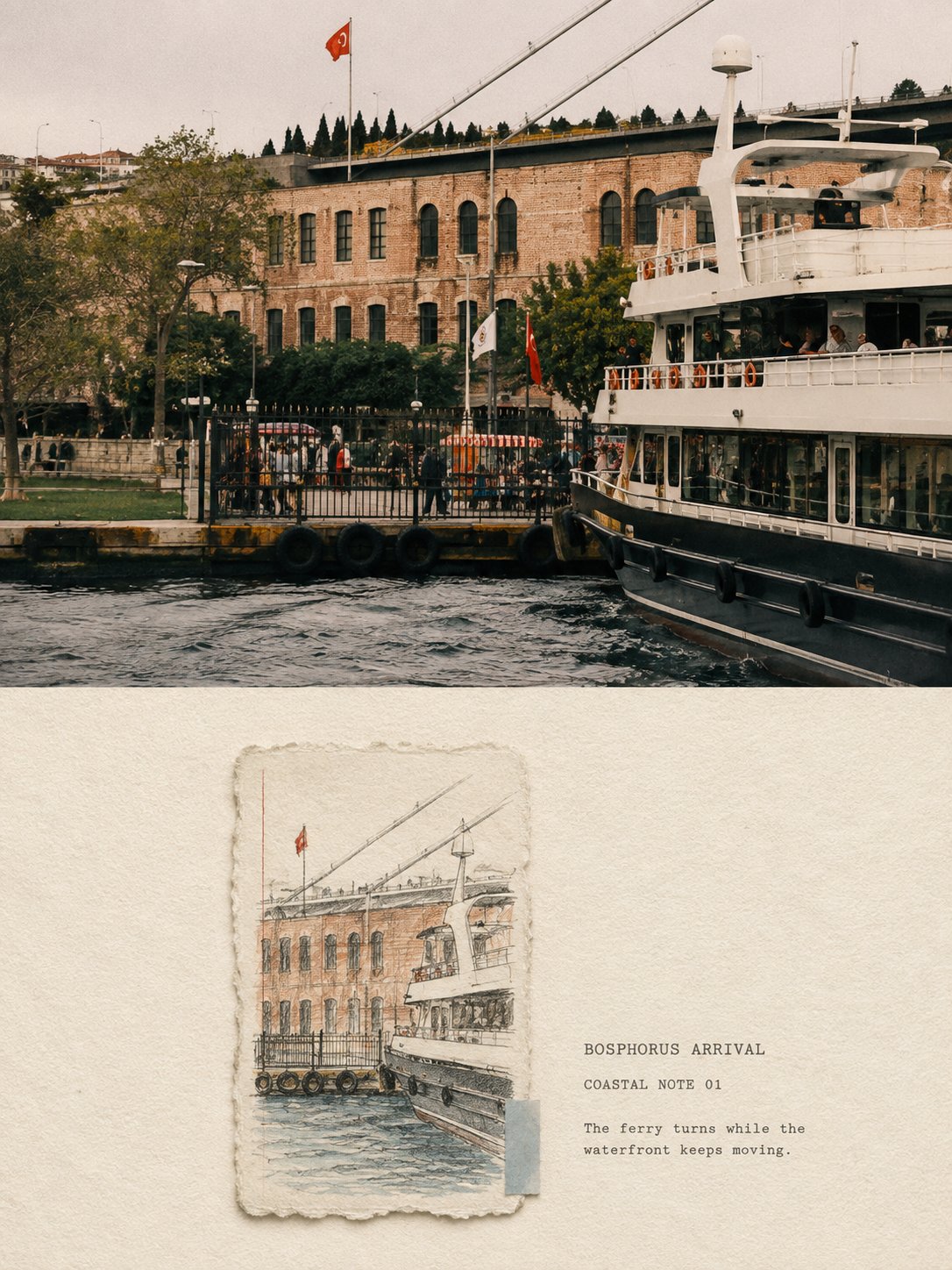
想创作具有影棚级质感且情绪松弛的艺术大片,却苦于无法完美呈现 纸窗海岸记忆高级对比旅行海报 中复杂的细节与光影质感?
Nanobanana Pro 完美还原了画面的细腻纹理与高级氛围,助您精准定格具备顶尖商业杂志感的视觉瞬间。
复制这套免费提示词,一键复制进顶级模型,秒出大片。
Struggling to create Paper Window Coastal Memory Travel Poster Prompt with a high-end editorial style? Nanobanana Pro captures the textures and lighting details perfectly for a hyper-realistic masterpiece. Get FREE Prompt, enjoy one-click copy, and create instantly!
Prompt (English):
ADVERTISEMENT
Please turn each travel photo I upload into an independent “PAPER WINDOW COASTAL MEMORY” high-end contrast poster. Output each photo separately, no multi-image collages.

The overall composition uses a 3:4 vertical layout. The upper original photo accounts for about 48%–50% of the frame, and the lower Paper Window Memory area accounts for about 50%–52%. Use a clear, straight, and restrained horizontal boundary between the two areas, without gradients, feathering, or overlapping.

The upper part must use the original photo itself, accurately maintaining the identity and number of subjects, the poses of people or animals, the direction of ships, the outlines of buildings, the mountain and coastlines, spatial relationships, viewing angles, natural textures, real light and shadow, and the original color atmosphere.

Apply only slight travel art publication-level color grading and extremely thin film grain. To adapt to the vertical format, you may reasonably crop or naturally extend the sky, water, ground, and environment without subjects, but do not stretch, distort, move, replace, or redraw the subject, and do not use AI-reconstructed similar photos to pose as the original.

The lower part uses a large area of warm off-white rough-textured watercolor paper as a complete background, retaining clearly visible cotton paper fibers, paper teeth, and slight natural color variations.

The large area of white space in the lower part is the main component of the composition; do not use maps, stamps, shells, tape, or decorative journal materials to fill the paper.

Place a small, vertical or nearly vertical hand-drawn paper sketch with naturally torn edges in a position slightly to the left or slightly off-center in the lower part.

The small sketch typically occupies only about 38%–45% of the width and about 45%–58% of the height of the lower part; at least 45%–60% of continuous, quiet, unpainted rough paper white space must be reserved around it.

The torn edges have real cotton paper fibers and slight physical thickness, using only soft, restrained contact shadows. Do not make it into thick cardboard, a 3D photo frame, a Polaroid photo, or a floating card.

Inside the small sketch, extract only one core travel anchor point most worth remembering from the photo, such as a boat, a windmill, a group of domes, a lighthouse, a section of a pier, a seaside building, or a pedestrian.

Pair it with two to four necessary environmental clues, such as a small stretch of shoreline, a strip of water, a few masts, a mountain ridge, a few rooftops, or plants. Proactively delete crowds, repeated boats, dense buildings, signs, window panes, clutter, and photographic noise.

Do not shrink the entire photo and draw it completely into the paper window, and do not follow the original photo's complete cropping, subject proportions, and information density.

Readjust the scale of the subject, the position of secondary elements, and the proportion of paper white space so that the core object feels like a separately preserved observation rather than a colored pencil copy of the photo. The interior of the sketch also retains obvious uncolored areas, with brushstrokes stopping naturally before reaching the torn edges.

The drawing medium is mainly hesitant, slender graphite pencil lines with slight manual errors, combined with dry colored pencils, light watercolor pencils, local paper surface scratches, and broken strokes.

The color scheme is entirely extracted from the original photo and summarized into a limited palette, such as the grayish-blue and turquoise of the sea and sky, the warm stone and ochre colors of buildings and land, the grayish-green of plants, and one very small characteristic color from the original image.

Colors remain soft, faded, and have a slight sense of old travel sketches; do not use high-saturation colors to fill the entire sketch.

Add an extremely thin, slightly faded red or warm-colored pencil vertical line to the edge of the small sketch, along with a small piece of grayish-blue, turquoise, or warm-gray paper fragment extracted from the photo's colors.

These elements are only used to establish the editorial rhythm of the paper and must not become a fixed brand logo or obstruct the subject.

By default, the lower part includes a small amount of accurate and clearly readable English text, placed in the continuous white space to the right of or near the small sketch. The text includes:

1. A scene or imagery title consisting of 1–3 English words;
2. A field similar to “COASTAL NOTE 01” or “TRAVEL NOTE 01”;
3. A short observation sentence of 5–12 English words, describing the weather, actions, buildings, boats, seawater, or spatial relationships that actually exist in the photo.

Text uses restrained typewriter serif, old lead type, or thin scholarly font, with slightly wide letter and line spacing, allowing for slight ink deficiency and uneven pressure at the edges, as if printed directly on rough paper.

The main title must be clearly recognizable at normal chat preview sizes and should not be shrunk into a gray decorative line. Do not fabricate cities, dates, coordinates, quotes, or historical information on your own.

Overall temperament is quiet and gentle, with a real paper touch and a sense of looking back after travel. The upper part retains the light and sound while the journey was happening; the lower part is like picking an object from memory and redrawing it on a small piece of paper tucked into a book.

Avoid:
The lower part completely redrawing the original scene;
Material replacement with the same cropping and same scale;
Full-surface watercolor background;
Giant hand-drawn sketches;
Multiple torn-paper cards;
Dense journal collages;
Smooth vector line art;
Children's cartoons;
Commercial travel icons;
Accumulation of maps, stamps, shells, and tape;
Heavy drop shadows;
Plastic 3D;
Fake Chinese, gibberish;
Author names, signatures, logos, QR codes, URLs, and watermarks.
中文参考:
ADVERTISEMENT
请将我上传的每一张旅行照片分别制作成一张独立的
“PAPER WINDOW COASTAL MEMORY|纸窗海岸记忆”
高级对比海报。每张照片单独输出,不得多图拼贴。

整体采用3:4竖版构图。上方原始照片约占画面48%–50%,
下方纸窗记忆区约占50%–52%。两个区域之间使用清楚、
平直、克制的水平边界,不得渐变、羽化或互相覆盖。

上半部分必须使用原始照片本身,准确保持主体身份、数量、
人物或动物姿态、船只方向、建筑轮廓、山体与海岸线、
空间关系、观察角度、自然材质、真实光影和原有色彩氛围。

仅进行轻微的旅行艺术出版物级调色与极薄胶片颗粒。
为适配竖版,可以合理裁切或自然扩展天空、水面、地面与
无主体环境,但不得拉伸、扭曲、移动、替换或重新绘制主体,
不得使用AI重建的相似照片冒充原图。

下半部分使用大面积温暖米白色粗纹水彩纸作为完整背景,
保留清楚可见的棉纸纤维、纸齿与轻微自然色差。

下半部分的大面积空白是构图的主要组成,不要使用地图、
邮票、贝壳、胶带或装饰性手账素材填满纸面。

在下半部分偏左或略偏中心的位置,放置一张小型、竖向或
接近竖向的自然撕边手绘纸稿。

小纸稿通常只占下半部分宽度约38%–45%、高度约45%–58%,
四周必须保留至少45%–60%连续、安静、未经绘制的粗纸留白。

撕边具有真实棉纸纤维和轻微物理厚度,只使用柔和、克制的
接触阴影。不得将它做成厚纸板、立体相框、拍立得照片或
悬浮卡片。

小纸稿内部只提取照片中最值得记住的一个核心旅行锚点,
例如一艘船、一座风车、一组穹顶、一个灯塔、一段码头、
一座海边建筑或一位行人。

搭配两至四条必要的环境线索,例如一小段岸线、一条水面、
几根桅杆、一道山脊、少量屋顶或植物。主动删除人群、
重复船只、密集建筑、招牌、窗格、杂物和摄影噪声。

不要把整张照片缩小后完整画进纸窗,也不要沿用原图的完整
裁切、主体比例和信息密度。

重新调整主体尺度、次要元素位置与纸白比例,使核心物件像
一次被单独保存的观察,而不是照片的彩铅复制品。小稿内部
同样保留明显未上色区域,笔触在接近撕边前自然停止。

绘画媒介以迟疑、纤细、略带手工误差的石墨铅笔线为主,
结合干涩彩铅、浅淡水彩铅、局部纸面擦痕与断裂笔触。

配色完全从原始照片提取并归纳为有限色盘,例如海水与天空
的灰蓝、青绿,建筑与土地的暖石色、赭色,植物的灰绿色,
以及一处很小的原图特征色。

颜色保持柔和、褪淡、略带旧旅行速写感,不能使用高饱和
颜色铺满整张纸稿。

在小纸稿边缘加入一根极细、略褪色的红色或暖色铅笔竖线,
以及一小块从照片色彩中提取的灰蓝、青绿或暖灰色纸片。

这些元素只用于建立纸本编辑节奏,不得变成固定品牌标识,
也不得遮挡主体。

下半部分默认加入一组少量、准确且清晰可读的英文文字,
放置在小纸稿右侧或附近的连续留白中。文字包括:

1. 一个由1–3个英文单词构成的场景或意象标题;
2. 一个类似“COASTAL NOTE 01”或“TRAVEL NOTE 01”的字段;
3. 一句5–12个英文单词的简短观察句,描述照片中真实存在的
   天气、动作、建筑、船只、海水或空间关系。

文字使用克制的打字机衬线体、旧铅字或细瘦书卷感字体,
字距与行距稍宽,边缘允许轻微缺墨和不均匀压力,像直接
印在粗纸上。

主标题在正常聊天预览尺寸下必须清楚辨认,不能缩成灰色
装饰线。不得自行编造城市、日期、坐标、引用或历史信息。

整体气质安静、温和,具有真实纸张触感和旅行后的回望感。
上半部分保留旅途正在发生时的光线与声音;下半部分则像从
记忆里挑出一个物件,重新画在一张被夹进书中的小纸片上。

避免:
下半部分完整复画原景;
相同裁切、相同尺度的材质替换;
整面水彩背景;
巨大手绘稿;
多个撕纸卡片;
密集手账拼贴;
光滑矢量线稿;
儿童卡通;
商业旅游图标;
地图、邮票、贝壳和胶带堆积;
厚重投影;
塑料3D;
假中文、乱码;
作者名、签名、Logo、二维码、网址和水印。