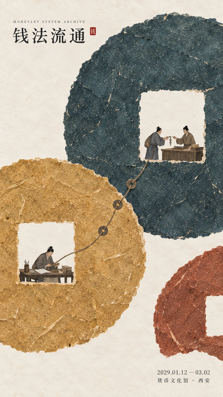
想创作具有影棚级质感且情绪松弛的艺术大片,却苦于无法完美呈现 现代东方美学纸纤维历史展览海报 中复杂的细节与光影质感?
Nanobanana Pro 完美还原了画面的细腻纹理与高级氛围,助您精准定格具备顶尖商业杂志感的视觉瞬间。
复制这套免费提示词,一键复制进顶级模型,秒出大片。
Struggling to create Modern Oriental Aesthetic Paper Fiber Exhibition Poster with a high-end editorial style? Nanobanana Pro captures the textures and lighting details perfectly for a hyper-realistic masterpiece. Get FREE Prompt, enjoy one-click copy, and create instantly!
Prompt (English):
ADVERTISEMENT
[Subject / Exhibition Name] {Fill in, e.g., Currency System / Phenology and Calendar / Temperament Standards / Land Surveying}
[Main Title] {Fill in}
[Core Abstract Concept] {Fill in, e.g., Circulation / Cycle / Calibration / Division}
[Main Color Gamut] {Fill in 3–5 colors, e.g., Deep Ink Blue + Earth Golden Yellow + Cinnabar Ocher / Spring Green + Summer Cyan + Autumn Ocher + Winter Blue}
[Main Visual Structure] {Fill in, e.g., Square-hole Circular Ring / Open Spiral / Long and Short Paper Pillars / Irregular Field Block Patchwork}
[Micro-narrative] {Fill in 2–4 real behaviors, e.g., Exchange and Bookkeeping / Observation and Recording / Pronunciation and Calibration / Surveying and Recording}
[Exhibition Information] {Date / Venue, optional}
[Aspect Ratio] 9:16 vertical version

Design a historical and cultural exhibition poster with modern Eastern editorial aesthetics, using "paper fiber + large color gamut + micro scenarios" as the core visual language. Do not start from ordinary ancient style scenes, but first refine the [Core Abstract Concept], and then use the [Main Visual Structure] to directly transform this concept into a large-area paper-based composition. For example, express circulation through a square-hole structure, express cycles through continuous rotation relationships, express standards through long and short scales, and express division through color block stitching and boundary relationships, so that viewers can feel the logic behind the theme from the composition even without reading the text.

Use the [Main Color Gamut] to establish 3–6 large paper color blocks with clear visual weight. All color blocks maintain a real and rich texture of handmade paper, watercolor pulp, mineral or plant pigments, with visible natural long and short fibers, pulp particles, pigment deposits, large-scale natural shading, slight indentations, and irregular torn paper edges; the color surfaces are complete, matte, clean, and have a sense of material, without dirt, yellow spots, strong noise, cheap vintage, or digital gradients. The large color gamut must bear the primary vision, remaining clearly identifiable in terms of main formal relationships even after being reduced to social media feed sizes.

Rotate, intersperse, stitch, vary scales, complement, enclose, partition, or create continuous relationships between the large color gamuts according to the theme, instead of simply laying a few color blocks on the background. The composition should have a very clear sense of method, allowing people to understand the large shape at first glance and produce a visual surprise of "this relationship is very interesting" at the second glance. Appropriately reserve warm ivory white negative space as a breathing area, but do not leave large areas empty just for minimalism; negative space must participate in the structure.

Embed [Micro-narrative] into the large paper color gamut, with characters and objects accounting for approximately 3%–6% of the screen. Characters must be performing real actions directly related to the theme, such as exchanging, recording, observing, calibrating, surveying, boundary setting, etc., rather than standing and posing. Micro-scenes can be distributed at different color gamut nodes, but do not make them into four-grid layouts, flowcharts, or step cards; they should be like small stories hidden in the huge color gamut, so that viewers only discover the complete human behavior and institutional logic behind the abstract structure when they get close.

Character clothing, objects, and environment remain restrained, keeping only the necessary elements to help understand the theme. Do not randomly stack ancient architecture, auspicious clouds, birds, flowers and birds, seals, brush calligraphy, or traditional patterns for the sake of an "Eastern cultural feel." A very small amount of cinnabar red, warm orange, or old gold can be used as institutional nodes, recording marks, or visual focal points, but they must have a real relationship with the content, with the total area controlled at 1%–3%.

Text typography adopts the Eastern editorial language of modern museums, historical archive exhibitions, and knowledge system exhibitions. The main title [Main Title] uses slender, upright Chinese Songti, Mingti, or modern fonts with a sense of publishing, maintaining small to medium font sizes so that Typography does not overwhelm the large color gamut. English sub-headings, dates, and venue information use smaller font sizes. The entire poster should try to retain only three sets of core text: "English sub-heading + Chinese main title + date/venue," without adding long subtitles, poems, sidebar descriptions, or meaningless English placeholders.

The overall reading order should be: large color gamut and abstract structural relationship → core concept → micro characters and real behavior → title and exhibition information. The final image should achieve a strong memory point of large shapes, colors, and composition from a distance, while paper fibers, character movements, cultural details, and knowledge logic appear only when viewed up close, combining material texture, design sense, and narrative sense.
中文参考:
ADVERTISEMENT
【主题 / 展览名称】{填写,例如:货币制度 / 物候历法 / 音律标准 / 土地丈量}
【主标题】{填写}
【核心抽象概念】{填写,例如:流通 / 循环 / 校准 / 划分}
【主色域】{填写 3–5 个颜色,例如:深墨青 + 土金黄 + 朱砂赭 / 春绿 + 夏青 + 秋赭 + 冬蓝}
【主视觉结构】{填写,例如:方孔圆环 / 开放螺旋 / 长短纸柱 / 不规则田块拼接}
【微型叙事】{填写 2–4 个真实行为,例如:交换与记账 / 观察与记录 / 发音与校准 / 丈量与入册}
【展览信息】{日期 / 场馆,可选}
【画幅比例】9:16 竖版

设计一张具有现代东方编辑美学的历史文化展览海报,以「纸纤维 + 大色域 + 微场景」作为核心视觉语言。不要从普通古风场景出发,而是先提炼【核心抽象概念】,再使用【主视觉结构】把这个概念直接转化成大面积纸本构图。例如通过方孔结构表现流通,通过连续旋转关系表现循环,通过长短尺度表现标准,通过色块拼接与边界关系表现划分,让观众即使不阅读文字,也能先从构图中感受到主题背后的逻辑。

使用【主色域】建立 3–6 个具有明确视觉重量的大型纸本色块。所有色块保持真实丰富的手工纸、水彩纸浆、矿物或植物颜料质感,可见天然长短纤维、纸浆颗粒、颜料沉积、大尺度自然浓淡、轻微压痕与不规则撕纸边缘;色面完整、哑光、干净、有材料感,不做脏旧、黄斑、强噪点、廉价复古或数字渐变。大色域必须承担第一视觉,缩小到社交媒体信息流尺寸后仍然能清楚识别主要形体关系。

根据主题让大色域发生旋转、穿插、拼接、尺度差异、互补、围合、分区或连续关系,而不是简单把几个色块铺在背景上。构图应具有一个非常清楚的方法感,让人第一眼看懂大形,第二眼产生“这个关系很有意思”的视觉惊喜。适当保留暖象牙白负空间作为呼吸区,但不要为了极简而大面积空置,留白必须参与结构。

在大型纸色域中嵌入【微型叙事】,人物与器物总体约占画面3%–6%。人物必须正在执行与主题直接相关的真实动作,例如交换、记录、观察、校准、丈量、定界等,而不是站着摆拍。微场景可以分布在不同色域节点,但不要做成四宫格、流程图或步骤卡片;应像隐藏在巨大色域里的小故事,让观众靠近后才发现抽象结构背后其实有完整的人类行为和制度逻辑。

人物服饰、器物和环境保持克制,只保留能帮助理解主题的必要元素。不要为了“东方文化感”随意堆叠古建筑、祥云、飞鸟、花鸟、印章、毛笔字或传统纹样。可以使用极少量朱砂红、暖橙或旧金作为制度节点、记录标记或视觉焦点,但必须与内容发生真实关系,总面积控制在1%–3%。

文字排版采用现代博物馆、历史档案展、知识系统展览的东方编辑语言。主标题【主标题】使用纤细、端正的中文宋体、明朝体或具有出版感的现代字体,保持中小字号,不让 Typography 压过大色域。英文小标、日期和场馆信息采用更小字号。整张海报尽量只保留“英文小标 + 中文主标题 + 日期场馆”三组核心文字,不加入大段副标题、诗句、侧栏说明或无意义英文占位词。

整体阅读顺序应为:大色域与抽象结构关系 → 核心概念 → 微型人物与真实行为 → 标题与展览信息。最终画面要做到远看有强烈大形、色彩和构图记忆点,近看才出现纸纤维、人物动作、文化细节和知识逻辑,兼具材料质感、设计感与叙事感。