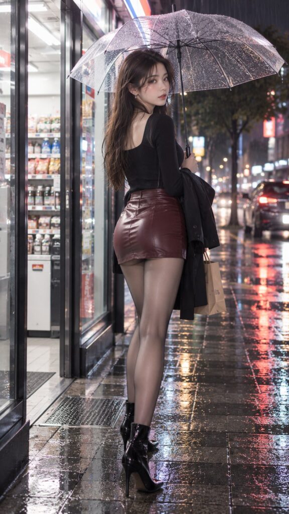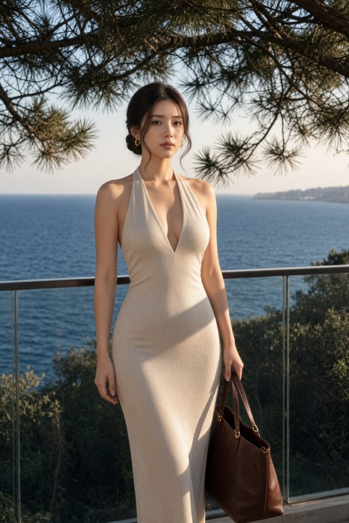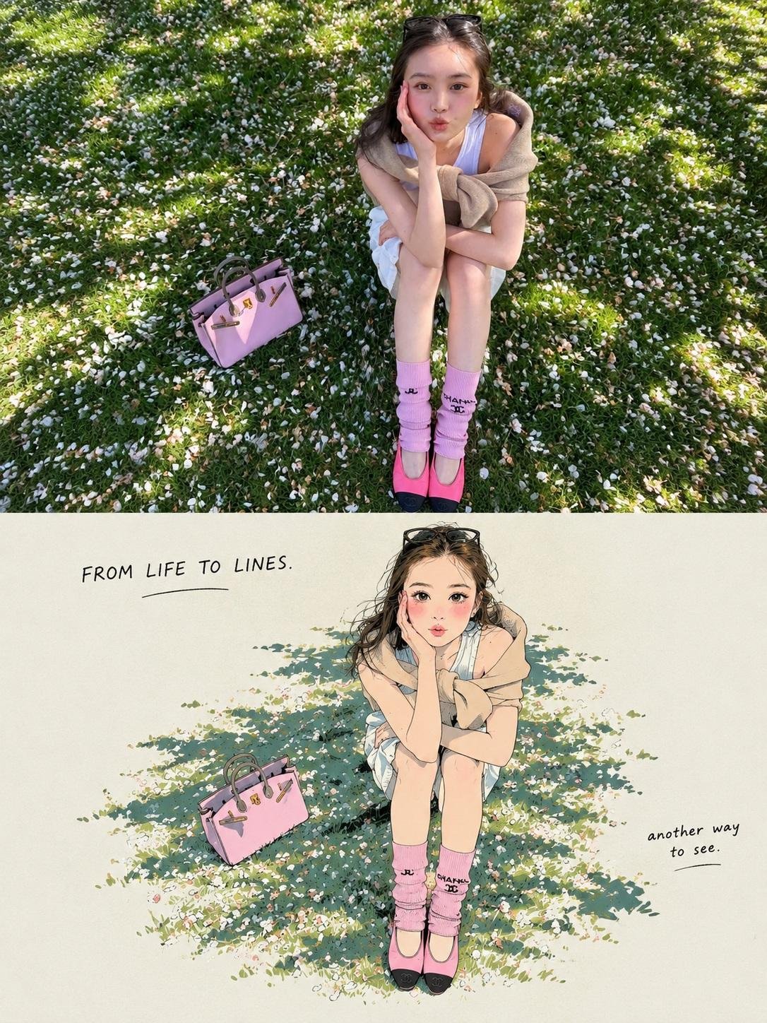
想创作具有影棚级质感且情绪松弛的艺术大片,却苦于无法完美呈现 照片转日式手绘漫画分屏海报 中复杂的细节与光影质感?
Nanobanana Pro 完美还原了画面的细腻纹理与高级氛围,助您精准定格具备顶尖商业杂志感的视觉瞬间。
复制这套免费提示词,一键复制进顶级模型,秒出大片。
Struggling to create Photo To Japanese Manga Split Poster with a high-end editorial style? Nanobanana Pro captures the textures and lighting details perfectly for a hyper-realistic masterpiece. Get FREE Prompt, enjoy one-click copy, and create instantly!
Prompt (English):
ADVERTISEMENT
Task: Create a 3:4 Split-Panel Photo-to-Japanese Illustration Poster

Transform the uploaded photograph into a vertically composed 3:4 comparison poster. The upper half displays the original photograph, while the lower half features a Japanese hand-drawn manga illustration with a limited-color print-poster aesthetic, faithfully redrawn from the same photograph.

Divide the canvas into two equal horizontal sections, each occupying exactly 50% of the total height. Both sections must have the same width. The horizontal division should connect seamlessly, with no gap, border, overlap, or decorative separator.

1. Upper Half — Original Photograph

- Preserve the original photograph exactly as it is.
- Do not redraw, recolor, retouch, or add any text to the photograph.
- Scale proportionally without stretching or distorting the image.
- If necessary, crop peripheral background areas first while preserving the main subject and important visual details.
- If the aspect ratio cannot be accommodated without compromising essential content, extend the edges with a light grayish-cream background. Never invent or reconstruct missing parts of the original photograph.

2. Lower Half — Japanese Hand-Drawn Illustration

Redraw the photograph as a Japanese-inspired hand-drawn manga illustration with a minimalist, limited-color screen-print poster aesthetic.

The original photograph is the exclusive source of the subject's identity, appearance, pose, structure, composition, layout, and relationships between objects.

For people:

- Preserve recognizable facial shape, hairstyle silhouette, expression, pose, gestures, and clothing category.
- Simplify the face into clean manga-style shapes.
- Render hair as grouped, flowing masses rather than individual strands.
- Express clothing through elegant, simplified fashion silhouettes.

For animals:

- Preserve the species, body proportions, distinctive coat-color patterns, and pose.
- Use simplified contours and flat color blocks to retain recognizability.

For objects:

- Preserve the original silhouette, essential structural details, and proportions.

For landscapes and scenery:

- Preserve the terrain, architecture, distribution of visible elements, and spatial depth.
- Redraw the main landscape as a cohesive illustration rather than reducing it to an isolated object.

Preserve all visible contact, overlap, and occlusion relationships. Depict only what is visible in the source photograph. Do not introduce new subjects, props, gestures, or structures outside the original image.

If an additional style reference is provided, use it only for drawing technique, color palette, and layout. Never copy its subjects or content.

3. Linework and Color Treatment

Use a consistent combination of delicate ink outlines, naturally simplified shapes, and limited-color flat fills.

- Ink outline: Near-black "#02030B", with varied pressure, subtle line-weight changes, occasional pauses, and slightly irregular hand-drawn edges.
- Keep internal lines minimal, retaining only the structural details necessary to define form.
- Use clean, continuous, opaque color blocks.
- Merge shadows into a small number of hard-edged color shapes.
- Avoid individual hair strands, dense hatching, photorealistic textures, and excessive decorative detail.
- Preserve the subject's essential natural colors and distinctive identifying color patterns.

Lower-panel background: Light grayish cream "#ECEDE5".

Primary accent: Warm red "#E9444B".

Secondary accent: Muted blue-gray "#5296BD".

Use red as the dominant accent and blue sparingly. Ensure that accent colors complement the subject without compromising its recognizability.

Simplify the background to the cream paper tone, retaining only the environmental details needed to communicate the setting, explain the action, and preserve spatial relationships. For landscape photographs, translate the principal scenery into the illustration rather than omitting it.

4. Lower Panel — Minimalist Poster Layout

Create a refined editorial composition with a small illustration surrounded by generous negative space.

- Treat the subject and essential environmental elements as one cohesive illustration.
- Scale the complete illustration proportionally and center it within the lower panel.
- Keep the entire illustration group within approximately 65–70% of the panel width and 60–65% of the panel height.
- Fit the illustration within these limits without stretching or distorting it.
- Maintain generous light grayish-cream margins on all sides.
- Do not let the illustration touch the edges or fill the entire panel.
- Do not use large background color blocks to fill the empty space.
- Do not add a border around the illustration.

The overall layout should resemble a thoughtfully designed Japanese art-print poster: restrained, balanced, airy, and visually sophisticated.

5. Handwritten Typography

Add two small handwritten text elements within the negative space of the lower panel.

Top area: Place a small, delicate, near-black handwritten phrase, such as:

“FROM LIFE TO LINES.”

Beside the illustration: Add an even smaller, casual handwritten phrase, such as:

“another way to see.”

Generate both phrases automatically based on the subject, setting, and emotional atmosphere of the original photograph. The wording should feel concise, natural, poetic, and contextually relevant.

The example phrases are references for tone and placement only. Do not use them automatically if a more fitting caption can be generated.

Typography must remain subtle and secondary to the illustration. Use a natural handwritten style with fine, slightly imperfect strokes. Ensure all generated text is spelled correctly and legible.

6. Final Output Requirements

- Aspect ratio: 3:4 portrait.
- Upper half: 50% of canvas height, displaying the untouched original photograph.
- Lower half: 50% of canvas height, displaying the Japanese-inspired hand-drawn illustration.
- Equal panel widths, seamless horizontal transition, no gap, no frame, and no overlap.
- Consistent minimalist Japanese manga linework and limited-color print-poster styling.
- Small, centered illustration with generous cream-colored negative space.
- Subtle, context-aware handwritten typography in the lower panel.

Core principle: The original photograph determines what is depicted. The illustration style determines how the lower half is redrawn. Preserve the source's identity and composition while transforming the lower panel into an elegant, minimalist Japanese illustration poster.
中文参考:
ADVERTISEMENT
任务:创建一个 3:4 分屏照片转日式插画海报

将上传的照片转换为垂直构图的 3:4 对比海报。上半部分显示原始照片,下半部分呈现日式手绘漫画插画,具有限量色印刷海报美学,忠实地根据同一张照片重新绘制。

将画布分为两个相等的水平部分,每个部分正好占据总高度的 50%。两个部分的宽度必须相同。水平分割应无缝连接,没有间隙、边框、重叠或装饰性分隔符。

1. 上半部分 — 原始照片

- 完全保留原始照片的原貌。
- 不要对照片进行重新绘制、重新着色、修饰或添加任何文字。
- 按比例缩放,不拉伸或变形图像。
- 如有必要,先裁剪边缘背景区域,同时保留主体和重要的视觉细节。
- 如果长宽比无法在不损害核心内容的情况下适应,请使用浅灰乳白色背景延伸边缘。严禁虚构或重建原始照片缺失的部分。

2. 下半部分 — 日式手绘插画

将照片重新绘制为具有极简、限量色丝网印刷海报美学的日式手绘漫画插画。

原始照片是主体身份、外观、姿势、结构、构图、布局以及物体间关系的唯一来源。

对于人物:

- 保留可辨识的面部形状、发型轮廓、表情、姿势、手势和服装类别。
- 将面部简化为干净的漫画风格形状。
- 将头发渲染为成组的、流动的块状,而非单根发丝。
- 通过优雅、简化的时尚剪影表达服装。

对于动物:

- 保留物种、身体比例、独特的毛色图案和姿势。
- 使用简化的轮廓和扁平色块以保持辨识度。

对于物体:

- 保留原始轮廓、基本结构细节和比例。

对于风景和场景:

- 保留地形、建筑、可见元素的分布和空间深度。
- 将主要风景重新绘制为统一的插画,而不是将其简化为孤立的物体。

保留所有可见的接触、重叠和遮挡关系。仅描绘源照片中可见的内容。不要引入原始图像之外的新主体、道具、手势或结构。

如果提供了额外的风格参考,仅将其用于绘画技法、色调和布局。严禁复制其主体或内容。

3. 线条与色彩处理

结合使用精致的墨线轮廓、自然简化的形状和限量色扁平填充。

- 墨线轮廓:接近黑色的 "#02030B",带有变化的压力、细微的线条粗细变化、偶尔的停顿以及略微不规则的手绘边缘。
- 保持内部线条极简,仅保留定义形状所必需的结构细节。
- 使用干净、连续、不透明的色块。
- 将阴影合并为少数硬边色块。
- 避免单根发丝、密集的阴影线、写实纹理和过多的装饰细节。
- 保留主体基本的自然色彩和独特的标识性颜色模式。

下半部分背景:浅灰乳白色 "#ECEDE5"。

主要强调色:暖红色 "#E9444B"。

次要强调色:柔和的蓝灰色 "#5296BD"。

将红色作为主导色,少量使用蓝色。确保强调色在不损害辨识度的前提下补充主体。

将背景简化为乳白色纸张色调,仅保留传达环境、解释动作和保持空间关系所需的细节。对于风景照片,将主要景色转化入插画中,而非忽略。

4. 下半部分 — 极简海报布局

创建一个精致的编辑式构图,小型插画被大量的留白包围。

- 将主体和基本环境元素视为一个整体插画。
- 将完整的插画按比例缩放并居中放置在下半部分。
- 使整个插画组保持在画板宽度的 65–70% 和高度的 60–65% 左右。
- 在这些限制内调整插画,不拉伸或变形。
- 在四周保持充裕的浅灰乳白色边距。
- 不要让插画触碰边缘或填满整个画板。
- 不要使用大面积背景色块来填充空白区域。
- 不要为插画添加边框。

整体布局应类似于设计考究的日式艺术印刷海报:克制、平衡、通透且视觉上高端。

5. 手写字体

在下半部分的留白区域添加两个小型手写文本元素。

顶部区域:放置一个细小、精致、接近黑色的手写短语,例如:

“FROM LIFE TO LINES.”

插画旁边:添加一个更小的、随意的手写短语,例如:

“another way to see.”

根据原始照片的主体、环境和情感氛围自动生成这两个短语。用词应简洁、自然、富有诗意且符合语境。

示例短语仅供语调和位置参考。如果能生成更合适的标题,请勿自动使用它们。

字体必须保持微妙,次于插画。使用带有纤细、略带瑕疵笔触的自然手写风格。确保所有生成的文字拼写正确且清晰可辨。

6. 最终输出要求

- 纵横比:3:4 纵向。
- 上半部分:画布高度的 50%,显示未经处理的原始照片。
- 下半部分:画布高度的 50%,显示日式风格手写插画。
- 相同的画板宽度,无缝水平过渡,无间隙,无框架,无重叠。
- 一致的极简日式漫画线条和限量色印刷海报风格。
- 小型居中插画,带充裕的乳白色留白空间。
- 下半部分带有微妙的、感应语境的手写字体。

核心原则:原始照片决定描绘内容。插画风格决定下半部分的重绘方式。在将下半部分转变为优雅、极简的日式插画海报时,保留源图的身份和构图。