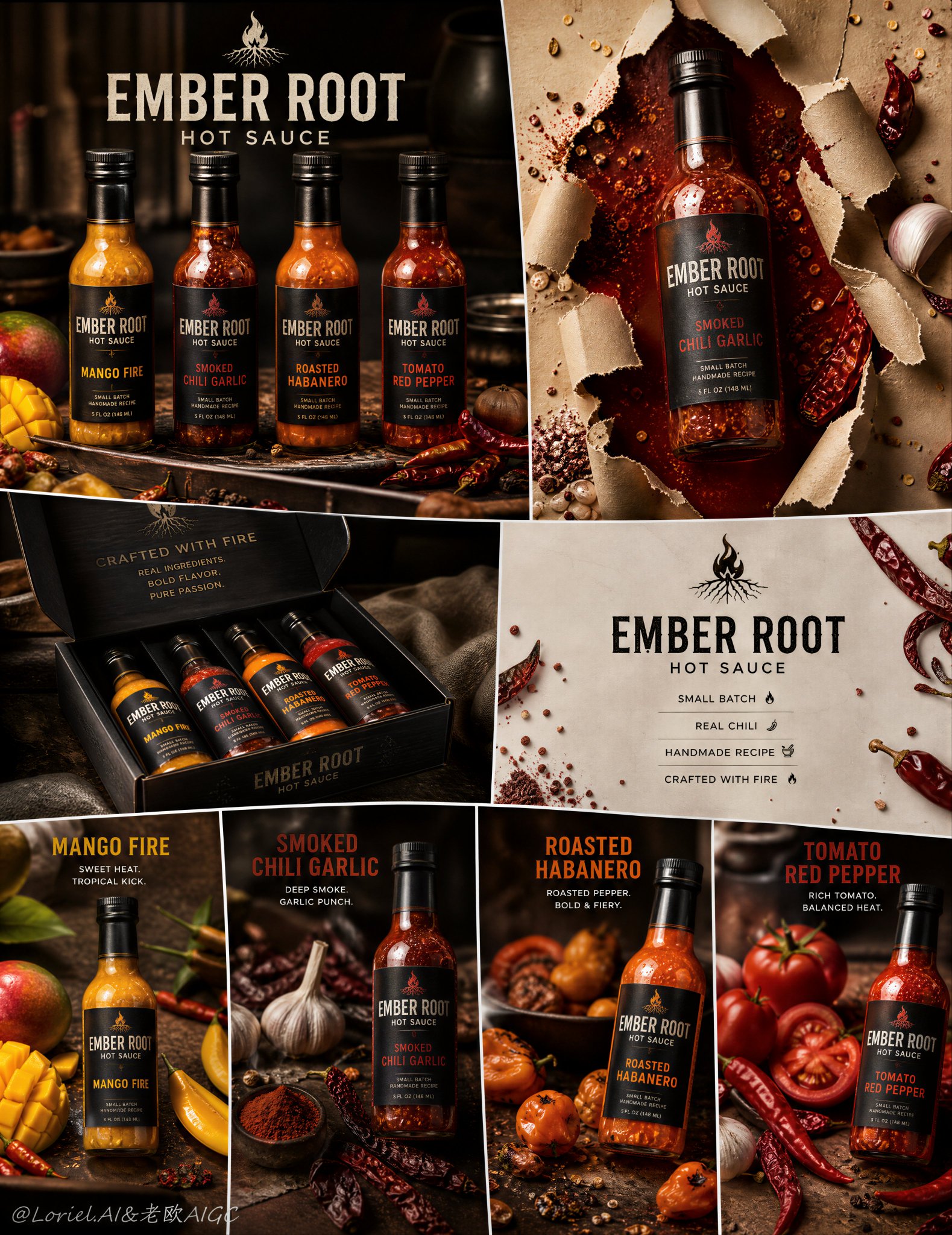
想创作具有影棚级质感且情绪松弛的艺术大片,却苦于无法完美呈现 烈焰之根手工辣酱八格高端画报 中复杂的细节与光影质感?
Nanobanana Pro 完美还原了画面的细腻纹理与高级氛围,助您精准定格具备顶尖商业杂志感的视觉瞬间。
复制这套免费提示词,一键复制进顶级模型,秒出大片。
Struggling to create Ember Root Artisanal Hot Sauce Campaign Board with a high-end editorial style? Nanobanana Pro captures the textures and lighting details perfectly for a hyper-realistic masterpiece. Get FREE Prompt, enjoy one-click copy, and create instantly!
Prompt (English):
ADVERTISEMENT
Create an ultra-premium irregular 8-panel hot sauce campaign board for a self-created artisanal brand called “EMBER ROOT HOT SAUCE”. The final artwork must feel like a collector-grade handcrafted flavor-series advertisement: highly structured but visually dynamic, with an irregular panel mosaic rather than a simple equal grid. The campaign must feature four realistic glass-bottled hot sauce products, each with a distinct flavor identity, repeated across different panel treatments, supported by chili-based ingredients, refined kitchen-accent background cues, premium English branding, and a bold tear-through-paper impact panel. The whole system must feel modern, tactile, handcrafted, fiery, and premium, while keeping the bottles as the absolute heroes.

Creative direction:
Combine Milk Cloud Orbit and Cream Halo Transit, and intensify the handcrafted hot sauce identity. Keep the exact irregular 8-panel skeleton, but make the bottles, sauce texture, ingredient styling, and packaging feel more clearly small-batch, artisan-made, and chef-driven. The final image must feel less like mass-market retail sauce and more like a premium handmade hot-sauce collection built from real peppers, real garlic, real spice oils, and slow-crafted recipes.

Core composition:
Use an irregular 8-panel board with varied panel sizes and aspect ratios, but with strong overall balance. The system should include:
1. one lineup panel showing all four sauces together,
2. one dramatic hero bottle panel with a tear-through-paper effect,
3. one premium packaging or gift-box panel,
4. one clean brand-information panel,
5. four smaller or medium product-focus panels showing the individual bottles in different flavor environments.
The board must feel like one unified artisanal flavor-series launch campaign with clear product hierarchy and excellent visual rhythm.

Brand direction:
Create a self-invented premium handcrafted hot sauce brand:
EMBER ROOT HOT SAUCE
Brand language: bold, artisanal, modern, fiery, premium, ingredient-forward, small-batch.
Use elegant English-only visible branding. Typography must feel strong, contemporary, and premium, never cheap, never generic. The logo and label system should feel globally market-ready but rooted in handcrafted authenticity.

Product lineup:
Create four distinct handcrafted glass-bottled hot sauces:
1. Mango Fire
2. Smoked Chili Garlic
3. Roasted Habanero
4. Tomato Red Pepper
All four bottles must share one unified glass-bottle shape and packaging system, but each must have its own label color, sauce tone, spice density, and ingredient cues.

Bottle realism:
Render each bottle with extreme realism: transparent glass, believable sauce viscosity, realistic cap texture, premium label print, subtle surface reflections, visible suspended chili seeds or spice particles where appropriate, and accurate bottle proportions. The bottles must feel premium, intense, and physically desirable.

Milk Cloud Orbit product-light logic:
This is critical. Purify the most convincing premium zones: glass shoulder reflections, sauce translucency, oil-rich highlight bands, chili skin specular points, and the glossy edge where thick sauce meets bottle glass. The bottles must feel more polished and more flagship-like, while the sauce itself feels richer, denser, and more alive.

Cream Halo Transit hierarchy logic:
Keep the same irregular 8-panel structure, but reduce non-product noise and tighten the relationship between packaging, single-bottle panels, and info panels. Text, icons, and supporting graphics should become more selective and more integrated so the handcrafted sauce, ingredients, and glass bottles dominate more absolutely.

Handcrafted sauce logic:
This is critical. The campaign must clearly feel like handmade hot sauce. Show subtle natural inconsistency in chili flakes, seed distribution, spice sediment, garlic texture, roasted pepper fiber, and thick slow-cooked sauce body. The sauces should feel kettle-made, chef-developed, and small-batch, with a tactile richness that suggests real ingredients rather than factory-flat texture. Packaging should feel artisanal-premium, as if sold in a gourmet pantry or chef-driven market.

Panel logic:
Lineup panel:
show all four bottles together in one elegant flavor-family arrangement, supported by selective chili and ingredient placement.
Tear-through-paper panel:
one hero bottle appears embedded in or breaking through ripped paper, revealing deep red sauce color behind the tear and surrounded by chili fragments, seeds, and spice specks.
Packaging panel:
show a premium branded presentation box or gift set containing the four bottles.
Brand-info panel:
clean minimal layout with brand title and a few short premium handcrafted claims such as:
SMALL BATCH
REAL CHILI
HANDMADE RECIPE
CRAFTED WITH FIRE
Flavor panels:
show each bottle individually in a controlled culinary setting with its own flavor ingredients.

Ingredient logic:
Use chili as the primary supporting ingredient across the campaign, with careful flavor-specific secondary cues:
Mango Fire: yellow chili, mango cubes, tropical pepper accents
Smoked Chili Garlic: dried chilies, garlic cloves, smoked spice dust
Roasted Habanero: orange-red habanero peppers, roasted pepper skin, charred spice crumbs
Tomato Red Pepper: red chilies, tomatoes, cracked pepper, subtle garlic support
All ingredient placement must feel clean, selective, and premium. No clutter.

Kitchen-accent background logic:
The backgrounds must suggest a refined prep-kitchen or artisanal sauce-making environment, but remain minimal. Use soft wood, stone, linen, ceramic, shadowed prep surfaces, or blurred culinary backdrops only as subtle context. The campaign must not feel like a busy cooking scene. It should feel editorial, chef-grade, and product-focused.

Break-through-paper logic:
This is critical. One key panel must use a bold torn-paper composition where the hot sauce bottle appears to emerge through ripped paper, revealing deep red sauce color behind it. The effect must feel tactile, sharp, and premium, not gimmicky. Surround it with chili seeds, red spice dust, or tiny fragments for impact.

Lighting:
Use extremely delicate high-end commercial product lighting. Let the glass, sauce, chili skin, garlic surfaces, roasted textures, and spice particles glow with premium highlight control. Keep the light warm, dramatic, and refined, but never greasy or chaotic.

Color system:
Use a premium handcrafted heat palette:
deep chili red, smoked brown, roasted orange, mango yellow, garlic cream, matte black, stone beige, and dark kitchen neutrals.
The board must feel intense and spicy, but still controlled, artisanal, and premium.

Typography logic:
Use minimal premium English-only branding and short supporting claims. Keep text restrained and elegant. Titles may include:
EMBER ROOT
HOT SAUCE
SMALL BATCH
HANDMADE RECIPE
CRAFTED WITH FIRE
Text must never overpower the bottles.

Mood:
bold, fiery, artisanal, premium, spicy, handcrafted, modern, tactile, ingredient-forward, commercial, collector-grade, chef-driven

Rendering style:
ultra-realistic handcrafted hot sauce campaign board, irregular 8-panel premium layout, self-created glass-bottled flavor series, chili-focused ingredient styling, stronger small-batch artisanal sauce identity, torn-paper hero panel, refined kitchen-accent backgrounds, elegant English branding, premium commercial lighting, 8k, world-class image quality

Negative prompt:
cheap supermarket sauce flyer, cluttered ingredient mess, weak bottle presence, noisy kitchen scene, fake sauce texture, factory-flat liquid, plastic label, low-detail chilies, cartoon rendering, too much text, low resolution, gimmicky tear effect, messy composition
中文参考:
ADVERTISEMENT
为一个名为“EMBER ROOT HOT SAUCE”的自创手工品牌创建一个超高端的非规则8面板辣酱宣传板。最终作品必须具有收藏级手工风味系列广告的感觉:结构严密但视觉动态,采用非规则面板马赛克而非简单的等分网格。宣传活动必须展示四款逼真的玻璃瓶装辣酱产品,每款都有独特的分味标识,在不同的面板处理中重复出现,并由辣椒原料、精致的厨房装饰背景线索、高端英文品牌标识以及一个大胆的纸张撕裂效果冲击面板支持。整个系统必须感觉现代、触感、手工、火热且高端,同时让瓶子作为绝对的主角。

创意方向:
结合 Milk Cloud Orbit 和 Cream Halo Transit,并加强手工辣酱的身份。保留完全相同的非规则8面板骨架,但让瓶子、酱汁质感、原料造型和包装感觉更明显地属于小批量、手工制作和厨师驱动。最终图像必须感觉不像大众市场的零售酱汁,而更像是由真实的辣椒、大蒜、香料油和慢速制作配方打造的高端手工辣酱系列。

核心构图:
使用一个具有不同面板尺寸和宽高比的非规则8面板板,但具有强大的整体平衡。该系统应包括:
1. 一个展示所有四种酱汁的阵容面板,
2. 一个带有纸张撕裂效果的戏剧性英雄瓶面板,
3. 一个高端包装或礼盒面板,
4. 一个干净的品牌信息面板,
5. 四个小型或中型产品焦点面板,在不同的风味环境中展示单瓶。
该宣传板必须感觉像一个统一的手工风味系列发布活动,具有清晰的产品层次和极佳的视觉节奏。

品牌方向:
创建一个自创的高端手工辣酱品牌:
EMBER ROOT HOT SAUCE
品牌语言:大胆、手工、现代、火热、高端、原料导向、小批量。
使用优雅的纯英文可见品牌标识。排版必须感觉强大、当代且高端,绝不廉价,绝不普通。标志和标签系统应感觉具备全球市场竞争力,但扎根于手工的真实感。

产品线:
创建四款独特的手工玻璃瓶装辣酱:
1. Mango Fire(芒果之火)
2. Smoked Chili Garlic(烟熏辣椒大蒜)
3. Roasted Habanero(烤哈瓦那辣椒)
4. Tomato Red Pepper(番茄红椒)
所有四个瓶子必须共享一个统一的玻璃瓶形状和包装系统,但每个瓶子必须有自己的标签颜色、酱汁色调、香料密度和原料提示。

瓶子真实感:
以极高的真实感渲染每个瓶子:透明玻璃、可信的酱汁粘度、真实的瓶盖质感、高端标签印刷、细微的表面反射、可见的悬浮辣椒籽或香料颗粒(在适当处),以及准确的瓶子比例。瓶子必须感觉高端、强烈且在物理上令人向往。

Milk Cloud Orbit 产品光影逻辑:
这是至关重要的。纯化最令人信服的高端区域:玻璃肩部反射、酱汁半透明感、富含油脂的高光带、辣椒皮的高光点,以及浓稠酱汁与瓶子玻璃接触的亮边。瓶子必须感觉更加精致和旗舰化,而酱汁本身感觉更丰富、更浓稠、更有生命力。

Cream Halo Transit 层次逻辑:
保持相同的非规则8面板结构,但减少非产品噪音,并紧固包装、单瓶面板和信息面板之间的关系。文字、图标和辅助图形应变得更具选择性和集成性,使手工酱汁、原料和玻璃瓶占据绝对主导地位。

手工酱汁逻辑:
这是至关重要的。宣传活动必须清晰地让人感觉到是手工制作的辣酱。展示辣椒碎、种子分布、香料沉积、大蒜质感、烤辣椒纤维和浓稠慢煮酱体的细微自然不一致性。酱汁应该感觉像是用壶煮的、厨师开发的、小批量的,具有一种触觉上的丰富感,暗示是真实的原料而非工厂化的平整质感。包装应感觉手工高端,仿佛在美食精品店或厨师驱动的市场中销售。

面板逻辑:
阵容面板:在一个优雅的风味家族排列中展示所有四个瓶子,辅以选择性的辣椒和原料摆放。
纸张撕裂面板:一个英雄瓶出现在撕裂的纸张中或从中突破,在撕裂处后面露出深红色的酱汁颜色,并被辣椒碎片、种子和香料微粒包围。
包装面板:展示一个包含四个瓶子的高端品牌展示盒或礼盒。
品牌信息面板:干净极简的布局,带有品牌标题和一些简短的高端手工声明,例如:
SMALL BATCH(小批量)
REAL CHILI(真辣椒)
HANDMADE RECIPE(手工配方)
CRAFTED WITH FIRE(以火打造)
风味面板:在受控的烹饪环境中展示每个单瓶及其各自的风味原料。

原料逻辑:
在整个宣传活动中使用辣椒作为主要的辅助原料,并附带仔细的风味特定次要提示:
Mango Fire:黄辣椒、芒果丁、热带胡椒点缀
Smoked Chili Garlic:干辣椒、大蒜瓣、烟熏香料粉
Roasted Habanero:橙红色哈瓦那辣椒、烤辣椒皮、焦香香料碎
Tomato Red Pepper:红辣椒、番茄、碎胡椒、细微的大蒜支持
所有原料摆放必须感觉干净、有选择性且高端。不杂乱。

厨房装饰背景逻辑:
背景必须暗示一个精致的预备厨房或手工酱汁制作环境,但保持极简。仅将软木、石头、亚麻布、陶瓷、阴影覆盖的预备表面或模糊的烹饪背景作为细微的语境使用。宣传活动绝不能感觉像一个繁忙的烹饪场景。它应该感觉像社论大片、厨师级且以产品为中心。

纸张突破逻辑:
这是至关重要的。一个关键面板必须使用大胆的撕裂纸张构图,辣酱瓶似乎从撕裂的纸张中浮现,在其后露出深红色的酱汁颜色。效果必须感觉具有触感、尖锐且高端,而不是噱头。周围点缀辣椒籽、红色香料粉或微小碎片以产生冲击力。

灯光:
使用极其精致的高端商业产品照明。让玻璃、酱汁、辣椒皮、大蒜表面、烘烤质感和香料颗粒在高端高光控制下发光。保持光线温暖、戏剧化且精致,但绝不油腻或混乱。

色彩系统:
使用高端手工热度色调:
深辣椒红、烟熏棕、烘烤橙、芒果黄、大蒜奶油色、磨砂黑、石米色和深色厨房中性色。
画板必须感觉强烈且辛辣,但仍然受控、手工且高端。

排版逻辑:
使用极简的纯英文高端品牌标识和简短的辅助声明。保持文字克制且优雅。标题可能包括:
EMBER ROOT
HOT SAUCE
SMALL BATCH
HANDMADE RECIPE
CRAFTED WITH FIRE
文字绝不能压过瓶子。

氛围:
大胆、火热、手工、高端、辛辣、手工制作、现代、触感、原料导向、商业化、收藏级、厨师驱动

渲染风格:
超写实手工辣酱宣传板,非规则8面板高端布局,自创玻璃瓶装风味系列,辣椒导向的原料造型,更强的小批量手工酱汁身份,撕纸英雄面板,精致厨房装饰背景,优雅英文品牌标识,高端商业照明,8k,世界级图像质量

负向提示词:
廉价超市酱汁传单,杂乱的原料堆积,瓶子存在感弱,嘈杂的厨房场景,虚假的酱汁质感,工厂化的平整液体,塑料标签,低细节辣椒,卡通渲染,文字过多,低分辨率,噱头撕裂效果,混乱的构图