想创作具有影棚级质感且情绪松弛的艺术大片,却苦于无法完美呈现 高端西式快餐六宫格促销海报 中复杂的细节与光影质感?
Nanobanana Pro 完美还原了画面的细腻纹理与高级氛围,助您精准定格具备顶尖商业杂志感的视觉瞬间。
复制这套免费提示词,一键复制进顶级模型,秒出大片。
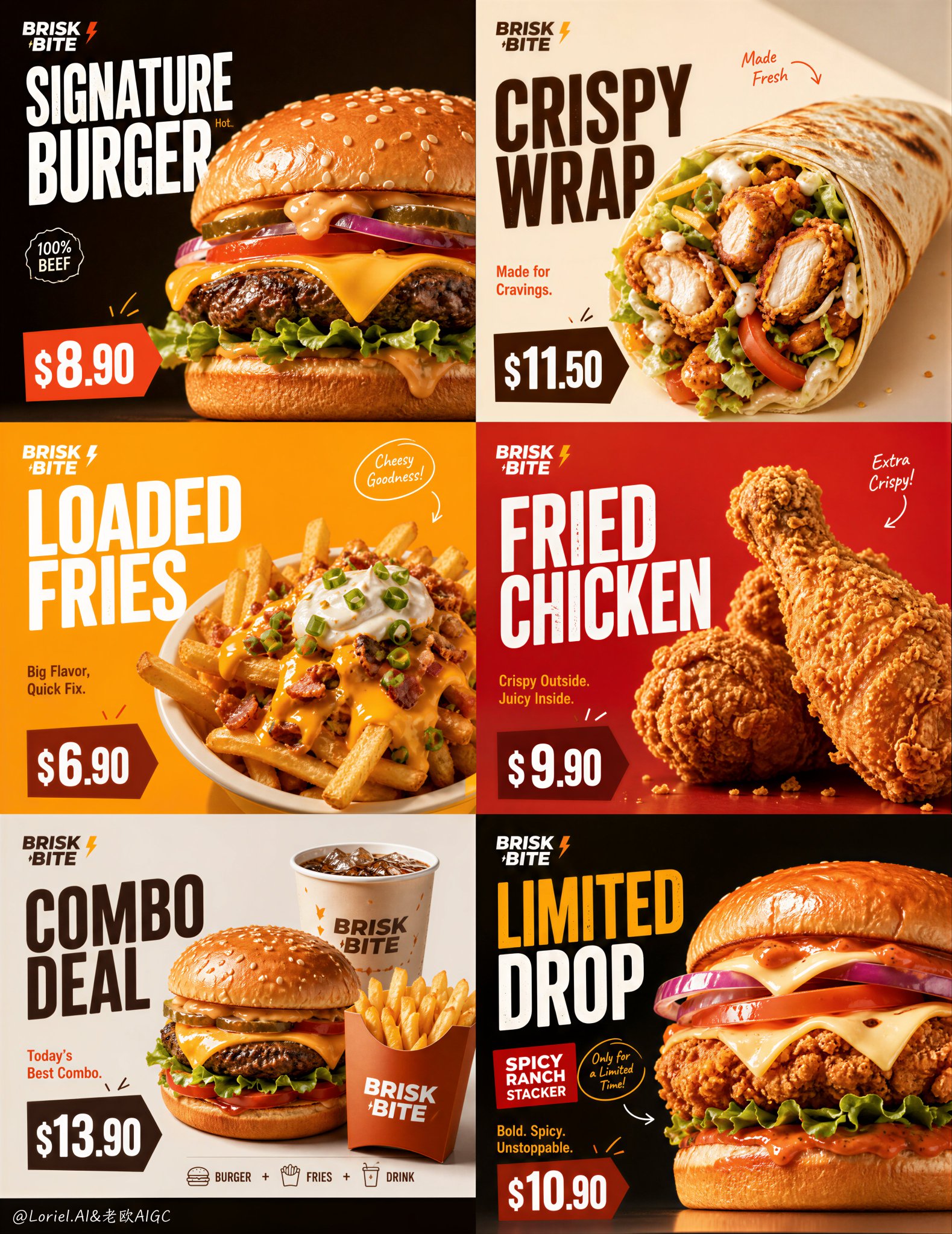
Struggling to create Brisk Bite Fast Food 6 Panel Promo Poster with a high-end editorial style? Nanobanana Pro captures the textures and lighting details perfectly for a hyper-realistic masterpiece. Get FREE Prompt, enjoy one-click copy, and create instantly!
Prompt (English):
ADVERTISEMENT
* one food hero + one stacked title + one price tag
Keep only one main food item, one large title, and one price anchor in each grid; the information hierarchy is fixed, so users don’t have to search for the key points.

* strict 2x3 grid, product-tier campaign rhythm
A uniform six-grid layout, but products are tiered using burgers, wraps, snacks, meal deals, and limited-edition items; the entire image functions both as a menu and as a promotional campaign.

* High-contrast fast-food color palette, minimal handwritten accents
Orange, yellow, red, and creamy white create a high-contrast, appetite-stimulating color scheme; handwritten arrows are placed only near prices or selling points to maintain a promotional feel without cluttering the design.

GPT- image 2 prompt
Create an ultra-premium 6-panel fast-food promotional poster for a fictional Western fast-food brand named BRISK BITE, merging extreme food realism with a stronger product-tier campaign rhythm. Fully preserve the exact structural logic and visual energy of a bold grid-based campaign layout: six square panels arranged in a strict 2x3 composition, each panel functioning like an individual high-impact promo card while remaining part of one unified brand world. The final artwork must feel like a world-class quick-service restaurant campaign: hyper-realistic, bright, graphic, youth-forward, clean, delicious, and highly commercial, with strong price labels, elegant English typography, minimal handwritten accents, and the food always remaining the visual hero.

Core structure:
Use a strict 2x3 six-grid layout with equal panel proportions and strong spacing consistency. Each panel must feel like a standalone fast-food promo visual, but all six together must read as one coherent branded campaign. Keep the structure bold, instantly readable, and optimized for promotional impact. Build a stronger sense of menu hierarchy by dividing the six panels into different fast-food product layers while keeping one visual system across all cards.

Brand identity:
Create a fictional premium fast-food brand:
BRISK BITE

Use modern English-only branding with a clean, bold, urban-friendly logo style. The brand must feel contemporary, accessible, energetic, and commercial, but still polished and premium. Include a small official-style logo placement consistently.

Product lineup hierarchy:
Design the six panels as a more clearly structured fast-food series:
1. Signature Burger
2. Crispy Wrap
3. Loaded Fries
4. Fried Chicken
5. Combo Meal
6. Limited Special

Each item must look real, premium, and highly craveable. Products should vary clearly in silhouette, ingredients, and appetite mood, so the six panels feel diverse, fast-moving, and commercial, while still belonging to one campaign family.

Panel design logic:
Each panel should include:
- one dominant real food hero
- one bold title block
- one clearly visible promotional price tag
- one short supporting line in English
- one or two minimal handwritten or drawn accents if useful
- strong negative space around the product so the composition remains clean and impactful

The product must remain the main visual focus. Typography and price blocks should support it, not overpower it. Each panel should feel like a fast-selling menu card with its own role inside the larger brand system.

Typography and text style:
Use bold premium English typography inspired by modern fast-food campaign design. Titles should be large, stacked, graphic, and highly legible. Example text system:
BRISK BITE
SIGNATURE BURGER
CRISPY WRAP
LOADED FRIES
FRIED CHICKEN
COMBO DEAL
LIMITED DROP

Use short supporting promotional lines such as:
Hot. Fresh. Fast.
Made for Cravings.
Today’s Best Combo.
Big Flavor, Quick Fix.
Weekend Favorite.

Add clear promo price tags in a strong quick-service layout style, for example:
$8.90
$11.50
$6.90
$9.90
$13.90
$10.90

Prices must be readable, bold, and naturally integrated like real fast-food advertising.

Color system:
Use a strong fast-food campaign palette with high contrast and promotional energy. Build the six panels from a unified set of premium commercial colors such as:
bright orange
warm yellow
cream beige
deep brown
red accent blocks
soft off-white

Vary the panel backgrounds and graphic blocks so each product tier feels distinct, but keep the brand system consistent and intentional. The overall feel must be bold and appetizing, not chaotic.

Food realism:
Push the food realism to the absolute highest level. Buns must feel soft and glossy. Fried chicken coating must feel crisp and textured. Melted cheese must feel hot and elastic. Fries must feel golden and salted. Wrap bread must feel toasted and slightly blistered. Sauces must feel rich, thick, and glossy. Lettuce, tomato, pickles, onions, and herbs must feel fresh, hydrated, and vivid. Add subtle crumbs, sauce drips, tiny seasoning particles, and minimal steam or warmth cues where appropriate. Everything must feel hyper-real, clean, and commercial.

Lighting:
Use extremely delicate, soft, high-end commercial food lighting. Let each product catch beautiful highlights on bread, cheese, meat, sauces, fried crust, and vegetables. Shadows must remain short, soft, and controlled. The image should feel bright, juicy, appetizing, and polished, with no harsh glare.

Handwritten accent logic:
Add only minimal handwritten-style promotional accents or sketch lines: a few arrows, little emphasis marks, tiny note-like circles, or small energetic strokes around price tags or food edges. These accents must feel playful and commercial, not messy. Keep them sparse and well designed.

Visual mood:
The full 6-panel poster must communicate instant craving, strong product confidence, speed, accessibility, and modern fast-food culture. It should feel like a premium restaurant launch campaign or digital menu-promo series with clean commercial sharpness and youthful impact. The hierarchy between burger, wrap, fries, fried chicken, combo, and limited special should be immediately felt.

Rendering style:
ultra-premium photorealistic fast-food advertising poster, 6-panel grid campaign, fictional Western fast-food brand BRISK BITE, product-tier structure with burger wrap fries fried chicken combo and limited special, bold English typography, strong promo price tags, minimal handwritten accents, soft cinematic commercial lighting, hyper-detailed food textures, world-class quick-service campaign aesthetics, 8k, masterpiece quality

Negative prompt:
cheap takeaway flyer, cluttered composition, cartoon food, weak product focus, low-detail burgers, fake cheese, plastic ingredients, messy typography, unreadable prices, generic supermarket styling, flat lighting, oversaturated chaos, low-resolution textures
中文参考:
ADVERTISEMENT
* 一个食物主角 + 一个堆叠标题 + 一个价格标签
在每个网格中仅保留一个主要食物项、一个大标题和一个价格锚点;信息层级是固定的,因此用户不必寻找重点。

* 严格的 2x3 网格,产品层级活动节奏
统一的六格布局,但产品使用汉堡、卷饼、小吃、套餐和限量版物品进行分层;整个图像既充当菜单又充当促销活动。

* 高对比度快餐配色方案,极简手写点缀
橙色、黄色、红色和乳白色营造出高对比度、刺激食欲的配色方案;手写箭头仅放置在价格或卖点附近,以保持促销感而不会使设计显得杂乱。

GPT-图像 2 提示词
为虚构的名为 BRISK BITE 的西方快餐品牌创建一个超高端 6 面快餐促销海报,将极端的食物写实主义与更强的产品层级活动节奏相结合。完全保留大胆的基于网格的活动布局的精确结构逻辑和视觉能量:六个正方形面板排列成严格的 2x3 构图,每个面板的功能就像一个独立的高冲击力促销卡,同时仍然是统一品牌世界的一部分。最终作品必须感觉像是世界级的快速服务餐厅活动:超写实、明亮、图形化、面向年轻人、干净、美味且高度商业化,带有醒目的价格标签、优雅的英文排版、极简的手写点缀,并且食物始终是视觉主角。

核心结构:
使用比例相等且间距一致性强的严格 2x3 六格布局。每个面板必须感觉像是一个独立的快餐促销视觉效果,但所有六个面板结合在一起必须读作一个连贯的品牌活动。保持结构大胆、瞬间可读,并针对促销影响进行优化。通过将六个面板划分为不同的快餐产品层,同时在所有卡片中保持一个视觉系统,来建立更强的菜单层级感。

品牌身份:
创建一个虚构的高端快餐品牌:
BRISK BITE

使用带有干净、大胆、都市友好标志风格的现代纯英文品牌。品牌必须感觉具有当代感、易于接近、充满活力和商业化,但仍然精致且高端。始终包含一个小的官方风格标志。

产品阵容层级:
将六个面板设计为结构更清晰的快餐系列:
1. 招牌汉堡
2. 脆皮卷饼
3. 丰富配料薯条
4. 炸鸡
5. 组合套餐
6. 限量特供

每件物品都必须看起来真实、高端且非常诱人。产品的轮廓、成分和食欲氛围应有明显变化,使六个面板感觉多样、快速移动且商业化,同时仍属于一个活动家族。

面板设计逻辑:
每个面板应包括:
- 一个占主导地位的真实食物主角
- 一个大胆的标题块
- 一个清晰可见的促销价格标签
- 一行简短的英文辅助说明
- 一两个极简的手写或绘制点缀(如果有用)
- 产品周围有强烈的负空间,以便构图保持干净且有冲击力

产品必须保持主要的视觉中心。排版和价格块应支持它,而不是压倒它。每个面板应感觉像是一张在更大的品牌系统内有自己角色的热销菜单卡。

排版和文本样式:
使用受现代快餐活动设计启发的粗体高端英文排版。标题应大、堆叠、具有图形感且高度易读。示例文本系统:
BRISK BITE
SIGNATURE BURGER
CRISPY WRAP
LOADED FRIES
FRIED CHICKEN
COMBO DEAL
LIMITED DROP

使用简短的辅助促销语,例如:
Hot. Fresh. Fast.
Made for Cravings.
Today’s Best Combo.
Big Flavor, Quick Fix.
Weekend Favorite.

以强烈的快速服务布局风格添加清晰的促销价格标签,例如:
$8.90
$11.50
$6.90
$9.90
$13.90
$10.90

价格必须可读、加粗,并像真实的快餐广告一样自然融合。

色彩系统:
使用具有高对比度和促销能量的强大快餐活动调色板。由一组统一的高端商业色彩构建六个面板,例如:
亮橙色
暖黄色
乳米色
深棕色
红色点缀块
柔和的米白色

Vary the panel backgrounds and graphic blocks so each product tier feels distinct, but keep the brand system consistent and intentional. The overall feel must be bold and appetizing, not chaotic.
改变面板背景和图形块,使每个产品层级感觉不同,但保持品牌系统一致且有目的。整体感觉必须大胆且诱人,而不是混乱。

食物写实主义:
将食物写实主义推向最高水平。汉堡面包必须感觉柔软且有光泽。炸鸡涂层必须感觉酥脆且有质感。融化的奶酪必须感觉热且有弹性。薯条必须感觉金黄且有盐。卷饼面包必须感觉经过烘烤且有轻微的起泡。酱汁必须感觉浓郁、粘稠且有光泽。生菜、西红柿、泡菜、洋葱和香草必须感觉新鲜、水润且鲜艳。在适当的地方添加微妙的碎屑、酱汁滴、微小的调味颗粒以及微小的蒸汽或温暖提示。一切都必须感觉超现实、干净且商业化。

灯光:
使用极其细腻、柔和、高端的商业食物灯光。让每种产品在面包、奶酪、肉类、酱汁、油炸脆皮和蔬菜上捕捉到美丽的亮部。阴影必须保持短促、柔和且受控。图像应感觉明亮、多汁、诱人且精致,没有刺眼的眩光。

手写点缀逻辑:
仅添加极简的手写风格促销点缀或素描线条:一些箭头、小的强调标记、微小的笔记状圆圈,或价格标签或食物边缘周围的小的活力线条。这些点缀必须感觉俏皮且具有商业感,而不是凌乱。保持它们稀疏且设计良好。

视觉氛围:
完整的 6 面海报必须传达即时的渴望、强大的产品信心、速度、易接近性和现代快餐文化。它应该感觉像是一个高端餐厅发布活动或具有干净商业锐度和年轻冲击力的数字菜单促销系列。汉堡、卷饼、薯条、炸鸡、套餐和限量特供之间的层级感应该被立即感受到。

渲染风格:
超高端写实快餐广告海报,6 面网格活动,虚构的西方快餐品牌 BRISK BITE,具有汉堡、卷饼、薯条、炸鸡、套餐和限量特供的产品层级结构,粗体英文排版,醒目的促销价格标签,极简手写点缀,柔和的电影级商业灯光,超精细的食物质感,世界级快餐活动美学,8k,杰作质量

负面提示词:
廉价外卖传单,凌乱的构图,卡通食物,产品重点不突出,细节不足的汉堡,假奶酪,塑料成分,凌乱的排版,无法辨认的价格,通用的超市风格,平淡的灯光,过度饱和的混乱,低分辨率纹理