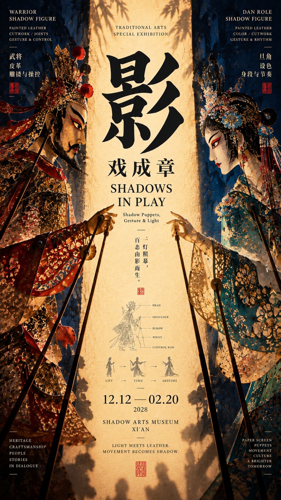
想创作具有影棚级质感且情绪松弛的艺术大片,却苦于无法完美呈现 中轴夹景文化海报设计提示词 中复杂的细节与光影质感?
Nanobanana Pro 完美还原了画面的细腻纹理与高级氛围,助您精准定格具备顶尖商业杂志感的视觉瞬间。
复制这套免费提示词,一键复制进顶级模型,秒出大片。
Struggling to create Central Axis Framed Scenery Cultural Poster Prompt with a high-end editorial style? Nanobanana Pro captures the textures and lighting details perfectly for a hyper-realistic masterpiece. Get FREE Prompt, enjoy one-click copy, and create instantly!
Prompt (English):
ADVERTISEMENT
[Theme]: ____
[Chinese Title]: ____
[English Title]: ____
[Left Visual Element]: ____
[Right Visual Element]: ____
[Left-Right Relationship]: Facing each other / Enclosing / Front and back / Intertwined / Other____
[Central Axis Content]: Light curtain / Path / Needle and thread / Fabric / Negative space / Other____
[Composition Method]: Character action / Outline framing / Spatial perspective / Linear penetration / Intertwined formation / Other____
[Main Tone]: ____
[Auxiliary Color]: ____
[Research Node]: ____
[Aspect Ratio]: 9:16

Generate a "Central Axis Framed Scenery" cultural poster with strong spatial relationships and a mature Editorial Design temperament.

First establish a clear central reading area, and then let the elements on the left and right sides jointly form the central axis through real relationships. The two sides are not just decorative symmetry, but truly participate in thematic expression.

You can choose different relationships according to the subject matter:

Characters facing each other: use character postures, sleeves, poles, or lines of sight to jointly frame the central light curtain or focal point;

Outline enclosing: use umbrella surfaces, buildings, utensils, or natural edges to enclose depth spaces such as rainy alleys, roads, and skies;

Front and back penetration: use the front and back sides of the same object, and pass through the center through real structures such as needles, threads, and rods to connect the two sides;

Linear intertwining: let two sets of lines from different directions meet in the center, gradually forming a complete fabric, pattern, or surface from independent linear elements.

The central axis is not necessarily a color strip; it can be a glowing area, a path of depth, a real needle and thread, a piece of fabric being formed, or even a piece of negative space jointly enclosed by the outlines of both sides.

The visual weight of the left and right sides should remain balanced, but mechanical mirroring is prohibited. Obvious differences can be created through color, posture, material, scale, and outline, as long as both sides ultimately push attention toward the center.

Typography is redesigned according to each theme and can be horizontal, staggered, cross-zone, close to the outline, or slightly interspersed with the real subject. Do not fixedly use four-character vertical arrangements, a single huge character in the center, or the same title template.

Information is concentrated in 2–3 areas, and a small research node with an area of about 5%–7% can be added, such as movement trajectories, structural relationships, stitch marks, opening and closing states, or warp and weft organization, making the image look more like a mature cultural exhibition visual rather than an ordinary decorative poster.

Control the color to 3–5 main colors, prioritizing clear large color gamuts and material contrasts.

At first glance, see the relationship between the left and right subjects and the center; at second glance, read the title; at third glance, discover how the characters, spaces, or lines actually participate in the composition.

Overall requirements: high-definition, clean, clear structure, rich but concentrated information, with Museum Exhibition Poster × Contemporary Editorial Graphic Design × East Asian Cultural Visual temperament.

Avoid: mechanical mirroring, no real relationship between left and right elements, center filled with irrelevant information, fixed title templates, multiple visual centers, random decorative lines, PPT-style information boxes, excessive small text, over-aging, mottled noise, and low-completion AI poster feel.
中文参考:
ADVERTISEMENT
【主题】:____
【中文标题】:____
【英文标题】:____
【左侧视觉元素】:____
【右侧视觉元素】:____
【左右关系】:对望 / 围合 / 正反 / 交织 / 其他____
【中轴内容】:灯幕 / 路径 / 针线 / 织物 / 留白 / 其他____
【构图方式】:人物动作 / 轮廓夹景 / 空间透视 / 线性穿透 / 交织成形 / 其他____
【主色调】:____
【辅助色】:____
【研究节点】:____
【画面比例】:9:16

生成一张具有强空间关系与成熟 Editorial Design 气质的「中轴夹景」文化海报。

先建立一个清楚的中央阅读区域,再让左右两侧元素通过真实关系共同形成中轴。两侧不只是做装饰性对称,而要真正参与主题表达。

可以根据题材选择不同关系:

人物对望:利用人物姿态、衣袖、操杆或视线共同夹出中央灯幕或焦点;

轮廓围合:利用伞面、建筑、器物或自然边缘围出雨巷、道路、天空等纵深空间;

正反穿透:使用同一对象的正反两面,并通过针、线、杆件等真实结构穿过中央,将两侧连接;

线性交织:让两组不同方向的线条在中央相遇,从独立线性元素逐渐形成完整织物、纹样或表面。

中轴不一定是一条色带,它可以是一块发光区域、一条纵深路径、一根真实针线、一段正在形成的织物,甚至是一块被两侧轮廓共同围出的负空间。

左右视觉重量保持平衡,但禁止机械镜像。可以通过颜色、姿态、材质、尺度和轮廓制造明显差异,只要两侧最终都把注意力推向中央。

Typography 根据每张主题重新设计,可横排、错位、跨区、贴近轮廓或与真实主体轻微穿插。不要固定使用四字纵排、中央巨大单字或同一种标题模板。

信息集中在 2–3 个区域,可加入一个面积约 5%–7% 的小型研究节点,例如动作轨迹、结构关系、针迹、开合状态或经纬组织,让画面更像成熟的文化展览视觉,而不是普通装饰海报。

色彩控制在 3–5 个主要颜色,优先使用明确的大色域和材质反差。

第一眼看到左右主体与中央关系;第二眼读到标题;第三眼发现人物、空间或线条究竟如何参与构图。

整体要求:高清、干净、结构明确、信息丰富但集中,具有 Museum Exhibition Poster × Contemporary Editorial Graphic Design × East Asian Cultural Visual 气质。

避免:机械镜像、左右元素没有真实关系、中央塞满无关信息、固定标题模板、多个视觉中心、随机装饰线、PPT 式信息框、过量小字、过度做旧、斑驳噪点和低完成度 AI 海报感。