想创作具有影棚级质感且情绪松弛的艺术大片,却苦于无法完美呈现 实验性排版与实体印刷痕迹文化刊物封面 中复杂的细节与光影质感?
Nanobanana Pro 完美还原了画面的细腻纹理与高级氛围,助您精准定格具备顶尖商业杂志感的视觉瞬间。
复制这套免费提示词,一键复制进顶级模型,秒出大片。
Struggling to create Experimental Print Culture Magazine Cover with a high-end editorial style? Nanobanana Pro captures the textures and lighting details perfectly for a hyper-realistic masterpiece. Get FREE Prompt, enjoy one-click copy, and create instantly!
Prompt (English):
ADVERTISEMENT
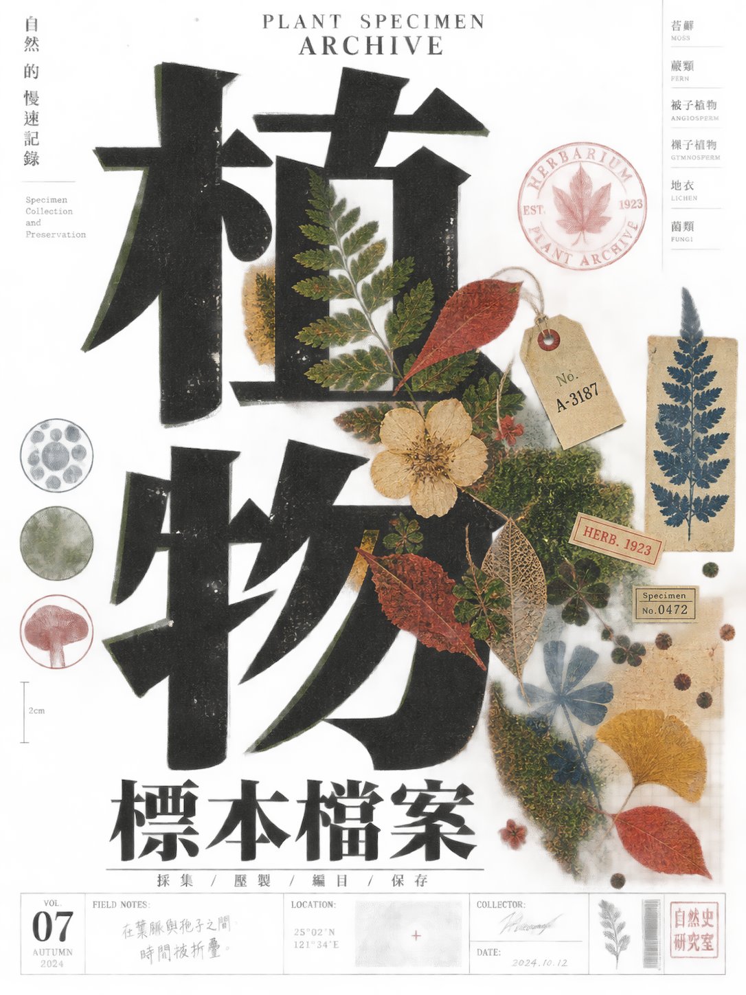
Let the future theme be provided by a magnified core symbol or subject, first creating an initial impact with large black glyphs or abstract text structures occupying the edges of the frame, then let a piece of high-saturation warm-colored flat illustration overlap, cut in, or create a misalignment relationship with it; text and images share the same set of rough printed edges, partial spot color shifts, and an incomplete regularity of a handmade feel, like real ink marks left after physical platemaking. Adopt a narrow vertical arrangement and strong whitespace, letting the main characters, theme images, and dense information columns form a clear reading path: huge black forms are responsible for weight, warm red, vermilion orange, pink, and a small amount of blue are responsible for visual jump points, and light beige paper is responsible for breathing. Text can be arranged along the vertical axis, with size, direction, and density forming a rhythmic contrast; the title glyphs emphasize exaggerated proportions, heavy strokes, tight letter spacing, sharp or asymmetric terminals, occasionally connected turns, and open counter-spaces, and must maintain a glyph skeleton recognizable across writing systems. Auxiliary text is like narrow column directories or annotations, creating order with high-density small font sizes without stealing from the subject. Illustrations use a small number of pure color blocks, silhouettes, repeating patterns, and local thin lines, staying close to the text and participating in the layout structure, not pursuing realism. Retain edge ink overflow, uneven paper base color, slight registration misalignment, and local fading, but do not add exquisite gradients, glass luster, excessive symmetry, digital sharpening, or commercial poster-style beautification; the overall feel should be like a culture magazine cover with editorial consciousness, experimental typography, and physical printing traces.

——————
Make a culture magazine cover about city sound collection: dominated by dark purple-black, with vermilion orange, coral pink, and a small block of cold cyan as high-saturation contrasts, a huge black letter structure cuts in horizontally from the top-right edge, the bottom-left features a compact illustration cluster composed of concentric ripples, microphone outlines, and intermittent lines, whitespace unfolds along the diagonal and leads the eye to the bottom information bar; the title uses right-aligned oversized characters and partial inversion, small column text is arranged vertically along the left edge, the aspect ratio is vertical 3:4.
中文参考:
ADVERTISEMENT
让未来主题由一个被放大的核心符号或主体提供内容,先以占据画面边缘的大型黑色字形或抽象文字结构形成第一眼冲击,再让一块高饱和暖色的扁平插图与其发生遮挡、切入或错位关系;文字与图像共享同一套粗粝的印刷边缘、局部套色偏移和不完全规整的手工感,像经过实体制版后留下的真实墨迹。采用偏窄的竖向编排与强烈的留白,让主字、主题图像和细密的信息栏形成清楚的阅读路径:巨大黑色形体负责重量,暖红、朱橙、粉红与少量蓝色负责视觉跳点,浅米色纸面负责呼吸。文字可沿垂直轴排列,大小、方向和密度形成节奏对比;标题字形强调夸张比例、厚重笔画、紧凑字距、锐利或不对称的端点、偶尔相连的转折与开放反白空间,必须保持跨文字系统仍可辨认的字形骨架。辅助文字像窄栏目录或注释,以高密度小字号制造秩序,不抢主体。插图使用少量纯色块、剪影、重复纹样和局部细线,贴近文字并参与版面结构,不追求写实。保留边缘溢墨、纸张底色不均、套印轻微错位和局部褪色,但不要添加精致渐变、玻璃光泽、过度对称、数字化锐化或商业海报式美化;整体应像一张有编辑意识、带实验排版和实体印刷痕迹的文化刊物封面。

——————
做成一张关于城市声音采集的文化刊物封面:以暗紫黑为主色,朱橙、珊瑚粉和一小块冷青作高饱和对照,巨大黑色字母结构从右上边缘横向切入,左下以同心波纹、麦克风轮廓和断续线条组成紧凑插图簇,留白沿对角线展开并把视线引向底部信息栏;标题采用右对齐的超大字与局部反白,细小栏目文字沿左边缘纵向排列,画幅为竖版 3:4。