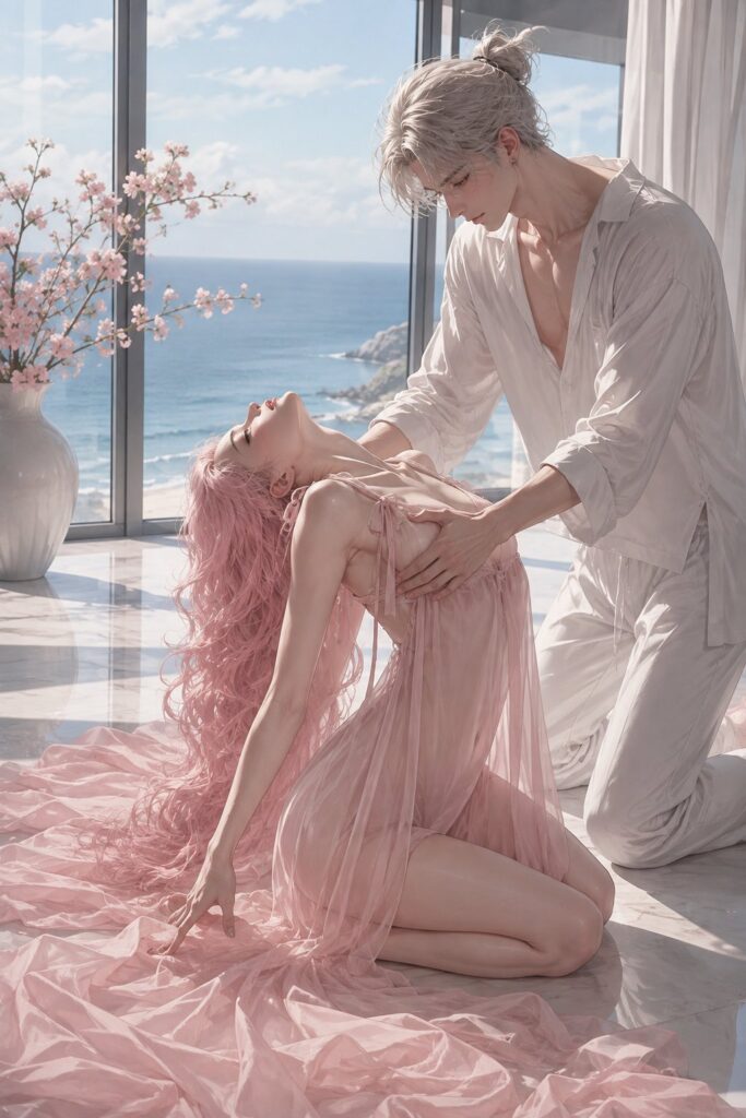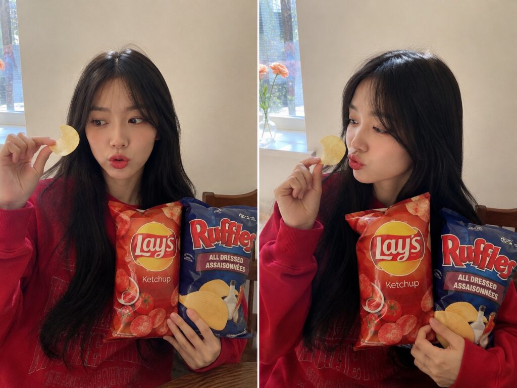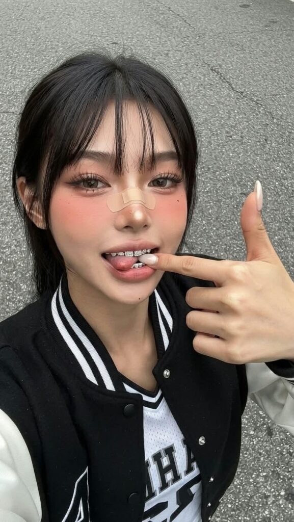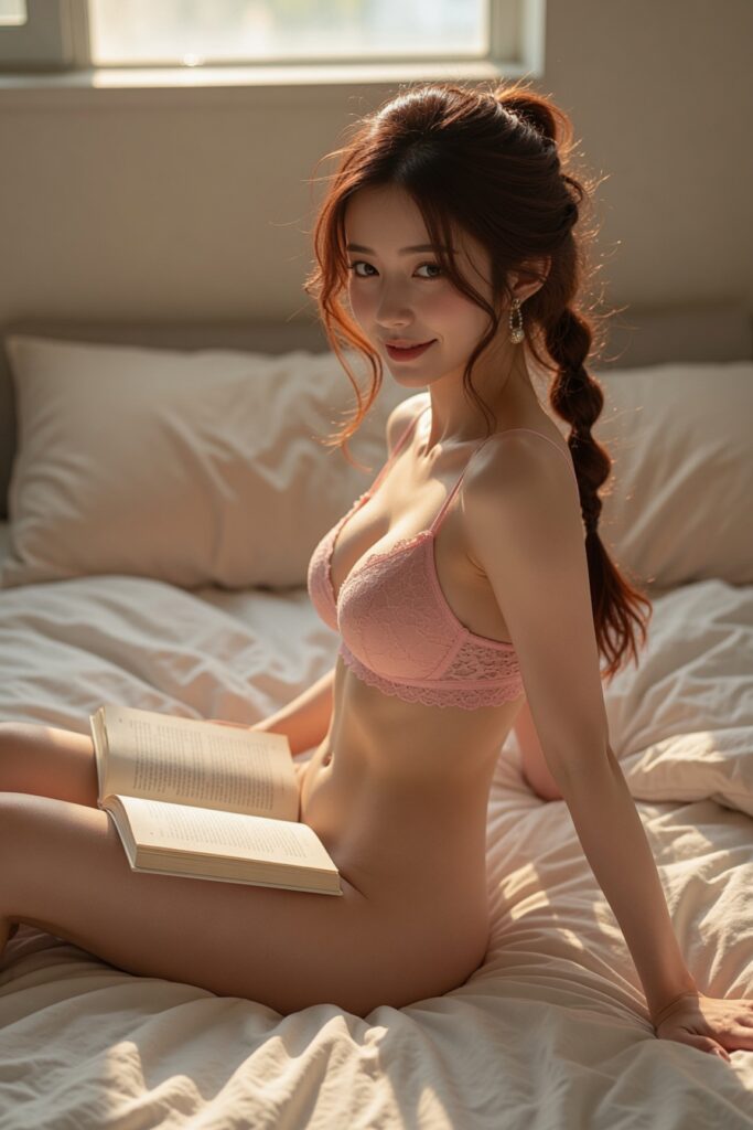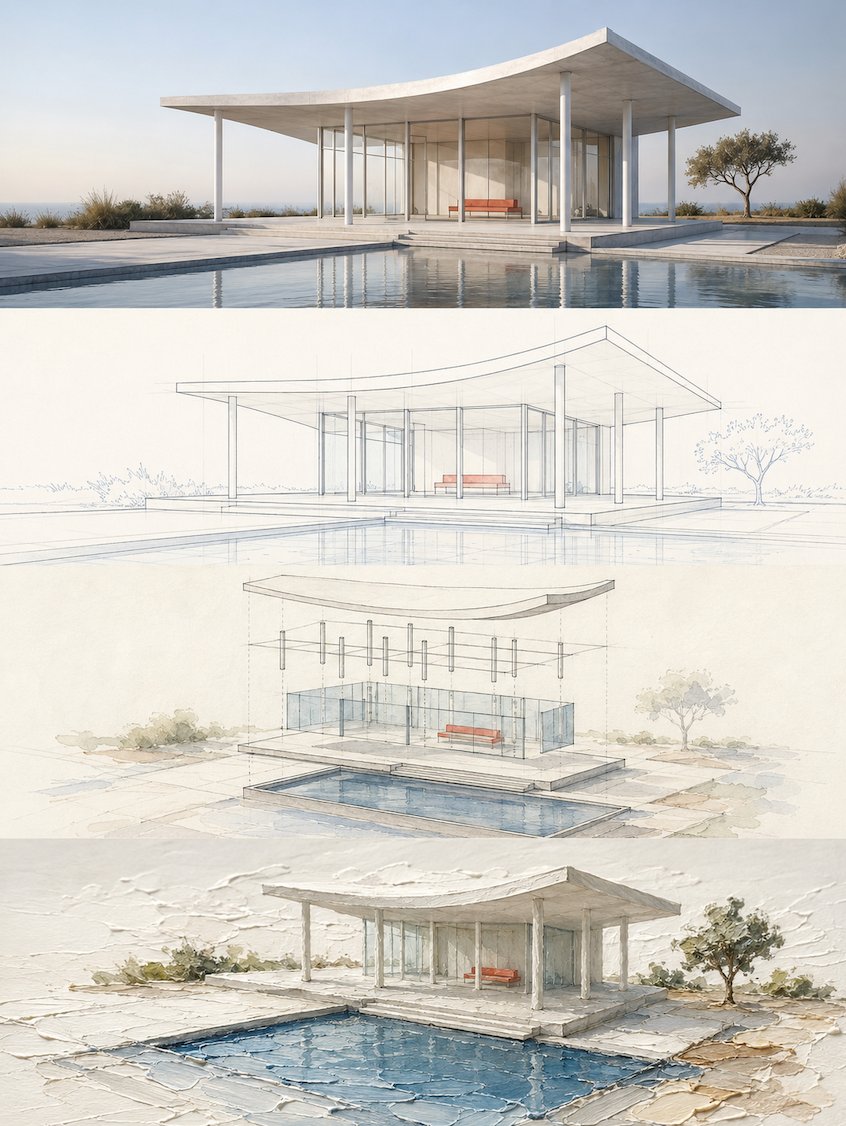
想创作具有影棚级质感且情绪松弛的艺术大片,却苦于无法完美呈现 四段式分层叙事风格转译设计海报 中复杂的细节与光影质感?
Nanobanana Pro 完美还原了画面的细腻纹理与高级氛围,助您精准定格具备顶尖商业杂志感的视觉瞬间。
复制这套免费提示词,一键复制进顶级模型,秒出大片。
Struggling to create Four Layer Narrative Style Design Poster with a high-end editorial style? Nanobanana Pro captures the textures and lighting details perfectly for a hyper-realistic masterpiece. Get FREE Prompt, enjoy one-click copy, and create instantly!
Prompt (English):
ADVERTISEMENT
Please turn each photo I upload into an independent premium design poster, no multi-image stitching, each photo output individually.

Overall 3:4 vertical composition. The frame is strictly divided from top to bottom into four equal horizontal areas, each area's height must precisely account for 25% of the overall frame, the ratio of the four layers is strictly 1:1:1:1, no ratio deviations allowed. Seamless transition between areas, no dividing lines, no white gaps. "No white gaps" here only refers to the seams between layers; inside each layer, negative space, paper, or solid color backgrounds can still be kept according to the corresponding style.

All four layers are based solely on the same uploaded photo, presenting the same subject, the same moment, and the same spatial relationship. Strictly maintain the subject's identity, quantity, key structures, proportions, posture, direction of movement, gaze, observation perspective, perspective, occlusion, left-right positions, front-back relationships, and core narrative consistency. The four layers are not four unrelated new compositions, but a continuous style translation of the same image. Since each layer is an extremely flat banner of approximately 3:1, the subject should be organized horizontally, with appropriate breathing space left on the left and right; natural horizontal extension of the background or slight cropping is allowed, but the subject must not be stretched vertically, key parts must not be cropped, character relationships must not be changed, or scenes unrelated to the original image must not be created.

The visual center of gravity, subject proportion, and contour placement of the four layers should be aligned vertically as much as possible, forming a coherent evolution from real photography gradually transitioning to the target style. Each layer must completely fill its own 25% area. Do not add layer numbers, dividing lines, borders, collage gaps, watermarks, or logos. Unless a certain layer's style description explicitly requires a small amount of edited text, receipt markings, or handwritten notes, do not generate extra text; even if text is needed, it must be minimal, restrained, not obscuring the subject, and as much as possible avoid garbled characters.

Layer 1 | Original Photography

Directly retain the real photography state of the uploaded photo as the visual benchmark for the style translation of the following three layers. Maintain the original person or subject's identity, quantity, facial features, hairstyle, clothing, structure, proportions, posture, action, gaze, interactive relationships, observation perspective, perspective, occlusion, environmental direction, natural light and shadow, and core colors, without performing illustration, texture transformation, geometrization, or 3D reconstruction.

To adapt to the extremely flat banner of approximately 3:1, only natural extension of the left and right sides of the background consistent with the logic of the original scene is allowed, or slight cropping that does not damage the subject; the subject's proportions must not be changed, people or buildings must not be stretched, and the head, hands/feet, key objects, or important narrative relationships must not be cropped. The frame remains natural, real, and clear, avoiding excessive skin smoothing, exaggerated color grading, fictional scenery, and decorations unrelated to the original image.

Layer 2 | Real Scene & Regular Line Drawing

In this approximately 3:1 flat banner area, translate the real subject of the first layer into the "Real Scene & Regular Line Drawing" style. Maintain the same subject identity, quantity, key structures, posture, left-right positions, perspective, spatial relationships, and core narrative as the first layer, then fully execute the following visual requirements:

Extract the most recognizable subject, contours, structures, postures, and narrative relationships around the theme, reconstructing them into a minimalist linear graphic expression. Do not mechanically trace details, but re-express with slender and accurate single lines, clear geometric perspective, restrained negative space, orderly detail rhythm, and appropriately abstract generalized modeling, retaining thematic features recognizable at a glance. If the theme leans toward a city or location, extract its most critical architectural skyline, street interface, signage rhythm, transportation facilities, shop window relationships, or crowd status; if the theme is not a city, extract its most core identity characteristics, contour language, structural relationships, and visual memory points, and translate them into a unified, concise, modern, and premium line drawing poster language. A small amount of geometric auxiliary elements, horizontal lines, vertical compositional lines, or rhythmic negative space can be added, making the entire frame look like a refinement and redesign of the theme's realistic scene.

The text system needs to naturally integrate into the overall layout, continuing this restrained, premium, and modern poster logic. Set a striking main title at the top; subtitles can use the original theme text, local language, country or region information, address, coordinates, serial number, year, or a short description. If the image contains street text, signs, or location information, it must be clear, natural, real, and professional, avoiding garbled characters, incorrect text, and random spelling. Text layout should be concise and orderly, together with the image forming a level of completion like collectible travel posters and city brand visuals, rather than explanatory labels randomly pasted on later.

Colors should not mechanically apply a fixed template, but should first understand the climate, light, sense of time, building materials, historical atmosphere, commercial warmth, culinary impressions, natural environment, and emotional texture of the theme itself, and then extract the primary color and background color relationship exclusive to that theme. The overall aesthetic can adopt single-color printing aesthetics or a very small amount of restrained color matching, forming rich changes through line density, brightness levels, local weight, negative space ratio, and detail rhythm, avoiding monotony and flatness. The final product should present a poster effect with clear lines, rich details, unified style, quiet modernity, agile restraint, and high-level aesthetics.

Layer 3 | Isometric Layered Watercolor Structure Study

In this approximately 3:1 flat banner area, translate the real subject of the first layer into the "Isometric Layered Watercolor Structure Study" style. Maintain the same subject identity, quantity, key structures, posture, left-right positions, perspective, spatial relationships, and core narrative as the first layer, then fully execute the following visual requirements:

Extract the most recognizable subject, contours, postures, and narrative relationships from the photo, reconstructing them into a structural deconstruction watercolor study in an axonometric style logic. The uploaded original photo is the sole basis; the subject's identity, geometric form, proportions, observation direction, spatial relationships, main colors, and scale references can only come from the original image. Do not directly paste the photo, do not do before-and-after comparisons, collages, or photographic slices.

When redrawing, first identify the core subject, main axis, original observation direction, foreground-midground-background relationships, 3–7 most important identifying features, 4–6 main colors, and environmental clues that can reflect scale in the original image. Retain the subject's overall contour, overall proportions, original perspective, symmetrical or asymmetrical relationships, key component relationships, identity-determining details, and main material colors, so that people can see at a glance that it is the same object as the original image.

The subject adopts axonometric redrawing logic, reorganized with clear, restrained, and professional axonometric spatial expression, but still faithful to the structural relationships and viewing logic of the original image. According to the subject's real structure, decompose it into 2–5 meaningful complete layers or components: buildings, objects, or composite items can be deconstructed along the roof, floors, shell, frame, base, modules, or connectors; landscapes or spaces can be expanded according to foreground, midground, background, and spatial enclosure levels; people, animals, or plants keep their bodies intact, only expressed through overlapping contours, posture layers, action lines, and surface color blocks, prohibiting dismemberment, dissection, or mechanical part-making. All layers should be restrainedly separated along the real axis or perspective direction, with uniform and moderate interlayer spacing, sharing the same central axis and spatial grid, and retaining one complete, stable, and most detail-rich base or anchor area, allowing the audience to reassemble the subject in their minds.

The overall frame composition remains professional, restrained, and editorial. The subject is centered or slightly offset according to the original image's center of gravity, with sufficient negative space around it, the stable base located at the bottom or center, and separated structural layers expanding upwards, outwards, or toward the depth of field along the real axis. Avoid dramatic fragmentation, excessive explosion diagrams, meaningless decorations, and mechanical deconstruction. The overall effect is like a highly complete research-type editorial poster, rather than an engineering manual.

The painting language adopts the temperament of an "architectural structural deconstruction watercolor study on warm ivory white watercolor paper," which can combine clear line drafts, semi-transparent watercolor blocks, a small amount of structural auxiliary lines, and restrained analytical markings. Retain slight paper texture, detailed brushstrokes, transparent color layering, and rational negative space, making it have both the knowledge sense of a research diagram and the elegance of an art publication. Colors are extracted from the original image and appropriately purified, remaining clear, accurate, restrained, and spirited, avoiding grayness, heaviness, over-rendering, and a cheap computer-rendered feel.

Text, as part of the composition, intervenes naturally in the form of "research diagrams / editorial notes." Extract a short title from the subject's identity, theme, action, state, or symbolic meaning of the photo, and pair it with a very small amount of numbering, structural markings, lateral notes, material words, status words, or miniature descriptions. Text remains slender, restrained, and professional, and can be arranged horizontally, vertically, or staggered along the axis, layering direction, negative space edges, or structural annotation positions, making it look like a combination of architectural research, watercolor observation diagrams, and high-end editorial design, rather than an ordinary poster title.

The whole presents axonometric structural logic, professional deconstruction order, watercolor research texture, editorial negative space, and premium publishing temperament. Whether the subject is a building, person, animal, plant, object, vehicle, street scene, interior, or natural landscape, the entire frame should grow the most appropriate deconstruction method from the original image's own structure, maintaining high adaptability and transferability. Avoid templated explosion diagrams, complex tech user interfaces, a sense of dismemberment, mechanical part sense, cartoonishness, e-commerce feel, and unfounded structural fabrications.

Layer 4 | Isometric 3D Impasto Space

In this approximately 3:1 flat banner area, translate the real subject of the first layer into the "Isometric 3D Impasto Space" style. Maintain the same subject identity, quantity, key structures, posture, left-right positions, perspective, spatial relationships, and core narrative as the first layer, then fully execute the following visual requirements:

Extract the most recognizable subject, contours, postures, and narrative relationships from the photo, reconstructing them into an exquisite impasto micro-landscape with axonometric three-dimensional spatial logic. The subject is not a flat illustration, but a three-dimensional miniature entity with clear volume, structure, front-to-back relationships, and a stable landing point; retain the object's most critical identity features, and appropriately organize the perspective and proportions to make it more complete, clear, and sculptural within a unified axonometric space.

The subject sits on a thematic color field formed by impasto paint. The color block is not an ordinary rectangular background, but should be converted into water, ground, road, grass, light belt, shoreline, shadow, or other spatial slices related to the theme according to the original image content, and naturally extend along the axonometric perspective direction. The subject must have a real spatial relationship with the color block, such as landing, embedding, passing through, extending, reflection, ripple, projection, or partial boundary-crossing, skillfully connecting the two-dimensional impasto strokes with the three-dimensional subject.

The composition is adaptively arranged based on the subject's volume, orientation, and movement direction, establishing a professional spatial order with diagonal axonometry, stable center of gravity, front-to-back depth, and large areas of negative space. The subject is usually located at a key node of the color block rather than mechanically centered, with the color block serving as visual guidance and perspective extension; if necessary, a set of low-weight clouds, sun, plants, ripples, or abstract natural imagery can be added to form front-to-back layers with the subject, but without establishing a second visual center.

The painting language uses a fusion of isometric miniature model x impasto oil painting x real paper surface. The subject's details are exquisite and the volume is clear, while the surrounding environment retains obvious palette knife marks, thick paint accumulation, undulating edges, and handcrafted brushstrokes; clouds, water, ground, and light can have an oil paint thickness similar to bas-relief, creating a tactile illusion of "a real model standing on oil paint that hasn't dried yet."

The color scheme is remixed by extracting the brightest, most vivid colors that best represent the subject's spirit from the uploaded original image, increasing brightness, purity, and vitality, using a large amount of clean warm white as breathing space, paired with a clear primary color and a small amount of sunlight-like warm color highlights. The overall look is bright, healing, vivid, and premium, avoiding grayness, gloom, Morandi-style tones, fluorescence, and cheap candy colors.

Text intervenes sparingly, extracting a short title from the photo's subject, location, emotion, or symbolic meaning, paired with a very small amount of sub-text, numbering, or miniature notes. The layout remains detailed and restrained, and can be arranged according to the axonometric direction, the edges of the impasto color blocks, or negative space areas, forming a clever echo with the spatial perspective, rather than a title independently pasted on the frame.

The whole presents a visual relationship of "axonometric three-dimensional subject x impasto color field x bright healing color scheme x real paper x large negative space." Whether the subject is a building, person, animal, plant, object, vehicle, or natural landscape, the three-dimensional subject should truly "stand, grow, or exist" in the space formed by the impasto color blocks, avoiding flat textures, ordinary illustrations, plastic computer rendering, toy model sense, and templated micro-landscapes.
中文参考:
ADVERTISEMENT
请将我上传的每一张照片分别制作成一张独立的高级设计海报,不多图拼接,每张照片单独输出。

整体采用 3:4竖版构图。画面从上到下严格四等分为四个横向区域,每个区域高度必须精确占整体画面的25%,四层比例严格为1:1:1:1,不允许出现比例偏差。区域之间无缝衔接,无分隔线、无留白间隙。这里的“无留白间隙”仅指层与层的接缝不能出现空隙;每层内部仍可按照对应风格保留负空间、纸面或纯色背景。

四层全部以同一张上传照片为唯一依据,呈现同一主体、同一瞬间和同一空间关系。严格保持主体身份、数量、关键结构、比例、姿态、动作方向、视线、观察视角、透视、遮挡、左右位置、前后关系与核心叙事一致。四层不是四张互不相关的新构图,而是同一画面的连续风格转译。由于每层均为约3:1的极扁横幅,主体应横向组织,并保留适量左右呼吸空间;允许对背景进行自然横向延展或轻微裁切,但不得纵向拉伸主体、裁掉关键部位、改变人物关系,或另造与原图无关的场景。

四层的视觉重心、主体占比和轮廓落点尽量上下对齐,形成从真实摄影逐步过渡到目标风格的连贯演化。每层都必须完整填满自身25%的区域。不要添加层号、分隔线、边框、拼贴缝隙、水印或Logo。除非某层风格说明明确要求少量编辑文字、票据标记或手写注释,否则不要额外生成文字;即使需要文字,也必须少量、克制、不遮挡主体,并尽量避免乱码。

第一层|原始摄影

直接保留上传照片的真实摄影状态,作为后三层风格转译的视觉基准。保持原始人物或主体的身份、数量、面部特征、发型、服装、结构、比例、姿态、动作、视线、互动关系、观察视角、透视、遮挡、环境方向、自然光影与核心色彩,不进行插画化、材质化、几何化或三维重建。

为了适配约3:1的极扁横幅,只允许对背景左右两侧进行符合原场景逻辑的自然延展,或进行不损伤主体的轻微裁切;不得改变主体比例,不得拉伸人物或建筑,不得裁掉头部、手脚、关键物件或重要叙事关系。画面保持自然、真实、清晰,避免过度磨皮、夸张调色、虚构景物和与原图无关的装饰。

第二层|真实场景与规则线描

在本层约3:1的扁横幅区域中,将第一层的真实主体转译为“真实场景与规则线描”风格。保持与第一层一致的主体身份、数量、关键结构、姿态、左右位置、视角、空间关系与核心叙事,再完整执行以下视觉要求:

围绕主题提取最具识别性的主体、轮廓、结构、姿态与叙事关系,重构为一幅极简线条图形化表达。不要机械描摹细节,而是以纤细准确的单线、清晰几何透视、克制留白、有秩序的细节节奏和适度抽象的概括造型重新表达,保留一眼可识别的主题特征。若主题偏城市或地点,可提取其最关键的建筑天际线、街道界面、标牌节奏、交通设施、橱窗关系或人群状态;若主题不是城市,也应提取其最核心的身份特征、轮廓语言、结构关系与视觉记忆点,并转化为统一、简洁、现代、高级的线描海报语言。可加入少量几何辅助元素、水平线、纵向构成线或节奏性留白,使整张画面像是对主题现实场景的提炼与再设计。

文字系统需要自然融入整体版式,延续这种克制、高级、现代的海报逻辑。顶部设置醒目的主标题;副标题可使用主题原文、当地语言、国家或地区信息、地址、坐标、编号、年份或一句简短说明。若画面包含街头文字、招牌或地点信息,必须清晰、自然、真实、专业,避免乱码、错误文字与随意拼写。文字排版应简洁有秩序,与画面共同构成收藏级旅行海报与城市品牌视觉般的完成度,而不是后期随意贴上的说明标签。

色彩不要机械套用固定模板,而应先理解主题本身的气候、光线、时间感、建筑材料、历史气息、商业温度、饮食印象、自然环境与情绪质地,再提炼出专属于该主题的主色与底色关系。整体可采用单色印刷美学或极少量克制配色,通过线条疏密、明度层次、局部压重、留白比例与细节节奏形成丰富变化,避免单调和平铺。最终成品应呈现线条清晰、细节丰富、风格统一、安静现代、灵动克制、审美高级的海报效果。

第三层|等距分层水彩结构研究图

在本层约3:1的扁横幅区域中,将第一层的真实主体转译为“等距分层水彩结构研究图”风格。保持与第一层一致的主体身份、数量、关键结构、姿态、左右位置、视角、空间关系与核心叙事,再完整执行以下视觉要求:

从照片中提取最具识别性的主体、轮廓、姿态与叙事关系,重构为一张 轴测式风格逻辑的结构解构水彩研究图。上传的原始照片是唯一依据,主体的身份、几何形态、比例、观察方向、空间关系、主要颜色与尺度参照只能来自原图。不要直接贴用照片,不要做前后对比、拼贴或摄影切片。

重绘时先识别原图中的核心主体、主轴线、原始观察方向、前中后景关系、3–7 个最重要的辨识特征、4–6 种主要颜色,以及能够体现尺度的环境线索。保留主体的整体轮廓、总体比例、原始视角、对称或非对称关系、关键构件关系、决定身份的细节与主要材质色彩,让人一眼看出与原图是同一对象。

主体采用 轴测式重绘逻辑,以清晰、克制、专业的轴测式空间表达重新组织,但仍然忠于原图的结构关系与观看逻辑。根据主体真实结构,将其拆分为 2–5 个有意义的完整层级或构件:建筑、器物或组合物体可沿屋顶、楼层、壳体、框架、基座、模块或连接体解构;景观或空间可按前景、中景、背景与空间围合层次展开;人物、动物或植物保持身体完整,只通过重叠轮廓、姿态层、动作线和表面色块表达,禁止肢解、解剖或机械零件化。所有分层都应沿真实轴线或透视方向克制分离,层间距均匀适中,共享同一中心轴与空间网格,并保留一个完整、稳定、细节最丰富的基座或锚点区域,让观众能够在脑中重新组装主体。

整张画面构图保持专业、克制、编辑化。主体居中或根据原图重心轻微偏置,四周保留充足留白,稳定基座位于下部或中心,分离的结构层沿真实轴线向上、向外或向景深方向展开。避免戏剧化碎裂、过度爆炸图、无意义装饰与机械感拆解。整体像一张完成度很高的研究型编辑海报,而不是工程说明书。

绘画语言采用 温暖象牙白水彩纸底上的建筑结构解构水彩研究图 气质,可结合清晰线稿、半透明水彩色块、少量结构辅助线与克制的分析性标记。保留轻微纸纹、细致笔触、透明叠色和理性留白,使其既有研究图的知识感,也有艺术出版物的优雅感。色彩从原图提取并适度提纯,保持清澈、准确、克制与有精气神,避免灰脏、厚重、过度渲染和廉价电脑渲染感。

文字作为构图的一部分,以 研究图 / 编辑注释 的方式自然介入。从照片的主体身份、主题、动作、状态或象征意义中提炼一个简短标题,并搭配极少量编号、结构标记、侧向注释、材料词、状态词或微型说明。文字保持细长、克制、专业,可沿轴线、分层方向、留白边缘或结构标注位置横排、竖排、错位排列,使其像建筑研究、水彩观察图与高级编辑设计之间的结合,而不是普通海报标题。

整体呈现 轴测式结构逻辑、专业解构秩序、水彩研究质感、编辑留白与高级出版气质。无论主体是建筑、人物、动物、植物、器物、交通工具、街景、室内或自然景观,整张画面都应从原图自身结构中生长出最恰当的解构方式,保持高度适配性与可迁移性。避免模板化爆炸图、复杂科技用户界面、肢解感、机械零件感、卡通感、电商感和无依据的结构杜撰。

第四层|等距立体厚涂空间

在本层约3:1的扁横幅区域中,将第一层的真实主体转译为“等距立体厚涂空间”风格。保持与第一层一致的主体身份、数量、关键结构、姿态、左右位置、视角、空间关系与核心叙事,再完整执行以下视觉要求:

从照片中提取最具识别性的主体、轮廓、姿态与叙事关系,以 轴测式三维空间逻辑重构为精致的厚涂微景观。主体不是平面插画,而是具有明确体积、结构、前后关系和稳定落点的立体微缩实体;保留原物最关键的身份特征,可适度整理视角与比例,使其在统一轴测空间中更加完整、清晰、有雕塑感。

主体坐落在一块由厚涂颜料形成的主题色域之上。色块不是普通矩形背景,而应根据原图内容转化为水面、地面、道路、草地、光带、岸线、影子或其他与主题相关的空间切片,并沿轴测透视方向自然延伸。主体必须与色块发生真实空间关系,可出现落地、嵌入、穿越、延伸、倒影、波纹、投影或局部越界,使二维厚涂笔触与三维主体巧妙连接。

构图依据主体的体量、朝向和运动方向自适应安排,以斜向轴测、稳定重心、前后纵深和大面积留白建立专业空间秩序。主体通常位于色块的关键节点而非机械居中,色块承担视线引导和透视延伸;必要时可加入一组低权重的云、太阳、植物、波纹或抽象自然意象,与主体形成前后层次,但不建立第二视觉中心。

绘画语言采用立体微缩模型 × 厚涂油画 × 真实纸面的融合方式。主体细节精致、体积清晰,周围环境则保留明显的刮刀痕迹、厚颜料堆积、起伏边缘和手工笔触;云、水、地面和光线可以具有近似浮雕般的油彩厚度,使画面产生“真实模型立在尚未干透的油画颜料上”的触觉错觉。

配色从上传的原图中提取最明亮、最鲜活、最能代表主体精气神的颜色重新调制,提高明度、纯净度和生命力,以大量清洁暖白作为呼吸空间,搭配清透主色和少量阳光般的暖色点睛。整体明亮、治愈、鲜活而高级,避免灰脏、低沉、莫兰迪化、荧光感和廉价糖果色。

文字少量介入,从照片的主体、地点、情绪或象征意义中提炼简短标题,并搭配极少量副文、编号或微型注释。排版保持细致、克制,可顺应轴测方向、厚涂色块边缘或留白区域排列,与空间透视形成巧妙呼应,而不是独立贴在画面上的标题。

整体呈现 轴测式立体主体 × 厚涂色域 × 明亮治愈配色 × 真实纸张 × 大面积留白 的视觉关系。无论主体是建筑、人物、动物、植物、器物、交通工具或自然景观,都应让三维主体真实“站立、生长或存在”于厚涂色块构成的空间中,避免平面贴图、普通插画、塑料感电脑渲染、玩具模型感和模板化微景观。