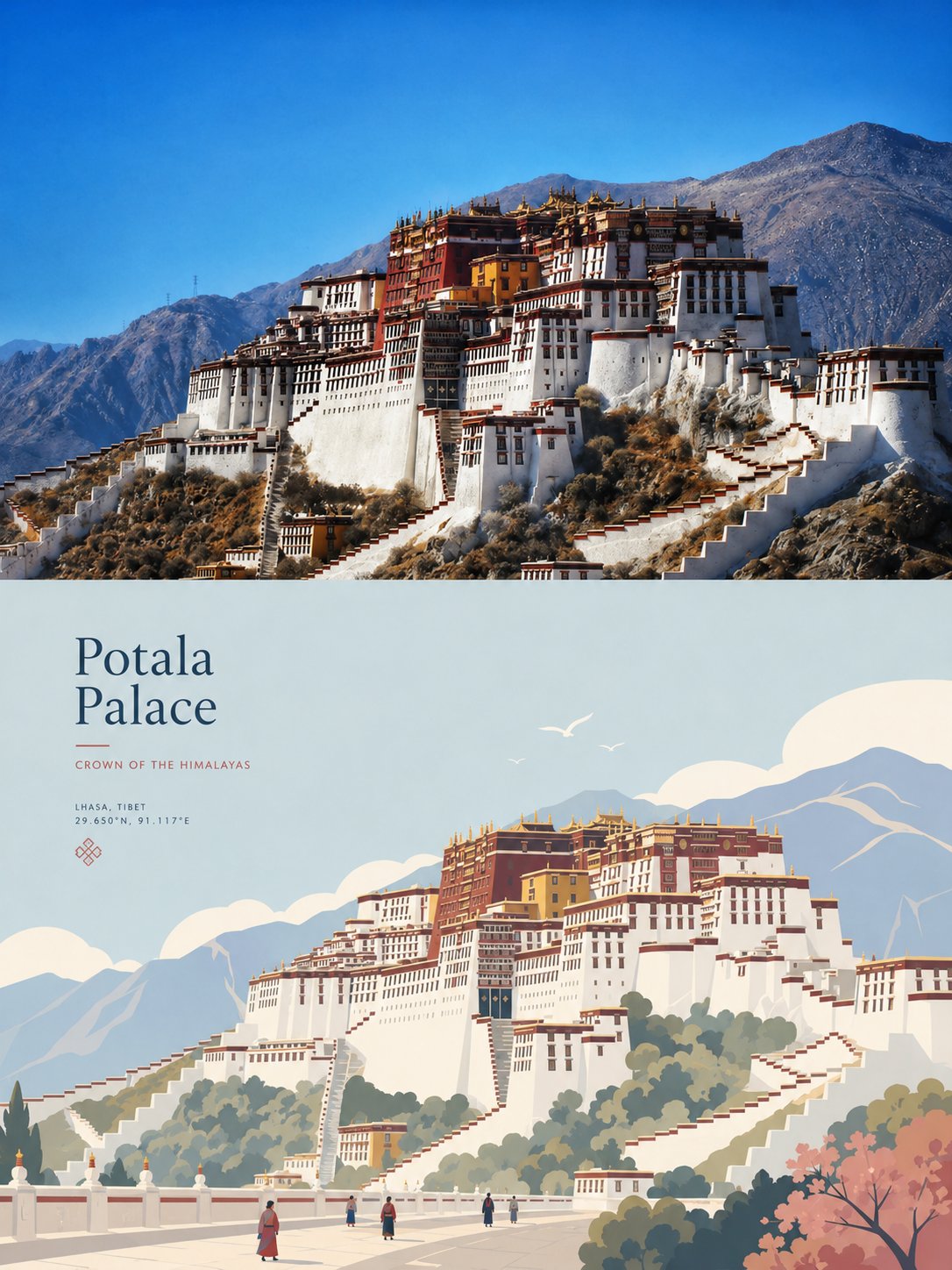
想创作具有影棚级质感且情绪松弛的艺术大片,却苦于无法完美呈现 高级简约艺术杂志风分屏旅行海报 中复杂的细节与光影质感?
Nanobanana Pro 完美还原了画面的细腻纹理与高级氛围,助您精准定格具备顶尖商业杂志感的视觉瞬间。
复制这套免费提示词,一键复制进顶级模型,秒出大片。
Struggling to create High End Minimalist Split Travel Poster Design with a high-end editorial style? Nanobanana Pro captures the textures and lighting details perfectly for a hyper-realistic masterpiece. Get FREE Prompt, enjoy one-click copy, and create instantly!
Prompt (English):
ADVERTISEMENT
Please turn each photo I upload into a separate, independently designed high-end poster. Do not make a collage or combine multiple images—each photo should be processed and output individually. Use an overall **3:4 vertical composition**, with the canvas divided into **two equal sections top and bottom**, in a strict **1:1 height ratio**, each occupying **50% of the image**.

The **upper half** should preserve the original photo, maintaining the subject’s identity, structure, pose, authentic texture, natural lighting, and original color atmosphere. Only apply subtle, refined photographic color grading to give it the feel of an **art magazine, independent publication, or exhibition photography**. To fit the format, the sky, ground, or environmental background may be naturally extended if needed, but the main subject must **not** be stretched, distorted, or altered.

The **lower half** should extract the most recognizable **subject, silhouette, pose, and narrative relationship** from the photo, and reconstruct them into a **premium minimalist flat-vector travel poster** style illustrated scene. Do not mechanically trace the photo. Instead, based on the original image’s visual personality, distill the most representative main visual focal point, and build around it with **2–4 supporting elements** that best express the atmosphere of the environment, the way of everyday life, the sense of place, or the state of living. Whether the original image contains a city, architecture, people, animals, plants, objects, vehicles, or natural scenery, the lower half should feel like a **custom-designed high-end travel visual poster** made specifically for that subject, rather than a fixed template applied to everything.

The composition should be reorganized according to the subject’s own character, rather than repeating the same layout. Build the image using **one clear focal point, distinct foreground-background layering, appropriate negative space, and a calm, orderly visual rhythm**. Depending on the original image, the scene may naturally transform into a street, plaza, waterfront, courtyard, passageway, platform, plant-based setting, interior corner, open landscape, or an environmental fragment with traces of daily life. The subject must always remain the primary visual center; all other elements should only reinforce the uniqueness of **“this place / this object / this situation.”** Avoid collage-like landmark stacking, postcard-style listing, or overly narrative arrangements. If people are needed in the scene, include only **3–6 small-scale figures**, naturally integrated into the environment, with **no single protagonist**.

The overall style should be **high-end minimalist flat vector illustration**: inspired by **Japanese stationery aesthetics, boutique sticker illustration, and modern editorial travel branding**. Use **clean geometric forms, soft contours, consistent line weight, flat color blocks, and restrained detailing**. The overall feeling should be **fresh, quiet, delicate, and contemporary**. Avoid realism, heavy shadows, watercolor textures, paper textures, complex brushwork, gradients, crowded backgrounds, and excessive detail.

The color palette should be based on a **soft, airy, slightly desaturated premium palette**, which may be adjusted by extracting and harmonizing the overall color temperature from the original image, while keeping the final result light and cohesive. Use **light pink-blue, misty blue, sky blue, and airy cool blues** to build the main atmosphere; balance them with **ivory white, creamy white, light beige, soft gray-green, and architectural neutrals**. Only allow a small amount of **dusty rose or muted blush** as subtle accents—for flowers, clothing, small signs, awnings, or local decorative details—so the image feels breathable yet still refined and layered.

The **text logic** should also become part of this style. Do not simply apply a city-name template. Instead, extract a **short title** from the original image’s **location, object name, theme, condition, or atmosphere**, and place it in the **upper left corner** or another area with generous negative space. Pair it with a **brief, restrained, tasteful tagline**. Typography should remain **understated, editorial, spacious, and premium**, never overpowering the visual. If necessary, add a small amount of secondary text, coordinate-style annotations, or tiny descriptive notes, so the text feels like a natural visual identity element from a **high-end travel brand or boutique postcard**, rather than a title bar added afterward.

The overall result should feel like a **high-end travel poster / boutique lifestyle postcard** designed specifically for the subject: **fresh, elegant, quiet, modern, and refined**, with generous negative space and a relaxed sense of presence. The **lower half of every poster must have its own independent visual identity**—you must not simply change the name while reusing the same composition, the same foreground, or the same arrangement of objects. Avoid anything that feels templated, repetitive, generic, or formulaic like a standard tourism poster.
中文参考:
ADVERTISEMENT
请将我上传的每张照片转换为一个单独的、独立设计的高级海报。不要制作拼贴画或合并多张图像——每张照片都应单独处理和输出。使用整体的 3:4 纵向构图,画布分为上下两个相等的部分,采用严格的 1:1 高度比例,各占图像的 50%。

上半部分应保留原始照片,保持主体的身份、结构、姿势、真实的纹理、自然的光线和原始的色彩氛围。仅应用细微、精致的摄影调色,使其具有艺术杂志、独立出版物或展览摄影的感觉。为了适应格式,如果需要,可以自然延伸天空、地面或环境背景,但主体不得被拉伸、扭曲或改变。

下半部分应从照片中提取最具辨识度的主体、轮廓、姿势和叙事关系,并将它们重构为一个高级简约扁平矢量旅行海报风格的插画场景。不要机械地描摹照片。相反,根据原始图像的视觉个性,提炼出最具代表性的主要视觉焦点,并围绕它构建 2–4 个辅助元素,以最好地表达环境的氛围、日常生活方式、地方感或生活状态。无论原始图像包含城市、建筑、人物、动物、植物、物体、车辆还是自然风光,下半部分都应感觉像是专门为该主体定制设计的高级旅行视觉海报,而不是套用在所有事物上的固定模板。

构图应根据主体自身的性格重新组织,而不是重复相同的布局。使用一个明确的焦点、清晰的前景-背景层次、适当的留白和冷静、有序的视觉节奏来构建图像。根据原始图像,场景可能会自然地转化为街道、广场、水边、庭院、通道、平台、植物环境、室内角落、开阔景观或带有日常生活痕迹的环境片段。主体必须始终保持为主要的视觉中心;所有其他元素应仅加强“这个地方 / 这个物体 / 这种情境”的独特性。避免拼贴式的地标堆砌、明信片式的罗列或过于叙事性的安排。如果场景中需要人物,仅包含 3–6 个小比例人物,自然地融入环境中,没有单一的主角。

整体风格应为高级简约扁平矢量插画:灵感来自日本文具美学、精品贴纸插画和现代编辑类旅行品牌设计。使用干净的几何形状、柔和的轮廓、一致的线宽、扁平色块和克制的细节。整体感觉应是清新、宁静、细腻且具有现代感。避免写实主义、厚重的阴影、水彩纹理、纸张纹理、复杂的笔触、渐变、拥挤的背景和过多的细节。

色调应基于柔和、轻盈、略显低饱和度的高级色板,可以通过提取并协调原始图像的整体色温进行调整,同时保持最终结果轻盈且凝聚。使用浅粉蓝、雾霾蓝、天蓝和轻盈的冷蓝色来构建主要氛围;用象牙白、奶白色、浅米色、柔和的灰绿色和建筑中性色来平衡它们。仅允许少量的灰粉色或柔和的浅粉色作为微妙的点缀——用于花朵、服装、小招牌、遮阳篷或局部装饰细节——使图像感觉透气但仍精致且富有层次感。

文字逻辑也应成为这种风格的一部分。不要简单地套用城市名称模板。相反,从原始图像的地点、物体名称、主题、状况或氛围中提取一个简短的标题,并将其放置在左上角或其他有大量留白的区域。为其配上一个简短、克制、有品位的标语。排版应保持低调、编辑风格、空间感和高级感,永远不要压过视觉效果。如有必要,添加少量的辅助文字、坐标式注释或微小的描述性说明,使文字感觉像是来自高级旅行品牌或精品明信片的自然视觉识别元素,而不是事后添加的标题栏。

整体效果应感觉像是专门为该主体设计的高级旅行海报 / 精品生活方式明信片:清新、优雅、宁静、现代且精致,具有大量的留白和轻松的临场感。每张海报的下半部分必须具有其独立的视觉身份——你绝不能在重复使用相同构图、相同前景或相同物体排列的同时仅仅更改名称。避免任何感觉像模板化、重复、通用或公式化的东西,如标准的旅游海报。