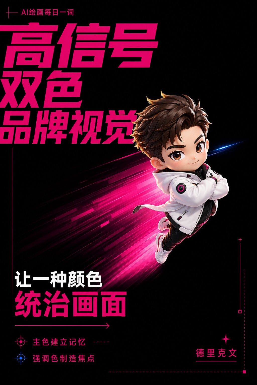
想创作具有影棚级质感且情绪松弛的艺术大片,却苦于无法完美呈现 高信号双色品牌视觉海报 中复杂的细节与光影质感?
Nanobanana Pro 完美还原了画面的细腻纹理与高级氛围,助您精准定格具备顶尖商业杂志感的视觉瞬间。
复制这套免费提示词,一键复制进顶级模型,秒出大片。
Struggling to create High Signal Two Color Branding Poster with a high-end editorial style? Nanobanana Pro captures the textures and lighting details perfectly for a hyper-realistic masterpiece. Get FREE Prompt, enjoy one-click copy, and create instantly!
Prompt (English):
ADVERTISEMENT
Design a 3:4 vertical 'High-Signal Two-Color Branding' poster for [Brand/Product/Character IP]. The visual uses Electric Magenta as the absolute main color, accounting for about 75%; Speed Blue as the scarce emphasis color, accounting for no more than 10%; the rest use pure black and cold white. Equal distribution of colors is prohibited. Use Swiss grid and bold asymmetrical composition, with oversized titles cutting in from the edges of the frame, allowing partial natural cropping; the core subject is off-center, occupying about 45% of the frame, with high-speed motion blur, scanning tracks, or directional ghosting, expressing ambition, speed, and a sense of rising. Titles use bold geometric sans-serif fonts, while numbers, coordinates, dates, and technical annotations use monospaced fonts. Add fine line coordinates, arrows, sequence numbers, and a very small amount of data, but do not create complex dashboards. The subject uses high-completion photography or exquisite 3D visuals, avoiding clichés such as handshakes, office buildings, business meetings, etc. The overall style is like a combination of cutting-edge tech brands, trendy magazines, and quantitative finance visual systems, eye-catching, precise, young, and impactful. Core logic: High-signal visuals rely not on 'multiple colors,' but on color power inequality: 75% main color establishes memory; 10% auxiliary color creates scarce focus; black and white are responsible for information and breathing space; monospaced fonts transmit technical attributes; moving images express brand personality.中文参考:
ADVERTISEMENT
为【品牌/产品/人物IP】设计一张3:4竖版「高信号双色品牌视觉」海报,High-Signal Two-Color Branding。画面采用电光洋红作为绝对主色,占比约75%;
速度蓝作为稀缺强调色,占比不超过10%;
其余使用纯黑和冷白。
禁止平均分配颜色。使用瑞士网格与大胆非对称构图,
超大标题从画面边缘切入,局部允许自然裁切;
核心主体偏离中心,占画面约45%,
带高速运动模糊、扫描轨迹或方向性拖影,
表达野心、速度和上升感。标题使用粗体几何无衬线字体,
数字、坐标、日期和技术注释使用等宽字体。
加入细线坐标、箭头、序列编号和极少量数据,
但不制作复杂仪表盘。主体采用高完成度摄影或精致3D视觉,
避免握手、写字楼、商务会议等陈词滥调。
整体像前沿科技品牌、潮流杂志与量化金融视觉系统的结合,
醒目、精准、年轻、有冲击力。 核心逻辑高信号视觉靠的不是「多颜色」,而是颜色权力不平等:75%主色建立记忆
10%辅色制造稀缺焦点
黑白负责信息和呼吸感
等宽字体传递技术属性
运动图像表达品牌性格