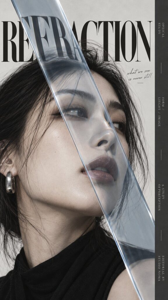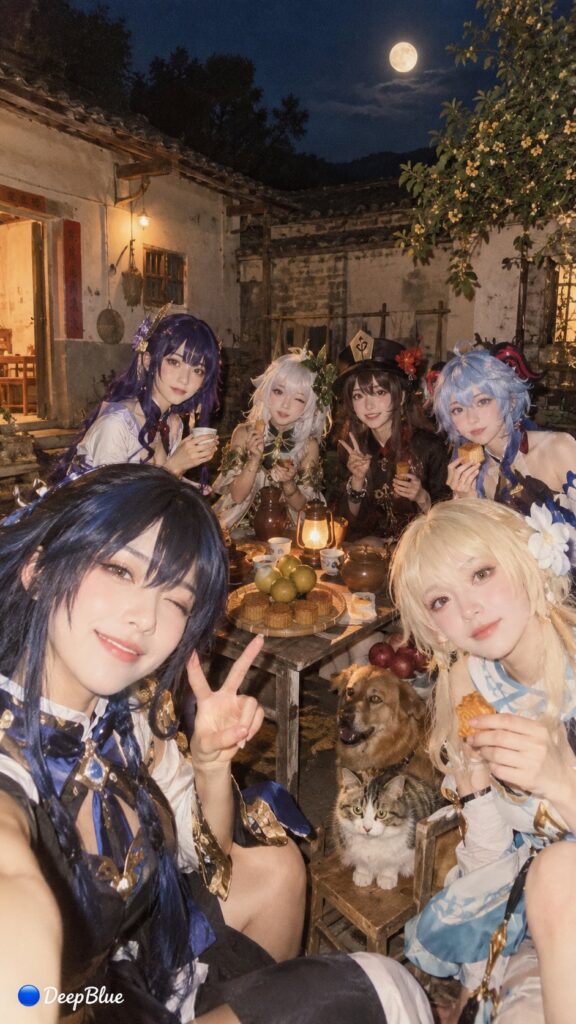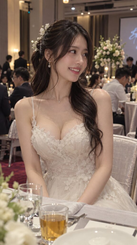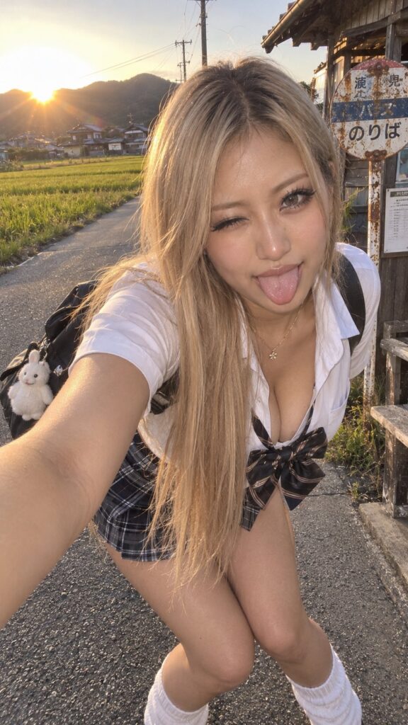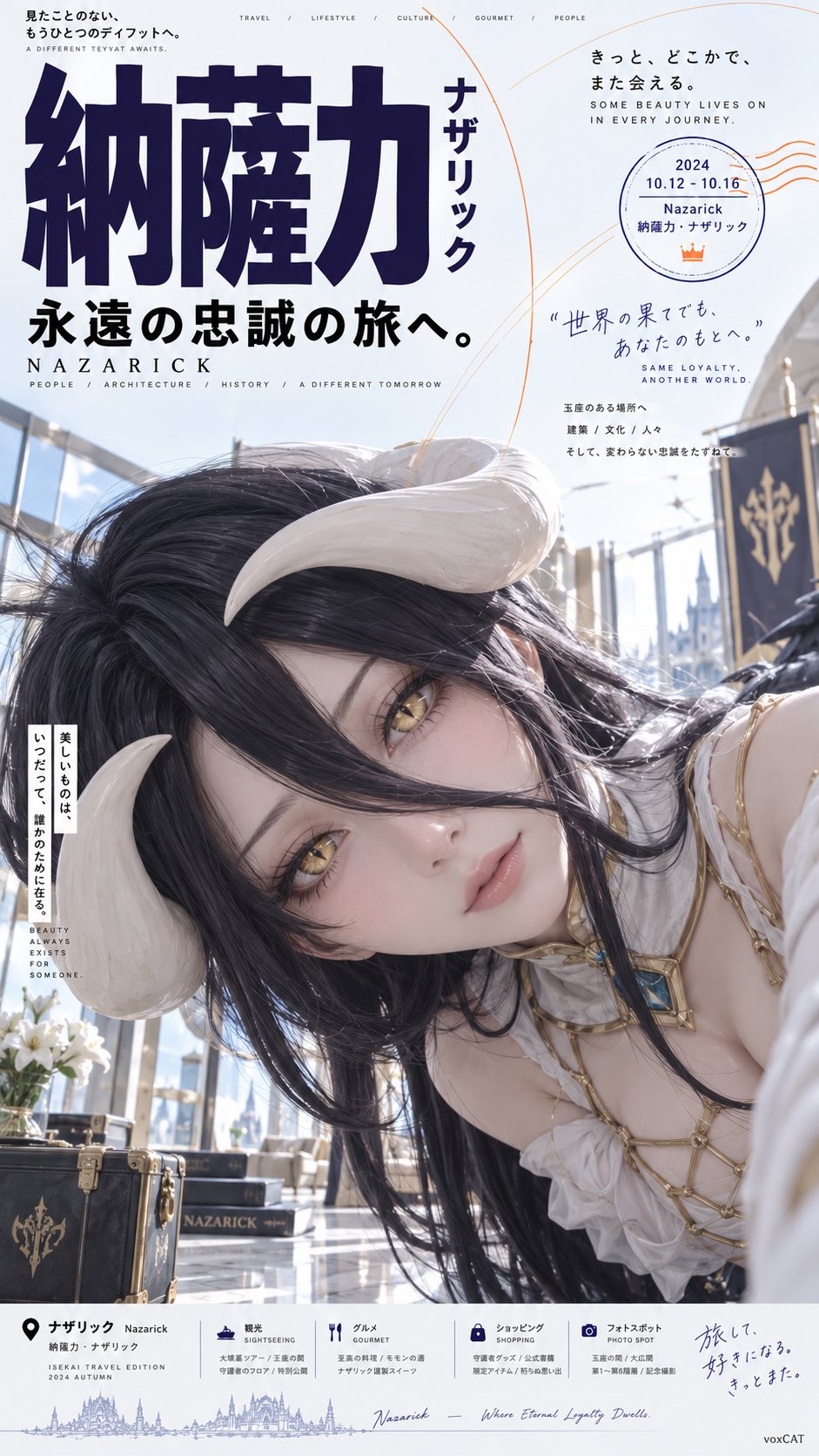
想创作具有影棚级质感且情绪松弛的艺术大片,却苦于无法完美呈现 日系旅行杂志荒诞歪头横向构图海报 中复杂的细节与光影质感?
Nanobanana Pro 完美还原了画面的细腻纹理与高级氛围,助您精准定格具备顶尖商业杂志感的视觉瞬间。
复制这套免费提示词,一键复制进顶级模型,秒出大片。
Struggling to create Japanese Travel Magazine Meme Editorial Poster with a high-end editorial style? Nanobanana Pro captures the textures and lighting details perfectly for a hyper-realistic masterpiece. Get FREE Prompt, enjoy one-click copy, and create instantly!
Prompt (English):
ADVERTISEMENT
[Character], preserve the most core identification features of the character, including face shape, hairstyle silhouette, hair color, pupil color, iconic accessories, clothing structure, representative colors, and temperament.

Design the character as a Japanese travel magazine Editorial poster with a slight internet Meme vibe. The character is shot in an extreme close-up, with the head tilted significantly to one side by about 70–90°, the face almost horizontal in the frame, and the head and face occupying more than half of the image; the upper body invades the composition horizontally from the right or bottom right, with shoulders, hair, and body extending naturally out of the frame, forming an unconventional 'horizontal intrusion into the frame' posture. The character's eyes are clearly visible and looking directly at the camera, with a natural expression, slightly confused, curious, or indifferent, not doing standard studio poses, and not standing upright.

Use slight wide-angle close-up perspective, the face is close to the lens, features have slight perspective magnification but remain natural and accurate; the subject creates a clear directional conflict with the vertical layout direction, creating a visual contrast of 'character posture is wrong, but poster design is very formal'.

The background is a clean, ordinary modern space with a slight sense of daily life, which can use light blue tiles, glass, walls, hotels, stations, travel scenes, or minimalist interiors, not cinematic scenes. The overall photography is close to a mobile phone snapshot or an ordinary consumer-grade digital camera snapshot, with natural and bright light, clear and direct, without strong cinematic lighting or exaggerated shallow depth of field.

The layout uses Japanese Travel Editorial × Lifestyle Magazine × Contemporary Asian Commercial Poster × Vernacular Meme Design. The overall layout is an asymmetric editorial grid: oversized bold Chinese theme characters are placed on the top left or left side, with vertical Japanese katakana added alongside; the top right uses a large area of white space and thin line arcs / information bubbles to arrange dates, locations, and short descriptions; a small amount of mixed Chinese, Japanese, and English small explanatory text, place names, kana phonetic notation, and travel information are added around the character; a relatively neat commercial information bar is set at the bottom of the image.

The font structure emphasizes the scale contrast between oversized Chinese characters and miniature editorial text, using bold sans-serif, narrow-body black fonts, vertical Japanese, and small English auxiliary information. The layout is professional, clean, and restrained, with a clear hierarchy of information, but the character's posture is deliberately absurd.

Colors are based on cool white, light gray, and blue-gray, with large areas of white space; deep purple and black serve as visual anchors for the main text, with a small amount of orange thin lines, arcs, or information graphics as auxiliary emphasis colors.

Overall effect: A Japanese travel magazine or commercial promotional poster that looks very formal, but the order is broken by a character with a large-angle tilted head and an ultra-close-up horizontal intrusion into the frame. Formal Editorial Design × Absurd Subject × Deadpan Humor × Internet Meme Vibe.
中文参考:
ADVERTISEMENT
【角色】,保留角色最核心的身份识别特征,包括脸型、发型轮廓、发色、瞳色、标志性配饰、服装结构、代表色与气质。

将角色设计成一张带有轻微网络 Meme 气质的日系旅行杂志 Editorial 海报。人物采用极端近距离拍摄,头部大幅向一侧倾斜约 70–90°,脸几乎横置在画面中,头脸占据画面约一半以上;上半身从画面右侧或右下方横向侵入构图,肩膀、头发、身体自然延伸到画外,形成非常规的“横向闯入画面”姿态。人物双眼清晰可见并直视镜头,表情自然、略带困惑、好奇或冷淡感,不做标准棚拍姿势,不端正站立。

使用轻微广角近距离透视,脸部距离镜头较近,五官具有轻微透视放大,但保持自然准确;主体与垂直版式方向产生明显方向冲突,制造一种“人物姿势出错,但海报设计非常正规”的视觉反差。

背景为干净、普通、略带生活感的现代空间,可使用浅蓝色瓷砖、玻璃、墙面、酒店、车站、旅行场景或极简室内,不做电影级场景。整体摄影接近手机随手拍或普通消费级数码相机快照,光线自然明亮,清晰直接,不使用强烈电影布光、不使用夸张浅景深。

版式采用 Japanese Travel Editorial × Lifestyle Magazine × Contemporary Asian Commercial Poster × Vernacular Meme Design。整体为非对称编辑网格:左上或左侧放置超大粗体中文主题字,旁边加入纵向日文片假名;右上使用大面积留白和细线圆弧 / 信息气泡,排布日期、地点、简短说明;人物周围加入少量中、日、英文混排的小型说明文字、地点名、假名注音和旅行信息;画面底部设置一条较规整的商业信息栏。

字体结构强调超大汉字与微型编辑文字之间的尺度反差,使用粗黑无衬线体、窄体黑体、纵排日文和小型英文辅助信息。排版专业、整洁、克制,信息具有清晰层级,但人物姿势刻意荒诞。

色彩以冷白、浅灰、蓝灰为基础,大面积留白;深紫、黑色作为主文字视觉锚点,少量橙色细线、圆弧或信息图形作为辅助强调色。

整体效果:一张看起来非常正规的日本旅行杂志或商业宣传海报,却被一个大角度歪头、超近景横向闯入画面的角色打破秩序。正式 Editorial 设计 × 荒诞主体 × 冷面幽默 × 网络 Meme 感。