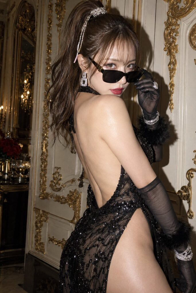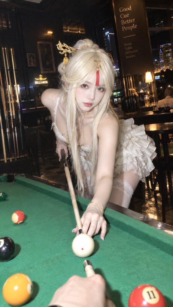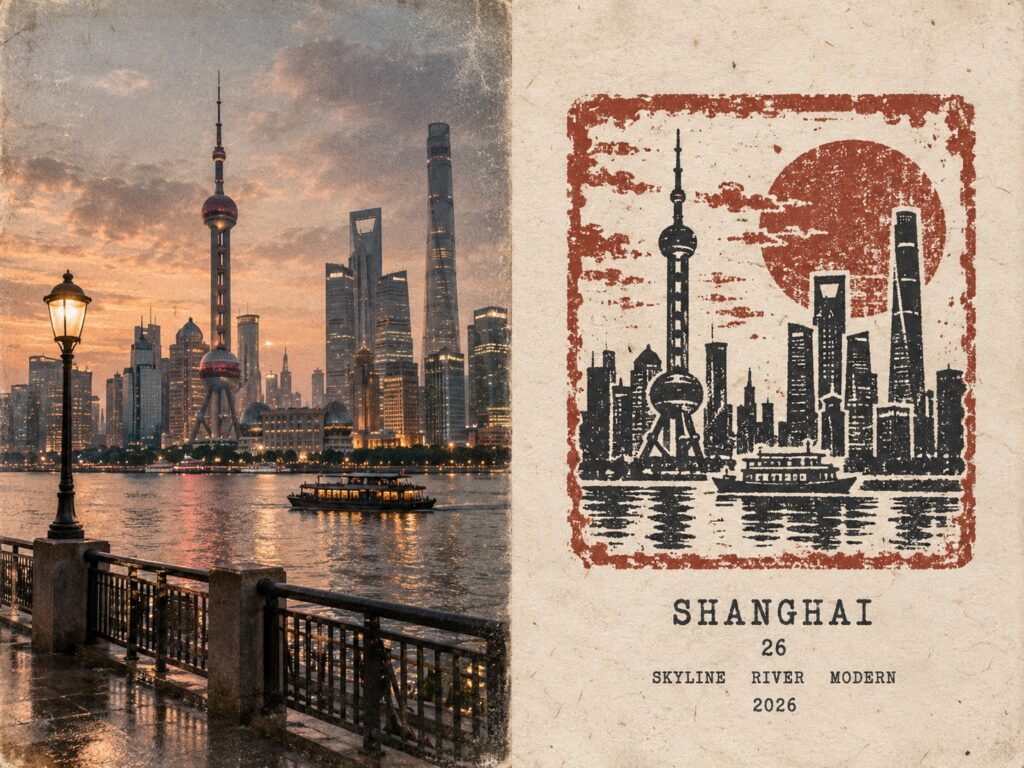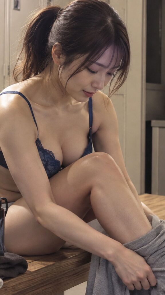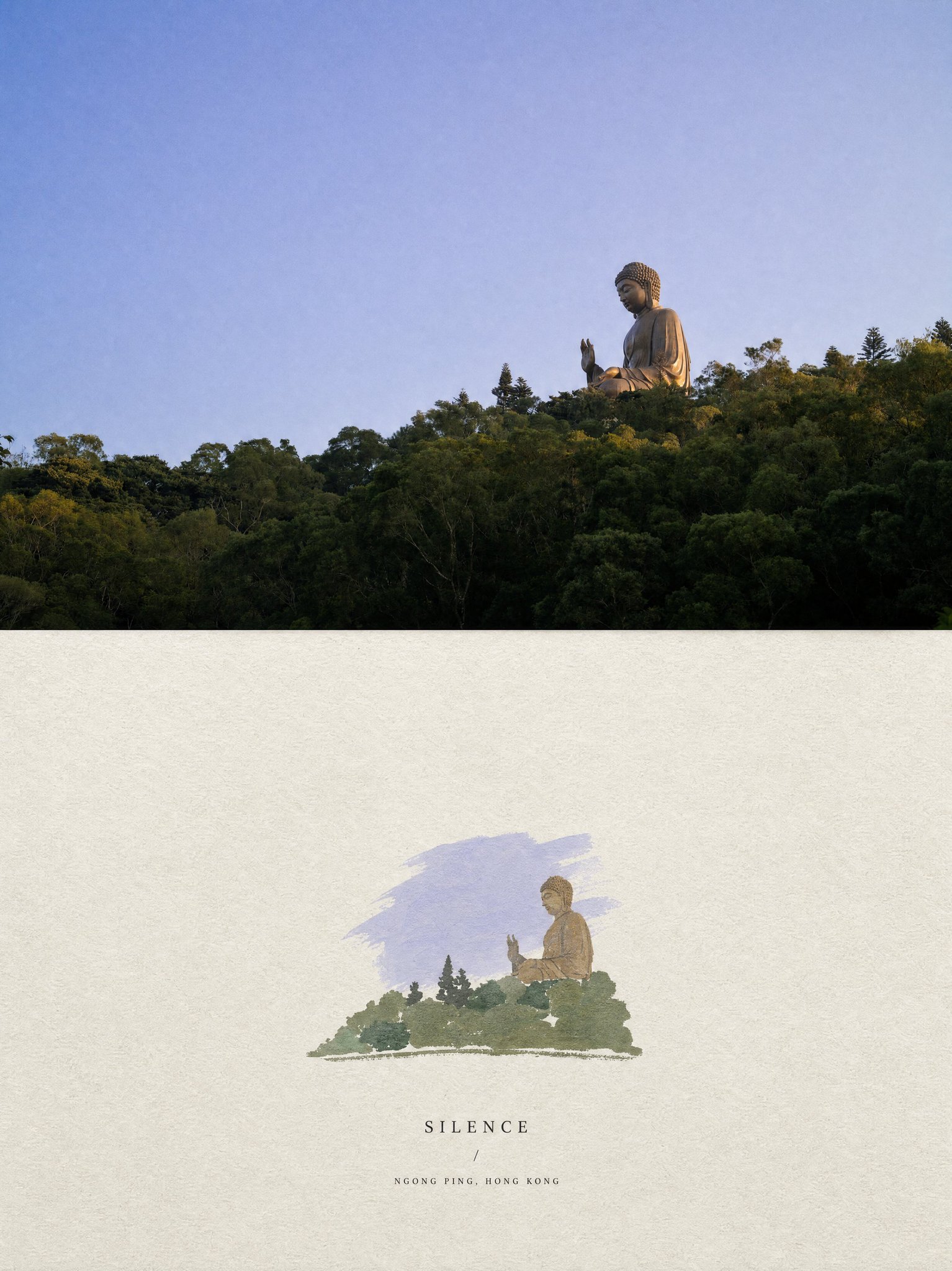
想创作具有影棚级质感且情绪松弛的艺术大片,却苦于无法完美呈现 极简高端艺术编辑海报 中复杂的细节与光影质感?
Nanobanana Pro 完美还原了画面的细腻纹理与高级氛围,助您精准定格具备顶尖商业杂志感的视觉瞬间。
复制这套免费提示词,一键复制进顶级模型,秒出大片。
Struggling to create Minimalist High End Editorial Poster with a high-end editorial style? Nanobanana Pro captures the textures and lighting details perfectly for a hyper-realistic masterpiece. Get FREE Prompt, enjoy one-click copy, and create instantly!
Prompt (English):
ADVERTISEMENT
Create one independent high-end editorial poster for each uploaded photo. Do not combine multiple photos into a collage. Each photo must be processed and output as a separate poster.

OVERALL FORMAT

Strict 3:4 vertical composition.

Divide the canvas horizontally into two exactly equal sections, with a precise 1:1 height ratio.

The top half occupies exactly 50% of the canvas.

The bottom half occupies exactly 50% of the canvas.

The two sections should feel visually connected as one refined art publication cover.

TOP HALF — ORIGINAL PHOTOGRAPH

Preserve the original photograph as faithfully as possible.

Keep the main composition, subjects, identity, facial features, body proportions, poses, expressions, clothing, objects, and spatial relationships unchanged.

Preserve the realistic photographic texture, natural lighting, shadows, atmosphere, and original color mood.

Apply only subtle, sophisticated editorial color grading, creating the feeling of a premium magazine photograph, contemporary art book, or high-end independent publication.

The image should remain photorealistic and authentic, never overly retouched or artificially stylized.

If necessary to fit the 3:4 composition naturally, extend the sky, ground, walls, or surrounding environmental background.

Background extension must feel seamless and photographic.

Never stretch, distort, reshape, replace, or alter the main subject.

BOTTOM HALF — MINIMAL HAND-DRAWN PAPER ILLUSTRATION

Extract the most recognizable visual elements from the original photograph and reinterpret them as a minimalist hand-drawn paper-cover illustration.

Preserve:

The most recognizable subject

Essential silhouette and proportions

Key pose or gesture

Important objects

The core narrative relationship between people and objects

Highly simplify the image. Remove unnecessary details and retain only the visual information needed for immediate recognition.

Use:

Delicate, slightly imperfect hand-drawn lines

A small number of bold, clearly defined acrylic-style flat color shapes

Rough paper texture

Visible handmade brush marks

Slightly irregular, organic edges

Subtle imperfections that make it feel genuinely handmade

The main illustrated subject should be small, centered, and carefully composed, occupying approximately 10–20% of the bottom half.

Leave a large amount of negative space around the illustration.

The background should primarily resemble:

Rough white paper

Warm off-white paper

Pale natural paper

Minimal editorial book-cover stock

Use only a few lines or small color shapes to suggest the surrounding environment.

COLOR PALETTE

Extract the dominant colors directly from the original photograph.

Compress the palette into no more than 4 main colors.

Keep the colors restrained, sophisticated, and harmonious.

Use bold but controlled flat color blocks.

Avoid excessive color variation.

Preserve subtle paper grain and handmade brush texture.

The illustration should visually feel like a simplified color interpretation of the photograph.

TYPOGRAPHY

A small amount of simple typography may be included when appropriate.

Possible elements:

A short title

Keyword

Object name

Location

Year

Number

Short phrase

Text should be minimal, understated, and editorial.

Typography should naturally interact with the large areas of negative space and the small illustration, evoking:

Art book covers

Independent publishing

Contemporary editorial design

Thoughtful children's picture books

Do not force text into the composition if it does not naturally fit the photograph.

VISUAL LANGUAGE

The final poster should feel:

Quiet · Poetic · Refined · Minimal · Innocent · Relaxed · Artistic · Thoughtful · High-recognition · Premium

The visual concept should be:

“A small subject surrounded by a large amount of empty space.”

The result should resemble a carefully designed independent art publication cover, rather than a commercial advertisement.

AVOID

Do not use:

Colored-pencil aesthetics

Crayon textures

Bleeding watercolor

Pure line-art illustration

Complex realistic illustration

Heavy oil-painting effects

Smooth polished digital illustration

3D rendering

Glossy 3D textures

Commercial cartoon aesthetics

Cute commercial character design

E-commerce advertising aesthetics

Generic poster templates

Excessive decorative elements

Busy compositions

Excessive typography

FINAL ART DIRECTION

The top half should feel like a beautiful, authentic editorial photograph.

The bottom half should feel like a small, handmade visual poem derived from that photograph.

The two halves should clearly belong to the same visual story, while maintaining a strong contrast between photographic realism above and minimal handmade illustration below.

Prioritize recognition, restraint, negative space, material texture, subtle imperfection, editorial sophistication, and artistic storytelling over decorative complexity.
中文参考:
ADVERTISEMENT
为每张上传的照片创建一张独立的高端编辑海报。不要将多张照片合并为拼贴画。每张照片必须作为独立的海报进行处理和输出。

整体格式

严格的 3:4 纵向构图。

将画布水平分为两个完全相等的部分,高度比例精确为 1:1。

上半部分正好占据画布的 50%。

下半部分正好占据画布的 50%。

这两个部分在视觉上应感觉像是一个精致的艺术出版物封面。

上半部分 — 原始照片

尽可能忠实地保留原始照片。

保持主要构图、主体、身份、面部特征、身体比例、姿势、表情、服装、物体和空间关系不变。

保留真实的照片质感、自然光线、阴影、氛围和原始色彩基调。

仅应用微妙、高级的编辑色彩分级,营造出优质杂志照片、当代艺术书籍或高端独立出版物的感觉。

图像应保持写实和真实,切勿过度修饰或人工风格化。

如果为了自然适应 3:4 构图而有必要,请延伸天空、地面、墙壁或周围的环境背景。

背景延伸必须感觉无缝且具有照片感。

绝不拉伸、扭曲、重塑、替换或改变主体。

下半部分 — 极简手绘纸张插画

从原始照片中提取最具辨识度的视觉元素,并将其重新诠释为极简手绘纸质封面插画。

保留:

最具辨识度的主体

基本的轮廓和比例

关键姿势或手势

重要物体

人物与物体之间的核心叙事关系

高度简化图像。去除不必要的细节,仅保留即时识别所需的视觉信息。

使用:

细腻、略带瑕疵的手绘线条

少量大胆、定义明确的丙烯风格平涂形状

粗糙的纸张质感

可见的手工刷痕

略微不规则的有机边缘

使其感觉真实手工制作的细微瑕疵

插画主体应小巧、居中并精心构图,占据下半部分约 10–20% 的空间。

在插画周围留出大量负空间。

背景应主要类似于:

粗糙的白纸

温暖的米白色纸

淡雅的天然纸张

极简编辑书封纸张

仅使用几根线条或小的色块来暗示周围环境。

调色板

直接从原始照片中提取主导颜色。

将调色板压缩为不超过 4 种主色。

保持色彩克制、高级且和谐。

使用大胆但受控的平涂色块。

避免过度的色彩变化。

保留细微的纸张颗粒和手工笔触质感。

插画在视觉上应感觉像是照片的简化色彩诠释。

排版

在合适时可以包含少量简单的排版。

可能的元素:

短标题

关键词

物品名称

地点

年份

数字

短语

文字应极简、低调且具编辑感。

排版应自然地与大面积的负空间和小插图互动,让人联想到:

艺术书封面

独立出版

当代编辑设计

深刻的儿童绘本

如果文字与照片不自然契合,请勿强行加入构图。

视觉语言

最终海报应感觉:

宁静 · 诗意 · 精致 · 极简 · 纯真 · 放松 · 艺术感 · 深刻 · 高辨识度 · 优质

视觉概念应为:

“大面积留白围绕的小主体”

结果应类似于精心设计的独立艺术出版物封面,而非商业广告。

避免

不要使用:

彩色铅笔美学

蜡笔纹理

晕染水彩

纯线条画插图

复杂的写实插图

沉重的油画效果

光滑打磨的数字插图

3D 渲染

光亮的 3D 纹理

商业卡通美学

可爱的商业角色设计

电子商务广告美学

通用海报模板

过多的装饰元素

繁忙的构图

过多的排版

最终艺术指导

上半部分应感觉像是一张美丽、真实的编辑照片。

下半部分应感觉像是源自该照片的一个小巧的手工视觉诗。

两部分应明显属于同一个视觉故事,同时在上方照片的写实感与下方极简手工插画之间保持强烈的对比。

优先考虑辨识度、克制、负空间、材料质感、微妙的瑕疵、编辑的高级感和艺术叙事,而非装饰的复杂性。