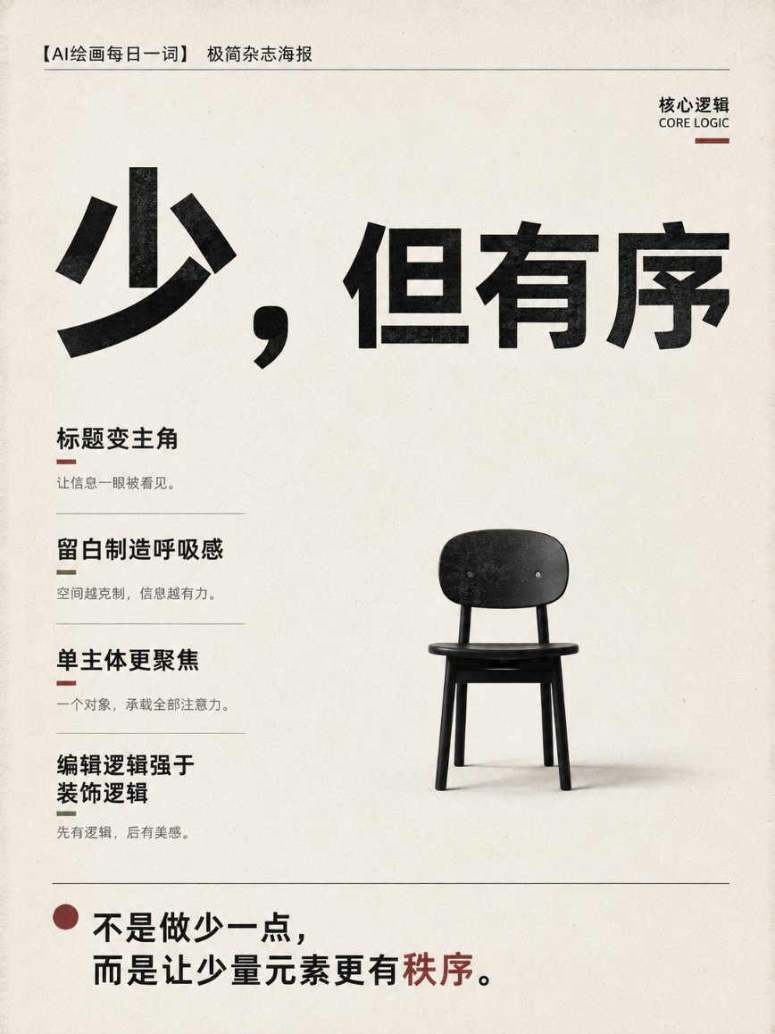
想创作具有影棚级质感且情绪松弛的艺术大片,却苦于无法完美呈现 极简主义独立杂志海报设计提示词 中复杂的细节与光影质感?
Nanobanana Pro 完美还原了画面的细腻纹理与高级氛围,助您精准定格具备顶尖商业杂志感的视觉瞬间。
复制这套免费提示词,一键复制进顶级模型,秒出大片。
Struggling to create Minimalist Magazine Poster Design Prompt with a high-end editorial style? Nanobanana Pro captures the textures and lighting details perfectly for a hyper-realistic masterpiece. Get FREE Prompt, enjoy one-click copy, and create instantly!
Prompt (English):
ADVERTISEMENT
Design a 3:4 vertical "minimalist magazine poster" for [person / product / viewpoint / exhibition theme].

The image uses an independent design publication cover layout, overall restrained, quiet, and avant-garde, with a contemporary editorial design sense.

The background uses warm white, off-white, or low-saturation solid colors, maintaining large areas of clean white space.

The image features only one core subject:
[person / product / architecture / object / abstract graphic]

The subject can be fully displayed, or use bold partial cropping, bleeding edges, or asymmetric placement, but must maintain a clear visual focus.

The title uses oversized bold sans-serif font, becoming the main visual anchor of the image.

Title content is controlled within 2—6 words, allowing some text to be obscured by the subject, extend to the edges of the frame, or be arranged asymmetrically, but must remain clearly readable.

Auxiliary information uses small neutral sans-serif font, like issue numbers, dates, column names, and short descriptions on a magazine cover.

The overall information hierarchy is limited to:
Level 1: Giant main title
Level 2: Only core subject
Level 3: Small amount of auxiliary information

Use a strict Swiss grid system and asymmetric editorial layout.

Main colors are controlled between black, white, gray, and one low-saturation accent color, such as:
Dark red, olive green, gray-blue, or earthy brown.

Add slight paper fiber, ink grain, and printing color registration deviation, but do not over-age.

The image should look like a limited edition publication cover produced by an independent design studio, rather than a common promotional poster.

Avoid:
Element stacking
Complex backgrounds
Multiple people
Fancy fonts
Gradient glows
Metallic effects
Cheap tech feel
Dense text
Decorative stickers
Meaningless graphics
中文参考:
ADVERTISEMENT
为【人物 / 产品 / 观点 / 展览主题】设计一张3:4竖版“极简杂志海报”。

画面采用独立设计刊物封面式排版,整体克制、安静、前卫,具有当代编辑设计感。

背景使用暖白色、灰白色或低饱和纯色,保留大面积干净留白。

画面只设置一个核心主体:
【人物 / 产品 / 建筑 / 物件 / 抽象图形】

主体可以完整展示,也可以采用大胆局部裁切、边缘出画或非对称摆放,但必须保持清晰的视觉焦点。

标题使用超大号粗体无衬线字体,成为画面的主要视觉锚点。

标题内容控制在2—6个字,允许部分文字被主体遮挡、延伸至画面边缘,或以非对称方式排列,但必须保持清晰可读。

辅助信息采用小号中性无衬线字体,像杂志封面的期号、日期、栏目名和简短说明。

整体信息层级限定为:
一级:巨大主标题
二级:唯一核心主体
三级:少量辅助信息

使用严格的瑞士网格系统和非对称编辑排版。

主色控制在黑、白、灰和一种低饱和强调色之间,例如:
暗红、橄榄绿、灰蓝或泥土棕。

加入轻微纸张纤维、油墨颗粒和印刷套色偏差,但不要过度做旧。

画面要像一本由独立设计工作室制作的限量刊物封面,而不是普通宣传海报。

避免:
元素堆叠
复杂背景
多人物
花哨字体
渐变发光
金属特效
廉价科技感
密集文字
装饰性贴纸
无意义图形