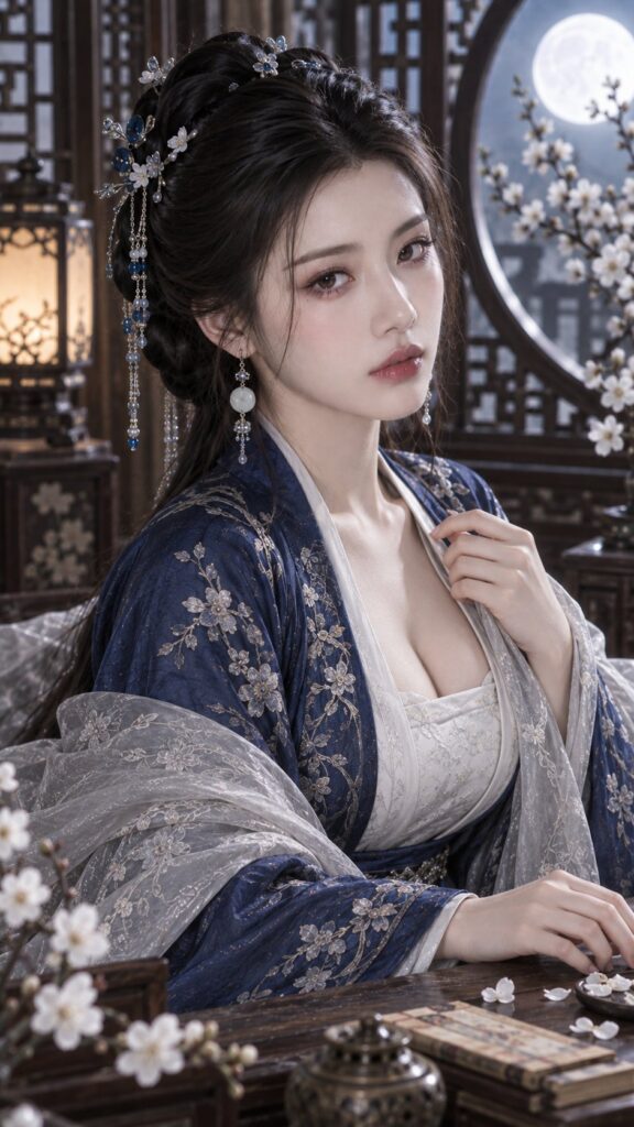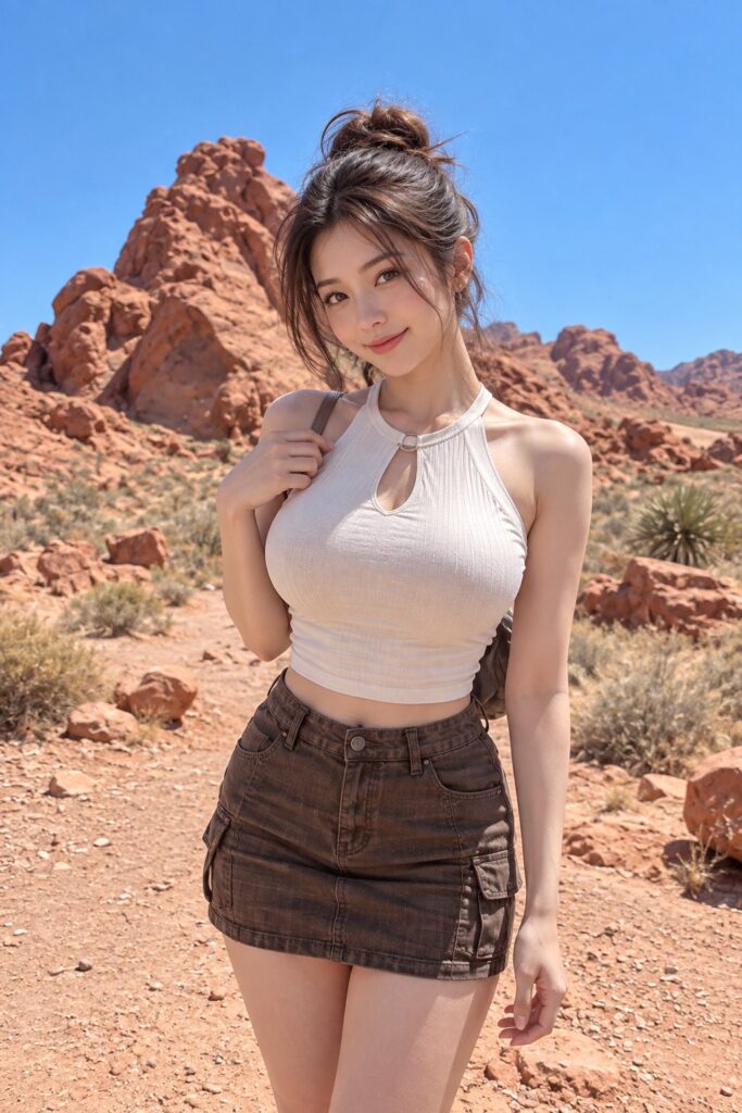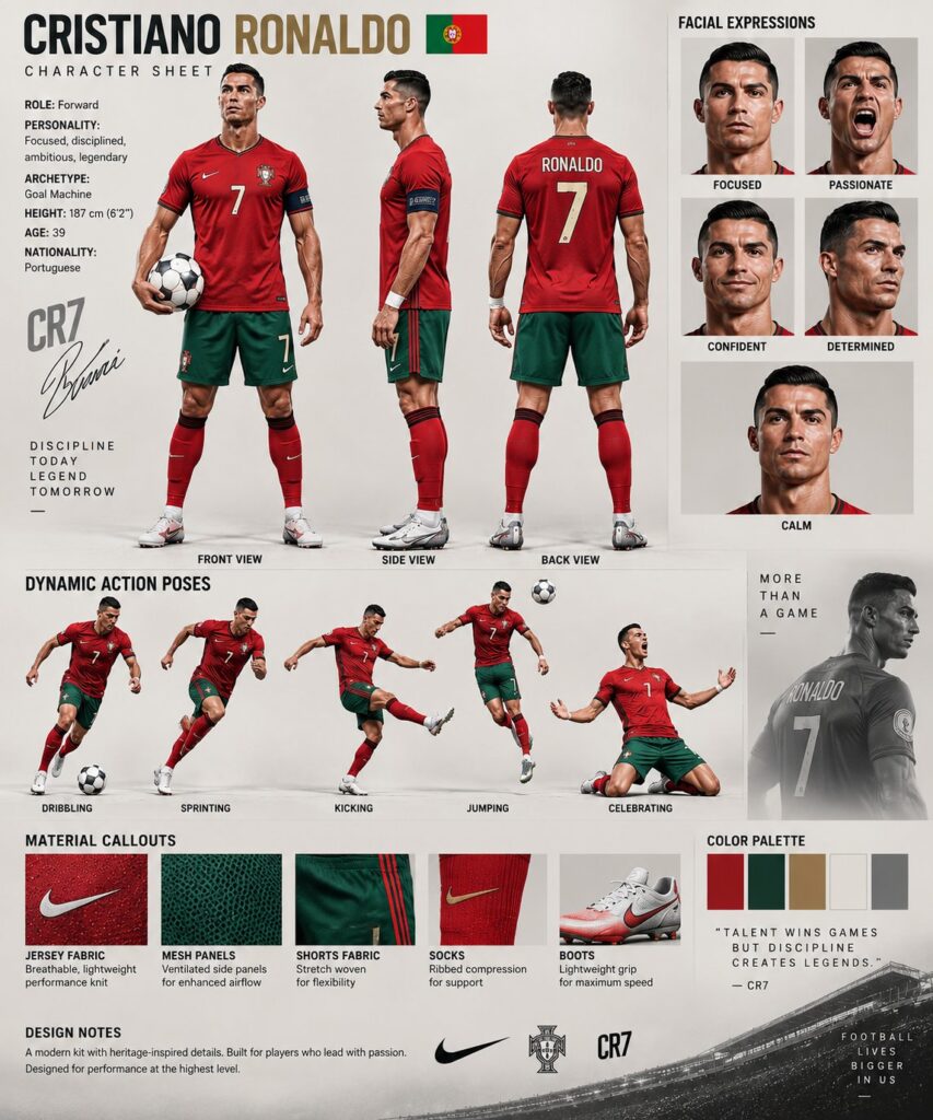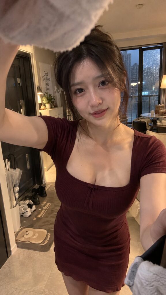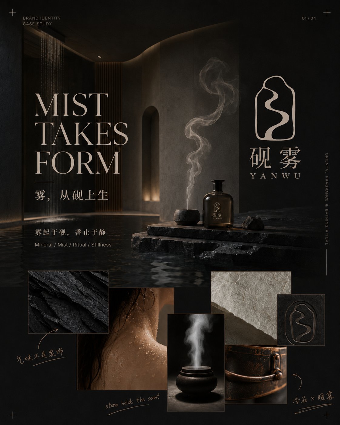
想创作具有影棚级质感且情绪松弛的艺术大片,却苦于无法完美呈现 资深品牌设计师四图视觉识别提案 中复杂的细节与光影质感?
Nanobanana Pro 完美还原了画面的细腻纹理与高级氛围,助您精准定格具备顶尖商业杂志感的视觉瞬间。
复制这套免费提示词,一键复制进顶级模型,秒出大片。
Struggling to create Senior Brand Designer Four Image Vi Proposal with a high-end editorial style? Nanobanana Pro captures the textures and lighting details perfectly for a hyper-realistic masterpiece. Get FREE Prompt, enjoy one-click copy, and create instantly!
Prompt (English):
ADVERTISEMENT
You are a senior brand designer, logo designer, visual art director, and editorial layout designer.

Please design and generate a set of [Four-Image Brand Visual Identity Proposal] directly for the same brand according to the brand information I fill in. Do not output image prompts first, and do not just provide plans or page outlines; generate 4 independent images directly.

[Brand Information]

Chinese Brand Name: [Fill in]
English Brand Name: [Fill in]
Brand Industry: [Fill in]
Main Products or Services: [Fill in]
Brand Positioning and Target Audience: [Fill in]
Brand Core Concept: [Fill in]
Brand Personality Keywords: [Fill in 3–5]
Brand Slogan: [Fill in, or re-refine based on concept]

Logo Inspiration Source: [Fill in]
Logo Type: [Abstract Symbol / Chinese Character Integration / Letter Graphic / Geometric Symbol / Emblem, etc.]
Meaning the Logo is expected to express: [Fill in]
Elements to avoid: [Fill in]

Overall Visual Style: [Fill in]
Main Color Tone: [Fill in]
Secondary and Accent Colors: [Fill in]
Main Materials: [Fill in 3–5 types]
Photography or Spatial Atmosphere: [Fill in]
Main Products, Packaging, and Application Scenarios: [Fill in]

Image Aspect Ratio: [Default 4:5 vertical]
Text Language: [Mainly Chinese / Mainly English / Combination of Chinese and English]
Supplementary Requirements: [Fill in]

If some information is not filled in, please automatically supplement a reasonable plan based on the brand industry, positioning, and concept. Do not stop because non-critical fields are empty.

━━━━━━━━━━━━━━━━━━
【Design Task】
━━━━━━━━━━━━━━━━━━

First, unify the design and lock the brand system, including:

- An original, clear, independently usable logo pattern
- Chinese and English brand wordmarks
- Main, secondary, and accent colors
- Typography, materials, and photographic language
- Secondary graphics and patterns extended from the logo
- Product, packaging, material, and spatial application methods

The logo cannot be text-only. It must include a design-heavy independent Symbol related to the brand concept, with clear outlines, negative space, or geometric structures, recognizable even when scaled down, and suitable for embossing, gold stamping, embroidery, engraving, and spatial signage.

Avoid directly using common industry icons, such as incense burners, tea leaves, female profiles, houses, common leaves, lotuses, auspicious clouds, Taiji, or traditional seals. They need to be abstracted, simplified, and reconstructed to form original brand symbols.

Once the logo is determined, the core outline, internal structure, wordmark, and combination method in the four images must remain consistent and cannot be redesigned for each image.

━━━━━━━━━━━━━━━━━━
【Content of the Four Images】
━━━━━━━━━━━━━━━━━━

Image 1 | Brand Worldview and Concept Cover

Use a large brand key visual to establish the brand mood and worldview, while clearly displaying the complete logo, Chinese name, English name, conceptual main title, brand manifesto, 3–5 mood or material images, and a small amount of handwritten conceptual notes.

Adopt a structure of "Main Title + Large Key Visual + Complete Logo + Irregular Mood Collage." The logo must be clearly visible but should not overpower the main title and brand atmosphere.

Image 2 | Logo Concept and Symbol Generation Logic

With the oversized Logo Symbol as the visual center, display the complete logo, Chinese and English wordmarks, horizontal and vertical combinations, simplified versions, conceptual source sketches, negative space, and structural relationships.

Add a small amount of hand-drawn outlines, arrows, circles, and designer's handwritten notes to let the audience understand why the logo was designed this way. The page should have a sense of research but should not be made into a complex engineering drawing or a traditional VI table.

Image 3 | Brand Visual Language and Design System

Display brand main colors, secondary colors, fonts, materials, photographic language, logo partial crops, and secondary patterns.

Colors need to establish a connection with real materials, such as stone, paper, metal, glass, plants, or fabrics. Secondary graphics must be extracted from the logo outline, internal curves, negative space, or strokes, and no irrelevant decorations should be added.

The layout uses a combination of regular grids and free collage, adding large typography, vertical text, thin lines, and a small amount of handwritten markings.

Image 4 | Brand Application and Experience Scenarios

Show how the brand enters real products, packaging, paper goods, fabrics, and spaces. Select 5–7 reasonable touchpoints based on the industry, such as the main product, gift box, tote bag, card, label, uniform, towel, metal signage, storefront, reception desk, or spatial wayfinding.

Adopt a structure of "One large product or spatial key visual + 4–6 application details." The complete logo, independent Symbol, and secondary patterns need to be used in layers; do not have every product repeatedly print the full brand name.

━━━━━━━━━━━━━━━━━━
【Overall Visual Requirements】
━━━━━━━━━━━━━━━━━━

The entire set of images adopts a design language that combines high-end brand proposals, Editorial magazine design, art direction boards, and modern visual identity cases.

Each image must have:

- A striking large main title
- A short subtitle
- A core description
- 2–4 keywords or information tags
- 2–4 meaningful handwritten notes
- A clear visual center
- Approximately 25%–35% white space

The main title should participate in the composition; it can be enlarged, cropped, displaced, arranged vertically, or interspersed with images and logos, rather than being a plain header.

Handwritten markings can use short sentences, arrows, circles, underlines, or simple sketches to explain the logo, fonts, colors, materials, and processes. Handwritten content must be short, clear, and meaningful, avoiding meaningless garbled text and full-screen graffiti.

The four images use a unified brand name, logo, font, color scheme, material, photographic atmosphere, margins, and guide lines, but the layout cannot be identical:

- Image 1: Large key visual and mood collage
- Image 2: Oversized logo and structural research
- Image 3: Color, font, and material system
- Image 4: Product space and application implementation

Avoid common PPTs, simple Moodboards, traditional VI tables, material website mockup collections, neatly repeated grids, large blocks of body text, information crowding, low-quality 3D materials, cheap gold, color drift, and changes in logo structure.

━━━━━━━━━━━━━━━━━━
【Output Requirements】
━━━━━━━━━━━━━━━━━━

Please directly generate 4 independent 4:5 vertical images. Do not merge the four contents into one collage, and do not output image generation prompts first.

Generate in the following order:

1. Brand Worldview and Concept Cover
2. Logo Concept and Symbol Generation Logic
3. Brand Visual Language and Design System
4. Brand Application and Experience Scenarios

If currently only one image can be generated at a time, please start directly from Image 1 and continue generating Image 2, Image 3, and Image 4 according to the same locked logo and visual system, without re-planning or changing the design direction.
中文参考:
ADVERTISEMENT
你是一名资深品牌设计师、Logo设计师、视觉艺术指导与Editorial版式设计师。

请根据我填写的品牌信息,为同一个品牌直接设计并生成一套【四图品牌视觉识别提案】。不要先输出图片提示词,也不要只给方案或页面大纲,直接生成4张独立图片。

【品牌信息】

中文品牌名:【填写】
英文品牌名:【填写】
品牌行业:【填写】
主要产品或服务:【填写】
品牌定位与目标人群:【填写】
品牌核心理念:【填写】
品牌性格关键词:【填写3—5个】
品牌标语:【填写,或根据理念重新提炼】

Logo灵感来源:【填写】
Logo类型:【抽象符号 / 汉字融合 / 字母图形 / 几何符号 / 徽章等】
希望Logo表达的含义:【填写】
不希望出现的元素:【填写】

整体视觉风格:【填写】
主色调:【填写】
辅助色与点缀色:【填写】
主要材质:【填写3—5种】
摄影或空间氛围:【填写】
主要产品、包装与应用场景:【填写】

画面比例:【默认4:5竖版】
文字语言:【中文为主 / 英文为主 / 中英结合】
补充要求:【填写】

如果部分信息没有填写,请结合品牌行业、定位和理念自动补充合理方案,不要因为非关键字段为空而停止。

━━━━━━━━━━━━━━━━━━
【设计任务】
━━━━━━━━━━━━━━━━━━

先统一设计并锁定品牌系统,包括:

- 一个原创、清晰、可独立使用的Logo图案
- 中文与英文品牌字标
- 主色、辅助色与点缀色
- 字体、材质和摄影语言
- 从Logo中延展出的辅助图形与纹样
- 产品、包装、物料和空间应用方式

Logo不能只有纯文字。必须包含一个具有设计感的独立Symbol,与品牌理念相关,具备清晰轮廓、负空间或几何结构,缩小后仍可识别,并适合压印、烫金、刺绣、雕刻和空间标识。

避免直接使用普通行业图标,例如香炉、茶叶、女性侧脸、房屋、普通树叶、莲花、祥云、太极或传统印章。需要经过抽象、简化和重新构成,形成原创品牌符号。

Logo一旦确定,四张图中的核心轮廓、内部结构、字标和组合方式必须保持一致,不能每张图重新设计。

━━━━━━━━━━━━━━━━━━
【四张图片内容】
━━━━━━━━━━━━━━━━━━

图1|品牌世界观与概念封面

用一张大型品牌主视觉建立品牌情绪和世界观,同时清晰展示完整Logo、中文名、英文名、概念主标题、品牌宣言、3—5张情绪或材质图片,以及少量手写概念注释。

采用“大标题+大型主视觉+完整Logo+非规则情绪拼贴”的结构。Logo必须明显可见,但不能压过主标题和品牌氛围。

图2|Logo概念与符号生成逻辑

以超大的Logo Symbol作为视觉中心,展示完整Logo、中英文字标、横版与竖版组合、简化版本、概念来源草图、负空间与结构关系。

加入少量手绘轮廓、箭头、圈选和设计师手写注释,让观众理解Logo为什么这样设计。页面要有研究感,但不能做成复杂工程图或传统VI表格。

图3|品牌视觉语言与设计系统

展示品牌主色、辅助色、字体、材质、摄影语言、Logo局部裁切和辅助纹样。

颜色需要与真实材质建立联系,例如石材、纸张、金属、玻璃、植物或织物。辅助图形必须从Logo轮廓、内部曲线、负空间或笔画中提取,不能添加无关装饰。

版式采用规整网格与自由拼贴结合,加入大型字体、纵向文字、细线和少量手写标记。

图4|品牌应用与体验场景

展示品牌如何进入真实产品、包装、纸品、织物和空间。根据行业选择5—7个合理触点,例如主产品、礼盒、手提袋、卡片、标签、制服、毛巾、金属标牌、门头、前台或空间导视。

采用“一张大型产品或空间主视觉+4—6张应用细节”的结构。完整Logo、独立Symbol和辅助纹样需要分层使用,不要让每件产品都重复印完整品牌名称。

━━━━━━━━━━━━━━━━━━
【整套视觉要求】
━━━━━━━━━━━━━━━━━━

整套图片采用高级品牌提案、Editorial杂志设计、艺术指导板与现代视觉识别案例相结合的设计语言。

每张图都必须有:

- 一个醒目的大型主标题
- 一个简短副标题
- 一句核心说明
- 2—4个关键词或信息标签
- 2—4处有意义的手写注释
- 一个明确的视觉中心
- 约25%—35%的留白

主标题要参与构图,可以放大、裁切、错位、纵向排列,或与图片、Logo互相穿插,不能只是普通页眉。

手写标记可以使用短句、箭头、圈选、下划线或简单草图,用于解释Logo、字体、颜色、材质和工艺。手写内容必须简短、清晰、有意义,避免无意义乱码和满屏涂鸦。

四张图使用统一的品牌名、Logo、字体、配色、材质、摄影氛围、边距和辅助线,但版式不能完全相同:

- 图1:大主视觉与情绪拼贴
- 图2:超大Logo与结构研究
- 图3:色彩字体与材质系统
- 图4:产品空间与应用落地

避免普通PPT、简单Moodboard、传统VI表格、素材网站Mockup合集、整齐重复的宫格、大段正文、信息拥挤、低质量3D材质、廉价金色、颜色漂移和Logo结构变化。

━━━━━━━━━━━━━━━━━━
【输出要求】
━━━━━━━━━━━━━━━━━━

请直接生成4张独立的4:5竖版图片,不要把四张内容合并成一张拼图,也不要先输出生图提示词。

按照以下顺序生成:

1. 品牌世界观与概念封面
2. Logo概念与符号生成逻辑
3. 品牌视觉语言与设计系统
4. 品牌应用与体验场景

如果当前一次只能生成一张图片,请直接从图1开始,并按照同一套已锁定的Logo和视觉系统继续生成图2、图3和图4,不需要重新规划或更换设计方向。