想创作具有影棚级质感且情绪松弛的艺术大片,却苦于无法完美呈现 火山之吻高端辣酱超写实商业海报 中复杂的细节与光影质感?
Nanobanana Pro 完美还原了画面的细腻纹理与高级氛围,助您精准定格具备顶尖商业杂志感的视觉瞬间。
复制这套免费提示词,一键复制进顶级模型,秒出大片。
Struggling to create Volcano Bite Hot Sauce Commercial Poster Prompt with a high-end editorial style? Nanobanana Pro captures the textures and lighting details perfectly for a hyper-realistic masterpiece. Get FREE Prompt, enjoy one-click copy, and create instantly!
Prompt (English):
ADVERTISEMENT
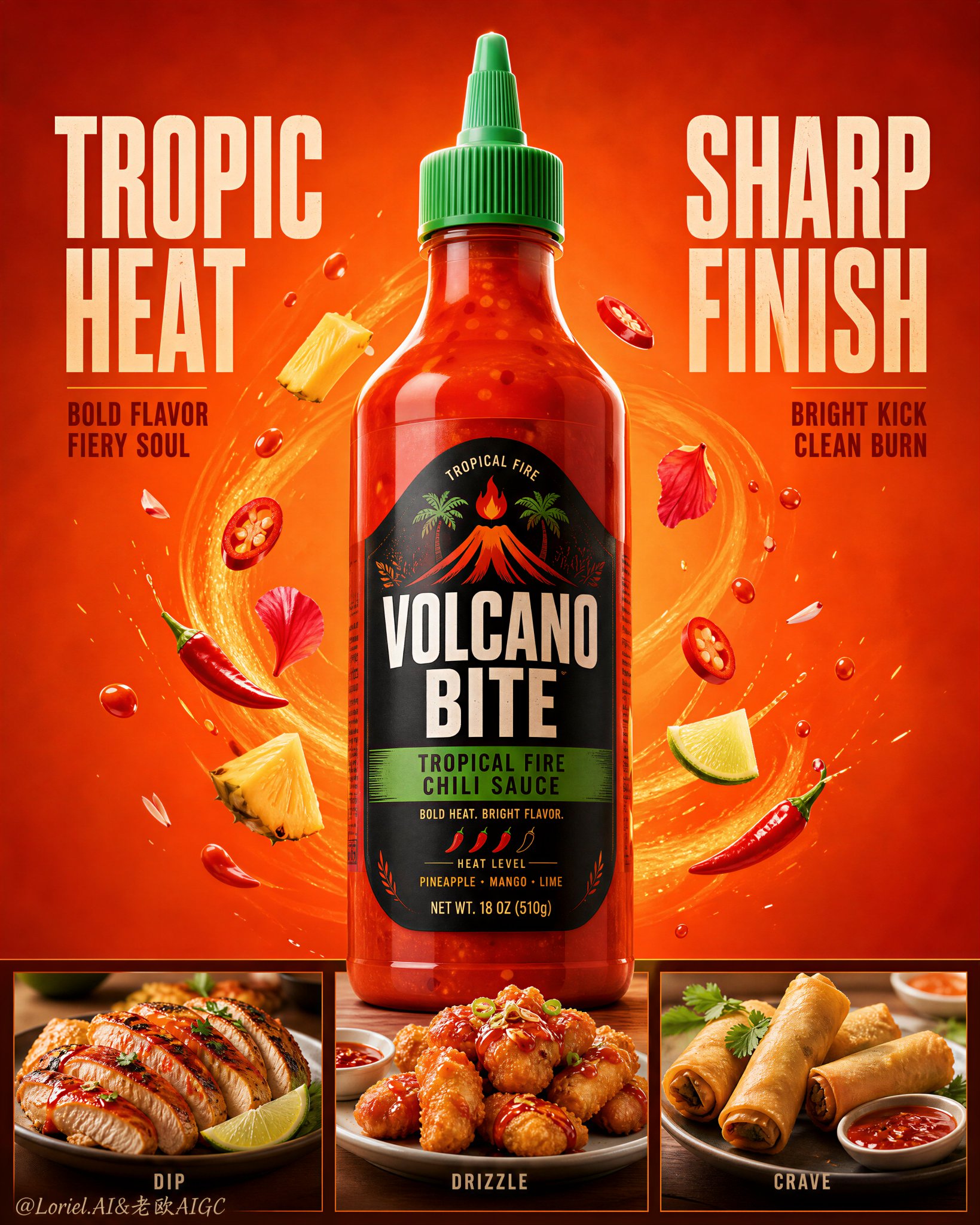
Create a flagship commercial advertising poster for an original hot sauce brand named "VOLCANO BITE", merging Orbit energy with Transit restraint. Use ultra-realistic product photography, not illustration, not 3D render. Keep the same structural logic: a blazing orange-red background with subtle heat-wave patterning, one giant centered squeeze bottle of tropical chili sauce as the absolute visual hero, bold headline blocks on the upper left and upper right, and a clean lower three-panel serving section showing three food-pairing dishes in equal-width compartments. The bottle must dominate the composition and overlap slightly into the lower band.

Style lock: premium FMCG condiment advertising, ultra-real packaging realism, strong product-first hierarchy, bold graphic poster design, tropical heat mood, clean campaign layout, high-end supermarket hero visual.

Core composition: one large front-facing squeeze bottle placed exactly at the center, vertically extending from the upper-middle into the lower-middle. Keep the bottle taller, sharper, and visually heavier than every other element. Place one condensed bold text block on the upper-left and one on the upper-right, balanced around the bottle shoulders. Use only a restrained number of floating accents around the bottle. The lower section must be divided into three equal compartments with identical visual width and clean alignment, each showing one smaller usage dish. Preserve strong negative space around the bottle so the poster feels premium and architectural.

Transit logic: reduce all non-essential clutter, shorten top copy, simplify the lower panel copy, and keep the background clean enough that scale, contrast, and the central bottle create the impact. Avoid a busy retail-flyer feeling. The bottle, the orange field, and the grid should do most of the work.

Orbit logic: arrange the background accents into a clear upward swirling motion around the bottle, guiding the eye from the lower food panels into the center bottle and then up toward the nozzle cap. Use a few controlled chili slices, fruit pieces, petals, and tiny sauce droplets in elegant rising arcs. The movement must feel concentrated and heat-driven, not messy.

Product concept: redesign the hero product as an original tropical chili sauce with a sharp green nozzle cap, a translucent bottle body filled with vivid red-orange sauce, and a bold label system reading "VOLCANO BITE" with a descriptor such as "tropical fire chili sauce". The label should feel premium, shelf-ready, and globally launchable, with strong vertical emphasis and a compact iconic heat mark. All label text must be original.

Lighting: bright studio key light from front-upper center with warm side shaping to emphasize bottle volume, cap texture, sauce translucency, and glossy reflections. Add gentle rim highlights around the bottle edges and soft grounded shadows under the lower dishes. Keep the background glowing and graphic, without muddy contrast or dead black zones.

Materials and realism: realistic semi-transparent plastic squeeze bottle with visible thickness, glossy sauce body with suspended chili flecks, crisp cap ridges, premium printed label with subtle sheen, believable liquid meniscus, and clean reflections. Lower food pairings should be highly realistic and appetizing: one sliced chicken platter, one fried savory snack plate, and one crispy spring-roll platter with dipping sauce. Keep all three plates aligned cleanly, sized consistently, and clearly secondary to the bottle.

Typography and layout: use original English text only, never copy existing wording. Place a bold upper-left headline such as "TROPIC HEAT" and an upper-right headline such as "SHARP FINISH". Keep the copy shorter, stacked, and poster-ready. In the lower panels, use only minimal micro-copy such as "dip", "drizzle", and "crave". The bottle label and top headlines must carry the branding.

Color strategy: dominant hot orange and saturated chili red, supported by green cap accents, off-white typography, pale fruit highlights, and natural food tones in the lower dishes. Keep the palette bold, tropical, hot, and tightly controlled.

Quality and physical rules: extremely sharp hero bottle, readable label, correct bottle symmetry, realistic sauce translucency, clean lower grid alignment, equal lower panel widths, consistent plate sizing, believable garnish scale, no warped bottle, no distorted food, no excessive props, no clutter, no cheap flyer feel. The bottle must remain the absolute visual hero at all times.

Negative prompt: copied branding, copied slogan, weak product hierarchy, blurry bottle, unreadable label, fake plastic reflections, warped cap, distorted bottle shape, muddy orange background, dead black patches, cluttered layout, too many floating ingredients, oversized lower dishes, inconsistent plate sizes, cheap retail flyer aesthetic, cartoon rendering, CGI look, illustration style, low-resolution food detail, product losing dominance.
中文参考:
ADVERTISEMENT
为名为“VOLCANO BITE”的原创辣酱品牌创作一张旗舰商业广告海报,融合轨道能量(Orbit energy)与过境克制(Transit restraint)。使用超写实的产品摄影,而非插画或3D渲染。保持相同的结构逻辑:炽热的橙红色背景带有微妙的热浪纹理,一个巨大的居中挤压瓶热带辣椒酱作为绝对视觉核心,左上角和右上角有醒目的标题块,底部是一个整洁的三面板供应区域,在等宽的隔间中展示三道配菜。瓶子必须占据构图主导地位,并与下方的条带略微重叠。

风格锁定:高端快消品调味品广告,超写实的包装真实感,强大的产品优先层级,大胆的平面海报设计,热带酷热氛围,整洁的竞选布局,高端超市主视觉。

核心构图:一个垂直延伸从上中到下中的大型正向挤压瓶放置在正中心。使瓶子比其他所有元素更高、更清晰、视觉分量更重。在左上角和右上角各放置一个紧凑的加粗文本块,围绕瓶肩平衡。瓶子周围仅使用有限数量的漂浮装饰。下部必须分为三个等宽、对齐整洁的区域,每个区域展示一道较小的食用菜肴。在瓶子周围保留强大的负空间,使海报具有高端感和建筑感。

过境逻辑:减少所有非必要的杂乱,缩短顶部文案,简化底部面板文案,并保持背景足够整洁,使比例、对比度和中心瓶子产生冲击力。避免忙碌的零售传单感。瓶子、橙色区域和网格应承担大部分视觉工作。

轨道逻辑:将背景装饰排列成围绕瓶子的清晰向上螺旋运动,引导视线从底部的食物面板进入中心瓶子,然后向上移向瓶盖。使用少量受控的辣椒片、水果碎块、花瓣和微小的酱汁液滴,呈优雅的上升弧线。运动必须感觉集中且由热力驱动,而不是混乱。

产品概念:将核心产品重新设计为带有锋利绿色瓶盖的原创热带辣椒酱,半透明瓶身装满鲜艳的红橙色酱汁,以及印有“VOLCANO BITE”和“tropical fire chili sauce”等描述语的大胆标签系统。标签应具有高端感、上架即售感并可全球发布,具有强大的垂直强调感和紧凑的标志性热度标记。所有标签文本必须是原创的。

光照:来自前上方中心的明亮影棚主灯,带有温暖的侧面造型光,以强调瓶子的体积、瓶盖的纹理、酱汁的半透明感和光泽反射。在瓶子边缘添加柔和的轮廓高光,并在下方菜肴下添加柔和的地面阴影。保持背景发光且具平面感,没有浑浊的对比度或死黑区域。

材质与写实:真实的半透明塑料挤压瓶,带有可见的厚度,带有悬浮辣椒碎的光泽酱体,清晰的瓶盖棱线,带有微妙光泽的高级印刷标签,可信的液体弯月面和干净的反射。底部的食物搭配应高度写实且令人垂涎:一盘切片鸡肉、一盘炸咸味小吃和一盘带蘸酱的酥脆春卷。保持三盘整齐排列,尺寸一致,且明显次于瓶子。

排版与布局:仅使用原创英文文本,严禁复制现有措辞。在左上角放置大胆标题,如“TROPIC HEAT”,右上角放置标题如“SHARP FINISH”。保持文案简短、堆叠并符合海报要求。在下方板块中,仅使用极简的微型文案,如“dip”、“drizzle”和“crave”。瓶身标签和顶部标题必须承载品牌形象。

色彩策略:主导色为火热的橙色和饱和的辣椒红,辅以绿色瓶盖点缀、米白色字体、淡色水果亮色以及底部菜肴中的自然食物色调。保持色调大胆、热带感、火热且严格受控。

质量与物理规则:极其清晰的核心瓶子,可读的标签,正确的瓶子对称,真实的酱汁半透明度,整洁的底部网格对齐,相等的底部面板宽度,一致的盘子尺寸,可信的装饰比例,瓶子无变形,食物无扭曲,无多余道具,不杂乱,没有廉价传单感。瓶子在任何时候都必须是绝对的视觉中心。

负面提示词:复制的品牌,复制的口号,弱产品层级,模糊的瓶子,无法阅读的标签,虚假的塑料反射,扭曲的瓶盖,变形的瓶形状,浑浊的橙色背景,死黑板块,杂乱的布局,过多的漂浮成分,过大的底部菜肴,不一致的盘子尺寸,廉价的零售传单美学,卡通渲染,CGI感,插画风格,低分辨率食物细节,产品失去主导地位。