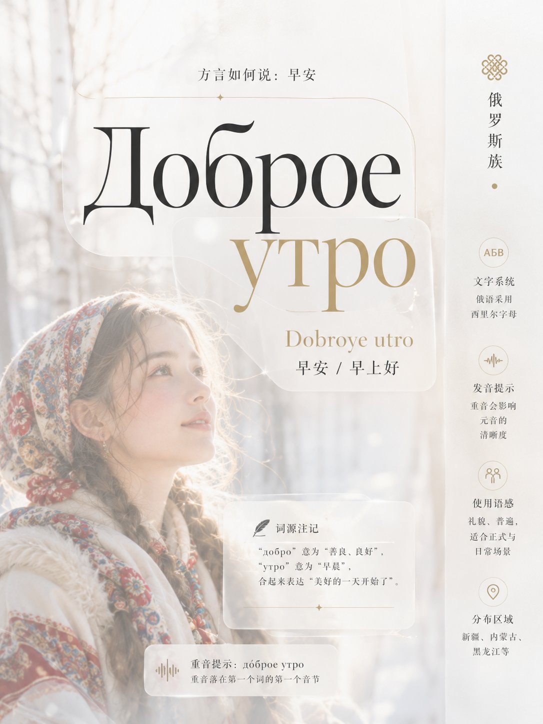
想创作具有影棚级质感且情绪松弛的艺术大片,却苦于无法完美呈现 少数民族方言早安诗性视觉排版指南 中复杂的细节与光影质感?
Nanobanana Pro 完美还原了画面的细腻纹理与高级氛围,助您精准定格具备顶尖商业杂志感的视觉瞬间。
复制这套免费提示词,一键复制进顶级模型,秒出大片。
Struggling to create Ethnic Minorities Good Morning Dialects Visual System with a high-end editorial style? Nanobanana Pro captures the textures and lighting details perfectly for a hyper-realistic masterpiece. Get FREE Prompt, enjoy one-click copy, and create instantly!
Prompt (English):
ADVERTISEMENT
Construct a light and translucent PPT visual system narrated by giant text and soft-focus imagery: with editorial rhythm as the main axis, using scale transitions of titles, focal imagery, descriptions, and data to form 'impact—pause—close reading'; with dynamic balance letting the top-left text center of gravity, biased visual subjects, and peripheral information bands counterbalance across space; using Gestalt principles of continuity and proximity, connecting scattered information with thin line tracks and grouping related content; using the Munsell value-chroma system to maintain projection readability of high-value backgrounds and local deep-value anchor points. Drawing from Alexey Brodovitch to establish editorial breathing with radical font sizes, cropping, and large white space; Muriel Cooper for thin spatial construction with translucent layers, light-color penetration, and front-middle-back ground; Herb Lubalin’s ligatures, shared strokes, and long-tail extensions for display characters only, making text directional graphics; Emil Ruder for body text rhythm, baseline order, and multi-level clarity, with the four collaborating in distinct domains without replicating individual works. Color schemes adopt a replaceable five-role syntax: background field accounts for 55%—65%, highest value, low chroma, and allowing slow warm-cold drift; focal visuals account for 20%—25%, medium-high value and medium chroma; informational text accounts for 10%—15%, establishing main contrast with deepest values; translucent support layers account for 5%—10%, low chroma and adjacent to the background to produce soft simultaneous contrast; high chroma highlights no more than 3%, falling only on key nodes. Future themes or brand color schemes must be mapped one-by-one by role, retaining area ratios, value order, chroma gradients, temperature relationships, and adjacent contrasts, without needing to change layout or fonts. Layout employs multi-column editorial grids and baseline grids: the first reading point is a column-crossing giant title, the second is a boundary-crossing focal visual, the third is data and descriptions; wide negative space is reserved around the edges, slender sidebars carry secondary information, breaking order with one column-cross or boundary-cross, controlling information density per page and ensuring thumbnail legibility. Backgrounds are composed of high-key photographic synthesis, first laying a vertically softened translucent base, then layering low-contrast environmental imagery and local out-of-focus foreground occlusion, finally adding a small amount of free-form halos; using diffused ambient light, low-density atomization, soft color spills without hard edges, and slight fabric-like vertical textures, with focal layer edges going from blurred to sharp, avoiding uniform full-page blurring. Typography uses a contrast pairing of high-stroke-contrast display serifs and a restrained body text system; display characters are oversized, compact, and allow for ligatures with shared strokes and terminal strokes extending in the reading direction, creating occlusion or guiding relationships with image contours; Chinese characters echo the vertical tension of Latin characters with sharp terminal strokes and balanced center-mass, while body text is graded by weight, width, spacing, and optical grayscale, with Chinese, English, and numbers aligned by visual weight rather than nominal font size. Clear, poetic, breathable, soft, agile, bright. Theme: 10 Ethnic Minorities, how to say Good Morning in dialects. A total of 10 images, each being a name theme. Different layouts. Each image should have 3-5 knowledge points, different information presentation methods. Professional collection-level typography and fonts. Aspect ratio 3:4. No serial number logic.中文参考:
ADVERTISEMENT
构建轻盈透光、由巨型文字与柔焦影像共同叙事的PPT视觉系统:以编辑节奏为主轴,用标题、焦点影像、说明与数据的尺度跃迁形成“冲击—停顿—细读”;以动态平衡让左上文字重心、偏侧视觉主体与边缘信息带隔空制衡;以格式塔连续与接近原则,用细线轨迹串联分散信息并将相关内容成组;以蒙塞尔明度—彩度体系维持高明度底场与局部深值锚点的投影可读性。借鉴Alexey Brodovitch以激进字号、裁切和大留白建立编辑呼吸,Muriel Cooper以半透明层、光色渗透和前中后景构造轻薄空间,Herb Lubalin只用于展示字的连字、共享笔画与长尾延伸,使文字成为方向性图形,Emil Ruder负责正文节奏、基线秩序与多层级清晰度,四者分域协作而不复刻个人作品。配色采用可替换的五角色语法:背景场占55%—65%,最高明度、低彩度并允许冷暖缓慢漂移;焦点视觉占20%—25%,中高明度与中彩度;信息文字占10%—15%,以最深值建立主对比;半透明支撑层占5%—10%,低彩度且邻接底场产生柔和同时对比;高彩度强调不超过3%,仅落在关键节点。未来主题或品牌配色须按角色一一映射,保留面积比例、明度次序、彩度级差、温度关系与邻接对比,无须改动版式和字体。版式采用多栏编辑网格与基线网格:第一阅读点为跨栏巨型标题,第二为越界的焦点视觉,第三为数据与说明;四周保留宽阔负空间,细长边栏承载次级信息,以一处跨栏或越界打破秩序,控制每页信息密度并确保缩略图可辨。背景以高调摄影合成构成,先铺垂直柔化的半透明基底,再叠低对比环境影像与局部失焦前景遮挡,最后加入少量自由形光晕;采用漫射环境光、低密度雾化、柔软无硬边的色彩溢出与轻微织物式纵向纹理,焦点层边缘由虚到实,避免全页均匀模糊。字体采用高笔画反差展示衬线与克制正文体系的对比配对;展示字超大、紧凑并允许连字共享笔画、末笔沿阅读方向延展,与影像轮廓发生遮挡或引导关系;中文以锐利收笔和均衡中宫呼应拉丁字的竖向张力,正文靠字重、字宽、字距和光学灰度分级,中英数字按视觉重量而非名义字号对齐。清透、诗性、呼吸感、柔和、灵动、明朗。

主题:10 个少数民族,方言如何说:早安
一共 10 张,每个都是一个名字主题
不同的排版
每个图片要有 3-5 个知识点、不同的信息呈现方式
专业收藏级的排版和字体
比例 3:4
不要有序列号逻辑