想创作具有影棚级质感且情绪松弛的艺术大片,却苦于无法完美呈现 日系独立店铺品牌标志设计探索方案 中复杂的细节与光影质感?
Nanobanana Pro 完美还原了画面的细腻纹理与高级氛围,助您精准定格具备顶尖商业杂志感的视觉瞬间。
复制这套免费提示词,一键复制进顶级模型,秒出大片。
Struggling to create Brand To Logo Exploration Sheet Design Prompt with a high-end editorial style? Nanobanana Pro captures the textures and lighting details perfectly for a hyper-realistic masterpiece. Get FREE Prompt, enjoy one-click copy, and create instantly!
Prompt (English):
ADVERTISEMENT
[Brand Name]: {BRAND NAME}
[Descriptor]: {BUSINESS TYPE / TAGLINE}
[Brand Type]: {e.g. bakery, hair studio, ceramic studio, bicycle workshop}
[Brand Keywords]: {3–5 keywords}
[Core Visual Ideas]: {people, objects, symbols, or concepts related to the brand}
[Primary Colors]: {2–4 restrained colors}
[Header Color]: {main header color}
[Final Ratio]: 9:16

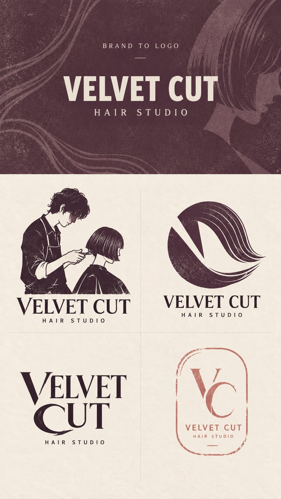
Create a professionally art-directed Brand to Logo exploration sheet for this brand, inspired by refined Japanese independent-shop identities, boutique branding, handcrafted print graphics, editorial typography, screen printing, block printing, and thoughtful local-business design. The result should feel designed, distinctive, and concept-driven rather than generated from generic AI logo templates.

LAYOUT

Use a strict 9:16 vertical composition. The upper brand-input section must occupy exactly 30% of the total image height, while the lower logo exploration section occupies exactly 70%. Keep the dividing line fixed at 30% from the top regardless of the length of the brand name. If the name is long, reduce the font size instead of increasing the header height.

Divide the lower 70% into four equal 2×2 quadrants using only very subtle thin dashed separators. Keep all four cells equal in size, with no outer border and no A/B/C/D numbering.

TOP SECTION

Use [Header Color] as the main background, with subtle paper grain, handmade print texture, and extremely low-contrast graphic traces inspired by the brand’s visual world. These background elements should remain atmospheric and should never become a full illustration.

Show only BRAND TO LOGO, [Brand Name], and [Descriptor]. Use clean, neutral typography for this original brand input and do not turn it into a finished logo yet. Do not add slogans, paragraphs, fake addresses, dates, decorative badges, unnecessary icons, or excessive microcopy.

LOGO DIRECTION 1 — CHARACTER / PICTORIAL

Create one memorable, concrete brand image using a person, animal, product, object, or recognizable activity directly related to the business. Simplify the subject into a compact logo composition with a strong silhouette, limited detail, restrained color, and subtle handmade print texture.

The image should feel like a genuine brand character or pictorial mark rather than a complete illustration. Avoid anime styling, exaggerated cute mascots, generic stock characters, or overly detailed scenes. Integrate the image naturally with the brand name so the pictorial element and wordmark feel like one identity.

LOGO DIRECTION 2 — EMBLEM / SYMBOL

Create a compact graphic symbol by combining two or three important ideas from [Core Visual Ideas]. Use negative space, shared geometry, overlap, transformation, visual metaphor, or double meaning so the elements become one unified mark rather than several icons placed next to each other.

The design should reward a second look while remaining simple enough to work at very small sizes. Prioritize a strong silhouette, clever graphic relationships, and clear conceptual relevance to the brand.

LOGO DIRECTION 3 — CUSTOM WORDMARK

Turn the brand name itself into the primary logo. Do not place a separate generic icon beside ordinary typography. Instead, identify a few letters with strong visual potential and modify them through cuts, shared strokes, altered counters, extended curves, negative space, structural substitutions, or subtle references to the brand’s core concept.

Only modify the letters that genuinely benefit from the concept. Keep the name highly readable and avoid decorating every character. The final result should feel like a custom-drawn wordmark designed specifically for this brand, with a clear visual idea embedded directly into the typography.

LOGO DIRECTION 4 — BRAND MARK

Create a secondary identity mark appropriate to the business, such as a maker’s mark, workshop tag, studio label, shop stamp, service mark, packaging mark, mirror label, ticket, or another format that naturally belongs to the brand’s real-world context.

Keep the structure restrained, open, and highly usable. Allow subtle handmade irregularity, broken edges, missing ink, incomplete borders, or asymmetry where appropriate, but maintain generous negative space and a clear hierarchy. Avoid rigid generic circular badges, overcrowded vintage emblems, fake heritage details, and unnecessary decorative information.

STYLE & DESIGN CONTROL

Use only 1–3 colors per logo, selected from [Primary Colors]. The four directions should share the same brand world, color logic, and general print character, but they must be visibly different in design methodology. At least one of the four concepts must contain a clear pictorial or character-based image; do not make all four logos abstract, typographic, or monogram-based.

Prioritize strong silhouettes, meaningful visual relationships, custom typography, negative space, restrained color, generous breathing room, subtle print grain, controlled irregularity, and authentic small-business character. The handmade quality should feel intentional and refined rather than distressed for decoration.

Avoid generic leaves, random botanical decoration, luxury serif clichés, fake founding dates, meaningless monograms, stock-vector icons, glossy effects, gradients, metallic foil, chrome, 3D rendering, photorealistic mockups, storefront scenes, packaging mockups, and unrelated decorative elements.

The finished image should resemble a sophisticated logo exploration page from an independent branding studio, showing four genuinely different but visually related directions for the same brand.
中文参考:
ADVERTISEMENT
[品牌名称]:{BRAND NAME}
[描述符]:{业务类型 / 口号}
[品牌类型]:{例如:面包店、美发工作室、陶瓷工作室、自行车工坊}
[品牌关键词]:{3–5 个关键词}
[核心视觉理念]:{与品牌相关的人物、物体、符号或概念}
[主要颜色]:{2–4 种克制的颜色}
[页眉颜色]:{主页眉颜色}
[最终比例]:9:16

为此品牌创建一个专业的艺术指导类“品牌到标志”探索表,灵感源自精致的日本独立店铺标识、精品品牌、手工印刷图形、编辑排版、丝网印刷、木版印刷和周到的本地业务设计。结果应具有设计感、独特性和概念驱动,而不是由通用的 AI 标志模板生成。

布局

使用严格的 9:16 垂直构图。上方的品牌输入部分必须恰好占据图像总高度的 30%,而下方的标志探索部分恰好占据 70%。无论品牌名称的长短,分界线都固定在距离顶部 30% 的位置。如果名称较长,请缩小字体大小而不是增加页眉高度。

将下方的 70% 分为四个相等的 2×2 象限,仅使用非常细微的薄虚线分隔符。保持所有四个单元格大小相等,没有外边框,也没有 A/B/C/D 编号。

顶部区域

使用 [页眉颜色] 作为主背景,带有细微的纸张纹理、手工印刷质感,以及受品牌视觉世界启发且对比度极低的图形痕迹。这些背景元素应保持氛围感,绝不能变成完整的插图。

仅显示 BRAND TO LOGO、[品牌名称] 和 [描述符]。为原始品牌输入使用干净、中性的排版,尚未将其转化为成品标志。不要添加标语、段落、虚假地址、日期、装饰性徽章、不必要的图标或过多的微缩文本。

标志方向 1 — 角色 / 图形

使用与业务直接相关的人物、动物、产品、物体或可识别的活动创建一个令人难忘的、具体的品牌形象。将主体简化为紧凑的标志构图,具有强烈的剪影、有限的细节、克制的色彩和细微的手工印刷纹理。

图像应感觉像是真正的品牌角色或图形标记,而不是完整的插图。避免动漫风格、夸张的可爱吉祥物、通用的素材角色或过度详细的场景。将图像与品牌名称自然结合,使图形元素和文字标记感觉像是一个整体。

标志方向 2 — 徽记 / 符号

通过结合 [核心视觉理念] 中的两个或三个重要想法来创建一个紧凑的图形符号。使用负空间、共有几何形状、重叠、变换、视觉隐喻或双重含义,使元素成为一个统一的标记,而不是并排放置的几个图标。

设计应经得起推敲,同时保持足够简单以便在极小尺寸下也能发挥作用。优先考虑强烈的剪影、巧妙的图形关系以及与品牌清晰的概念相关性。

标志方向 3 — 定制文字标记

将品牌名称本身作为主要标志。不要在普通排版旁边放置单独的通用图标。相反,识别出几个具有强烈视觉潜力的字母,并通过切割、共有笔画、改变字肚、延伸曲线、负空间、结构替换或对品牌核心概念的微妙引用来对其进行修改。

只修改那些真正能从概念中获益的字母。保持名称的高度可读性,避免装饰每个字符。最终结果应感觉像是专门为该品牌设计的定制手绘文字标记,排版中直接嵌入了清晰的视觉构思。

标志方向 4 — 品牌标记

创建一个适合该业务的次级身份标记,例如制作者标记、工坊标签、工作室标签、商店印章、服务标记、包装标记、镜面标签、门票或另一种自然属于品牌现实世界环境的格式。

保持结构克制、开放且高度可用。在适当的地方允许细微的手工不规则、破损边缘、缺墨、不完整的边框或不对称,但保持慷慨的负空间和清晰的层次结构。避免刻板通用的圆形徽章、拥挤的复古纹章、虚假的传统细节和不必要的装饰信息。

风格与设计控制

每个标志仅使用从 [主要颜色] 中选择的 1–3 种颜色。四个方向应共享相同的品牌世界、色彩逻辑和通用印刷特征,但在设计方法论上必须有明显区别。四个概念中至少有一个必须包含清晰的图形或基于角色的图像;不要让所有四个标志都变成抽象的、排版的或基于字母组合的设计。

优先考虑强烈的剪影、有意义的视觉关系、定制排版、负空间、克制的色彩、充裕的呼吸空间、细微的印刷纹理、受控的不规则性以及真实的真实小店特色。手工质感应感觉是刻意且精致的,而不是为了装饰而进行的磨损处理。

避免通用的叶子、随机的植物装饰、奢侈品衬线体陈词滥调、虚假的成立日期、毫无意义的字母组合、素材矢量图标、光泽效果、渐变、金属箔、铬、3D 渲染、写实样机、店面场景、包装样机和不相关的装饰元素。

成品图像应类似于独立品牌工作室制作的精美标志探索页面,展示同一品牌的四个真正不同但视觉相关的方向。