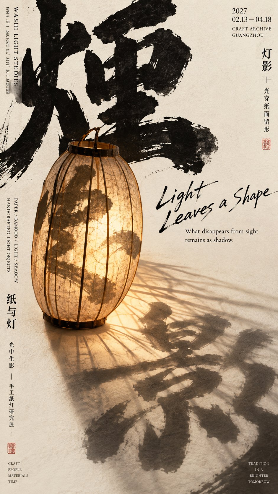
想创作具有影棚级质感且情绪松弛的艺术大片,却苦于无法完美呈现 东方艺术展览海报提示词 中复杂的细节与光影质感?
Nanobanana Pro 完美还原了画面的细腻纹理与高级氛围,助您精准定格具备顶尖商业杂志感的视觉瞬间。
复制这套免费提示词,一键复制进顶级模型,秒出大片。
Struggling to create Oriental Art Exhibition Poster Prompt with a high-end editorial style? Nanobanana Pro captures the textures and lighting details perfectly for a hyper-realistic masterpiece. Get FREE Prompt, enjoy one-click copy, and create instantly!
Prompt (English):
ADVERTISEMENT
[Theme]: {Fill in theme, e.g.: Light and Shadow / Refraction / Visage / Smoke Trails}
[Core Subject]: {Fill in a real object with strong silhouette and texture}
[Wild Character Content]: {Fill in 2 Chinese characters related to the theme}
[Main Subject Color]: {e.g.: Amber Gold / Cobalt Blue / Dark Wood Brown / Cinnabar Red}
[Interaction between Subject and Text]: {Refraction / Projection / Interspersing / Occlusion / Dissolution / Cutting / Stretching, etc.}
[English Auxiliary Title]: {Fill in a short English title}
[Exhibition Information]: {Theme / Date / Location, can be filled in freely}
[Aspect Ratio]: 9:16

Design a high-completion Oriental cultural art exhibition poster, the core visual method is "strong subject + giant wild characters + real texture interaction". The overall feel should have Oriental cultural temperament, and also possess the visual impact of modern editorial design and experimental typography.

Use clean and warm ivory white or warm beige art paper for the background, retaining only slight natural paper texture. Avoid complex backgrounds, heavy aging, stains, cracks, or strong grain, letting large areas of warm white negative space become an important component of the entire layout.

Use the two Chinese characters from [Wild Character Content] as the primary typography. The characters must be very huge, heavy, and free, with obvious brush strokes (pressing and lifting), thickness variations, natural flying-white, and realistic ink edges; some strokes can directly exceed the frame.

The two characters should not be neatly arranged like conventional titles; they can be misplaced, overlapped, interspersed, or staggered up and down. They should first be a set of strong black visual shapes that form a clear, oppressive large form even when viewed small.

Place a giant [Core Subject] in the center of the frame or the main visual focus, the subject occupying about 35%–55% of the frame. The object needs to have photography-level volume, material, structure, light and shadow; the silhouette must be clear, not reduced to an ordinary product display size.

The subject retains the [Main Subject Color], making it the primary color anchor besides the black calligraphy. Control other colors in the frame as much as possible, letting the subject's material itself bear the visual variation rather than increasing complexity through additional decorative colors.

The most important thing is to let the subject and the giant wild characters truly undergo [Interaction between Subject and Text], rather than simply placing the object in front of the text. The interaction relationship must come from the object's own real or reasonable physical properties, so the viewer can understand at first glance that "this subject is changing the text."

For example, transparent glass can refract, enlarge, or distort strokes; paper lamps can project calligraphy as shadows; smoke can block, dissolve, or extend ink marks; solid objects can intersperse with the text in front and behind or embed into negative space; a subject in motion can pull, push, cut, or change the calligraphy structure.

Establish clear front, middle, and back spatial layers between the subject and the text. Some strokes can be located behind and obscured by the object, while another part comes to the front of the object, letting the real subject and typography interlock in space rather than staying as a 2D overlay.

Use an asymmetric editorial design overall. The central area is responsible for "giant wild characters + strong subject + core interaction," while the left and right edges and remaining negative space areas include small-sized exhibition information, making the visual center strong enough while maintaining the information density of cultural publications.

Add a small amount of natural, loose handwritten English [English Auxiliary Title], like annotations personally written by the designer on the poster afterwards. The English should not be too large, nor use regular commercial fonts, making it an intermediate layer between the wild characters and the rational small text.

Add small information like dates, locations, exhibition themes, material keywords, and short descriptions to the left and right edges, which can be organized using narrow columns, vertical arrangements, or local misalignments. The amount of information can be rich, but the font must be significantly smaller than the subject and wild characters, so it does not compete with the central main visual.

Control the overall color scheme to warm ivory white background, deep ink black wild characters, [Main Subject Color], and a small amount of the subject's natural material colors. A very small number of vermilion seals can be added as an Oriental visual highlight, but do not use large amounts of red decoration, and avoid a red-gold festive feel.
中文参考:
ADVERTISEMENT
【主题】:{填写主题,例如:灯影 / 折光 / 面相 / 烟迹}
【核心主体】:{填写一个具有强轮廓、强材质感的真实器物}
【野字内容】:{填写 2 个与主题相关的汉字}
【主体主色】:{例如:琥珀金 / 钴蓝 / 深木褐 / 朱砂红}
【主体与文字互动】:{折射 / 投影 / 穿插 / 遮挡 / 消解 / 切割 / 拉伸等}
【英文辅助标题】:{填写简短英文标题}
【展览信息】:{主题 / 日期 / 地点,可自行填写}
【画幅比例】:9:16

设计一张高完成度的东方文化艺术展览海报,核心视觉方法为“强主体 + 巨型野字 + 真实材质互动”。整体既要有东方文化气质,也要具备现代编辑设计和实验 Typography 的视觉冲击。

背景使用干净温暖的象牙白或暖米白艺术纸,只保留轻微天然纸张纹理。不要复杂背景、重度做旧、脏污、裂纹或强颗粒,让大面积暖白留白成为整个版式的重要组成部分。

使用【野字内容】两个汉字作为主要 Typography。文字必须非常巨大、粗重、自由,具有明显的毛笔提按、粗细变化、自然飞白和真实墨迹边缘,部分笔画可以直接超出画框。

两个字不要像常规标题一样整齐排列,可以错位、压叠、穿插或上下错开。它们首先应该是一组强烈的黑色视觉形状,即使缩小观看,也能形成清楚、有压迫感的大形。

在画面中央或主要视觉重心放置一个巨大的【核心主体】,主体约占画面 35%–55%。器物需要有真实摄影级别的体积、材质、结构和光影,轮廓必须清楚,不要缩成普通产品展示尺寸。

主体保留【主体主色】,让它成为除黑色书法之外最主要的色彩锚点。画面尽量控制其他颜色,让主体材质本身承担视觉变化,而不是通过额外装饰颜色增加复杂度。

最重要的是让主体与巨大野字真正发生【主体与文字互动】,而不是简单将器物放在文字前面。互动关系要来自器物本身真实或合理的物理属性,让观众第一眼就能理解“这个主体正在改变文字”。

例如透明玻璃可以折射、放大或扭曲笔画;纸灯可以把书法投射成影子;烟气可以遮挡、消解或延续墨迹;实体器物可以与文字前后穿插、嵌入负空间;运动中的主体可以拉开、推动、切断或改变书法结构。

主体与文字之间要建立清楚的前、中、后空间层次。部分笔画可以位于器物后方被遮挡,另一部分重新来到器物前方,让真实主体和 Typography 在空间里互相咬合,而不是停留在二维叠图。

整体使用非对称编辑设计。中央区域负责“巨型野字 + 强主体 + 核心互动”,左右边缘和剩余留白区域再加入小尺寸展览信息,让视觉中心足够强,同时保持文化出版物的信息密度。

加入少量自然、松散的英文手写【英文辅助标题】,像设计师后来亲手写在海报上的注释。英文不要过大,也不要使用规整商业字体,让它成为野字与理性小字之间的中间层级。

左右边缘加入日期、地点、展览主题、材质关键词和简短说明等小型信息,可以使用窄栏、竖排或局部错位方式组织。信息量可以丰富,但字体必须明显小于主体和野字,不能抢夺中央主视觉。

整体配色控制为暖象牙白背景、深墨黑野字、【主体主色】和少量主体天然材质色。可以加入极少量朱红印章作为东方视觉点睛,但不要大量使用红色装饰,也不要出现红金节庆感。